
Is the 60/40 portfolio dead?
A retreat of inflation is not sufficient to bring back negative correlation between equities and bonds, if history is any guide.

The 60/40 equity-bond portfolio became popular as it enhanced risk-adjusted returns by leveraging the negative correlation between equities and bonds.
This negative correlation hasn’t been a permanent attribute of markets, only appearing 20 years ago. Before this time these two markets were positively correlated.
2022 has seen this positive correlation re-emerge during an equity market drawdown, the worst possible time for this to happen. This has prompted questions asking if the 60/40 portfolio is therefore “dead”.
Going through the history of correlations shows that it isn’t the presence of inflation that determines correlations, but the central banks attitude about where the tail-risk to inflation lies, whether that be in high inflation, or deflation.
If deflation becomes the primary concern for central banks again, they will cut rates during downturns, prompting the negative correlation to return.
The assumption of negative correlation between equities and bonds is built into many different parts of the financial system. Care must be taken to remember that it is an “assumption” and is not an immutable law.
The negative correlation between equities and bonds exists because of how monetary policy is set, specifically in reference to the strong desire for inflation within a certain predictable band. This has the greatest effect when monetary policy is eased in crisis; causing bonds to rally sharply while equity prices are falling. How monetary policy is conducted changes with time, however.
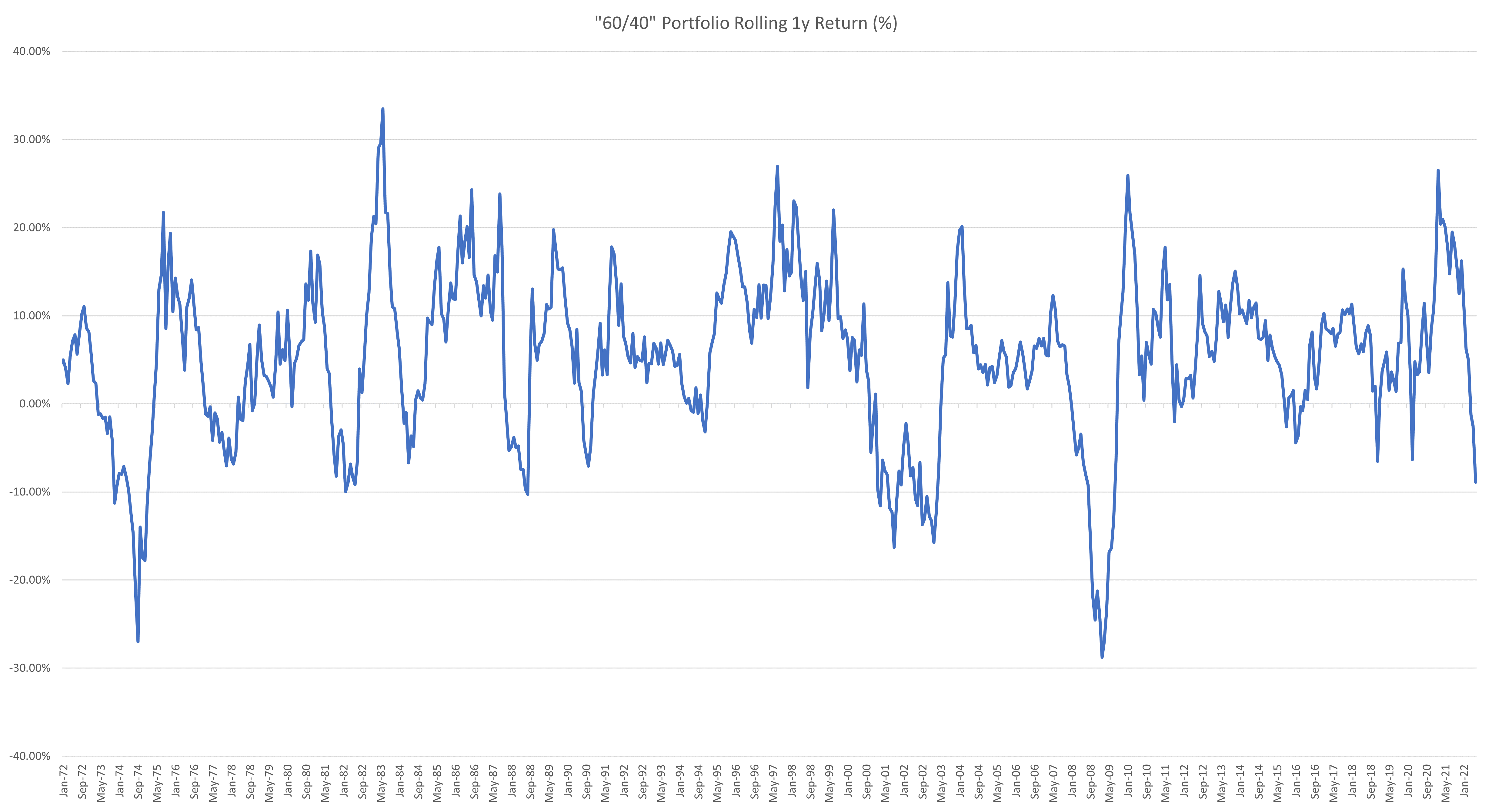
So far, 2022 has brought one of the biggest breaks in this negative correlation assumption that we’ve seen in a considerable period. in 2022, the generic 60/40 portfolio delivered the worst year-to-date return in a decade, returning -18%. The correlation has broken before but has tended to revert.
It’s easy to just say that it was the return of inflation that has caused this. However, this doesn’t answer the question of what caused correlation to shift from positive to negative at the start of the millennium, as inflation had been low for quite a while by that point.
If the level of inflation isn’t enough to guide us, then how will we know if the 60/40 portfolio has hit its use-by date?
The 60/40 portfolio
The 60/40 portfolio is the generic name for the traditional “low risk”, or “balanced” option used by more conservative investors. It refers to the relative weighting of equities and fixed income, being 60% and 40%. This model portfolio came about from the work of Harry Markowitz, who invented Modern Portfolio Theory.
Modern Portfolio Theory (MPT) is a portfolio construction technique that considers not only the return of the individual assets that you are looking to combine into a portfolio, but also the correlation of the returns of each of the assets. It suggests the optimal portfolio on a ‘efficient frontier’ of portfolios for a given level of risk by combining assets that have negative correlation.
The negatively correlated relationship of equities and bonds has benefitted portfolios over the last decade and it’s why, even at a 1.5% yield, bonds were still a mainstay in these types of portfolios. The power of negative correlation allows you to achieve something better than the sum of a portfolio’s parts and has been one of the few “free kicks” in markets that exist.
It hasn’t always been like this
Firstly, a disclaimer. Measuring correlation is impossible, as we can only estimate it. I’ve chosen monthly data points and a 1-year period to measure the correlations below, as I feel this is most representative of the correlations recognised by investors. These results may differ depending on different underlying assumptions.
With that out of the way, let’s look at the history of the equity and bond correlation.

The first striking aspect is that a negative correlation has only existed between equities and bonds since around the turn of the century. Average correlation was -0.4 in this period, with only very short periods of positive correlation.
Before this point, there was a strong positive correlation, with only temporary periods of negative correlation.
We can separate the relevant time period into 3 distinct phases. 1970 to 1997 was the period of positive correlation, 2002 until 2021 the negative correlation period, and the years in between (1998 to 2001 inclusive) a “transitory” or zero correlation period.
It is odd that two assets, which on average produce positive returns over the long term, would ever be consistently negatively correlated. Positive correlation would be the base-case normally.
This, however, is only true due to the outliers in the relationship which end up driving the correlation.
Where does the correlation come from?
If we plot the 1 month returns of each asset class against each other with a regression, we can see where the negative correlation arises from.
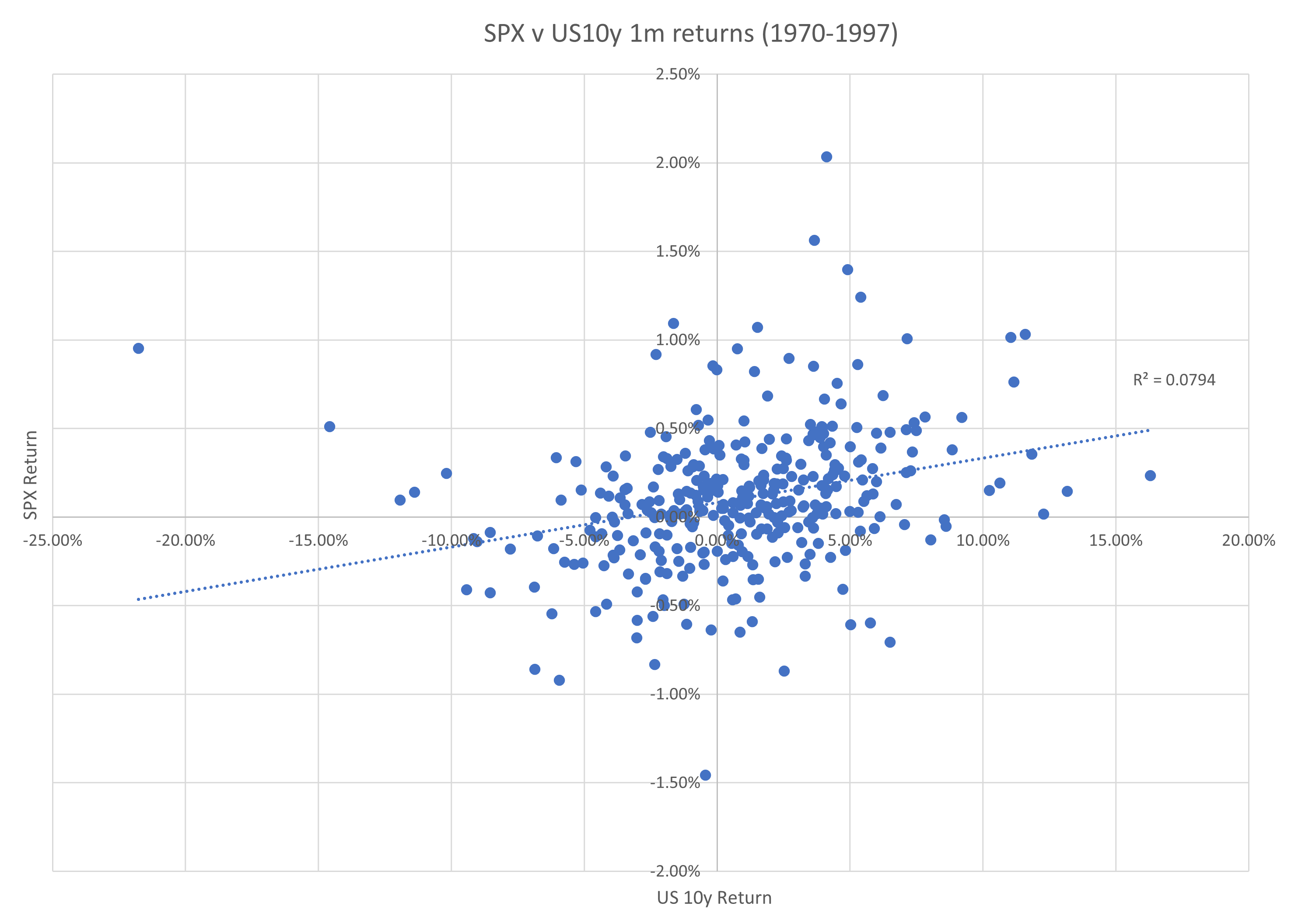
In the pre-1998 period, the positive correlation trend can be seen quite clearly, albeit with a considerable amount of error. Most return pairs sit within the “equities up, bonds up” quadrant, with the “equities down, bonds up” quadrant in a distant second place.
The fit isn’t great, however. The driver of this is that the bulk of the observations sit in the -5% to +5% monthly equities return and -0.50% to +0.50% bond return area, which exhibits no correlation. This means that the positive correlation is entirely driven by the outliers to this area, and this defines the difference between the positive correlation era and the negative correlation era.
The outliers that push the trendline to a positive slope are the weight of samples that end up in the top-right quadrant (equities up, bonds up) and in the lower-left quadrant (equities down, bonds down).
A comparison between this trendline and the negatively correlated post-2000 period is striking in this respect, especially in the top left quadrant.

In the negatively correlated period, there is a similar crowding of samples in the same neutral area as described previously, which similarly shows no correlation. It is the outliers once again that drive the negative slope on the trendline.
And it’s these outliers that are of the most interest. In the previous chart the sparser points in the “equities up, bonds up (yields down)” quadrant have seemingly jumped over to the “equities down, bonds up (yields down)” quadrant. For the points previously in that quadrant, the returns have shifted far higher for the same fall in the equity market. Most else remains the same.
This reduces our question to a simpler one. What happened to make bonds and equities switch their relationship with each other in extreme up and down markets?
Tail risks drive bond and equity markets
Breaking down the above scatter plots by decade reveals a little more of the story. The ‘70s saw negative returns in equities matched with negative returns in bonds, and vice-versa.

The ‘70s, marred with high inflation, saw volatile and weak equity markets along with rising bond yields. It’s important to note, however, that a portfolio of constant maturity 10-year bonds returned a decent 7.35%, the poorest return in any decade since, but still respectable (and decidedly not negative).
In my last newsletter, I went through the rationale for why it isn’t interest rates that dictate equity market volatility and returns, but rather economic uncertainty as measured by high inflation and unstable economic growth.
Within this framework, it makes sense that rising bond yields (and thus negative bond returns) were associated with a more uncertain environment. A more uncertain environment is less friendly to equity returns. This is important, and it forms the basis as to what changes later.
The ‘80s saw continued positive correlation as illustrated by the regression below (with significant error). Despite the fall in inflation in the early ‘80s, similar trends to the ‘70s can still be seen, with strong equity markets associated with strong bond returns.

During this period, lower interest rates had a strong positive effect on economies and encouraged a debt binge which was also positive for equity markets. Even though real interest rates were extremely high over this period, the end of the economic volatility of the ‘70s encouraged risk taking, and this effect was only supercharged as rates fell.
The ‘90s saw more of the same, with strong bond returns lining up with strong equity returns. The good times continued, and the respite from high inflation was more confidence inspiring than ever.

This is where things began to change, however. The 2000s brought the first example of negative correlation, and the experience of the GFC only strengthened this recalibration. There was some mis-aligned bond and equity performance in late 2008 and early 2009 which reduces the fit of this scatter plot, but the shift from previous decades is clear.
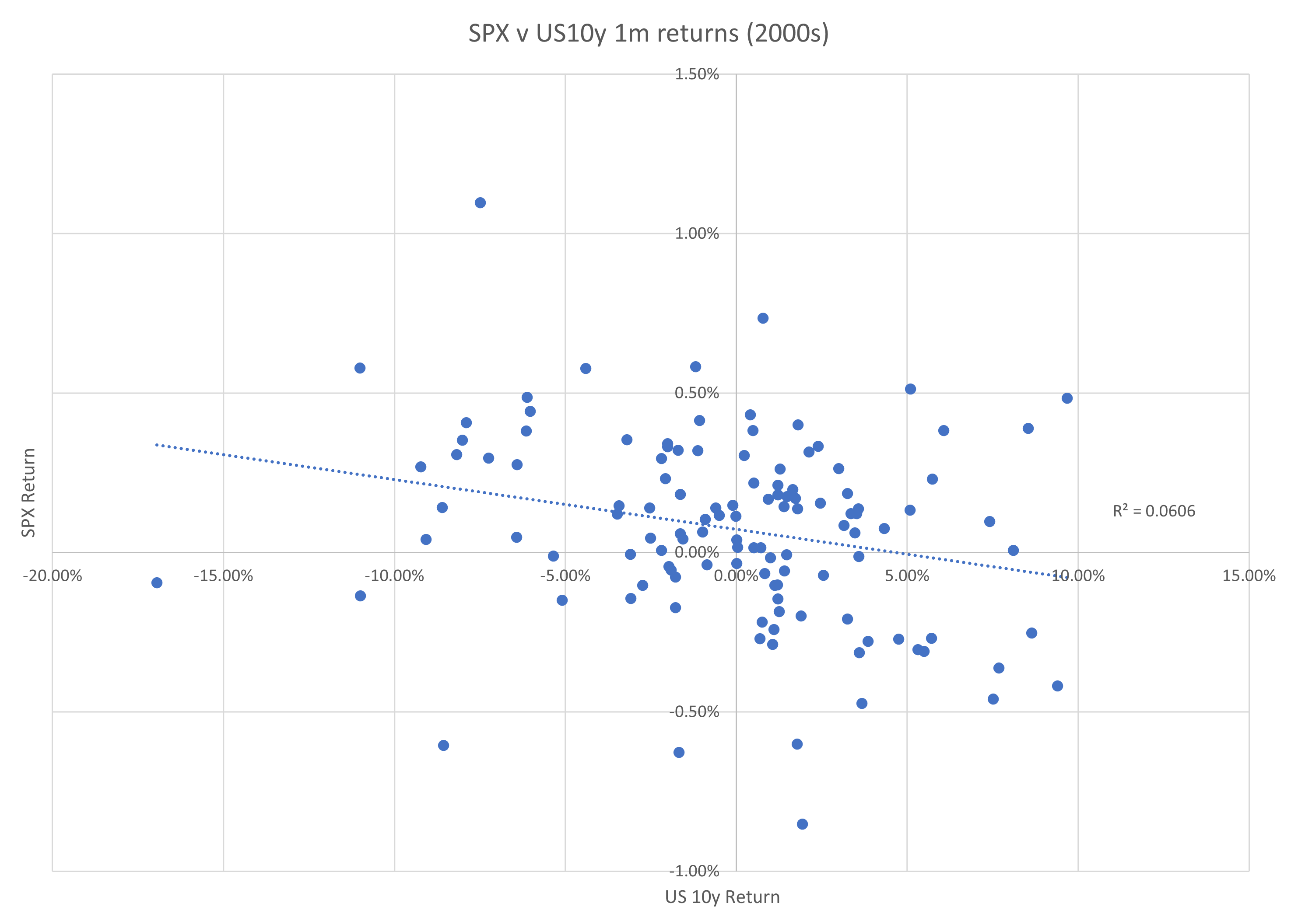
Samples have shifted towards the “equities down, bonds up” and “equities up, bonds down” quadrants. Bonds were now more likely to rally when equities fell. The safety of Treasuries was associated with equity market drawdowns, rather than equity market buoyancy.
Finally, the 2010s saw these correlation changes only get stronger, in a time of record low bond yields.
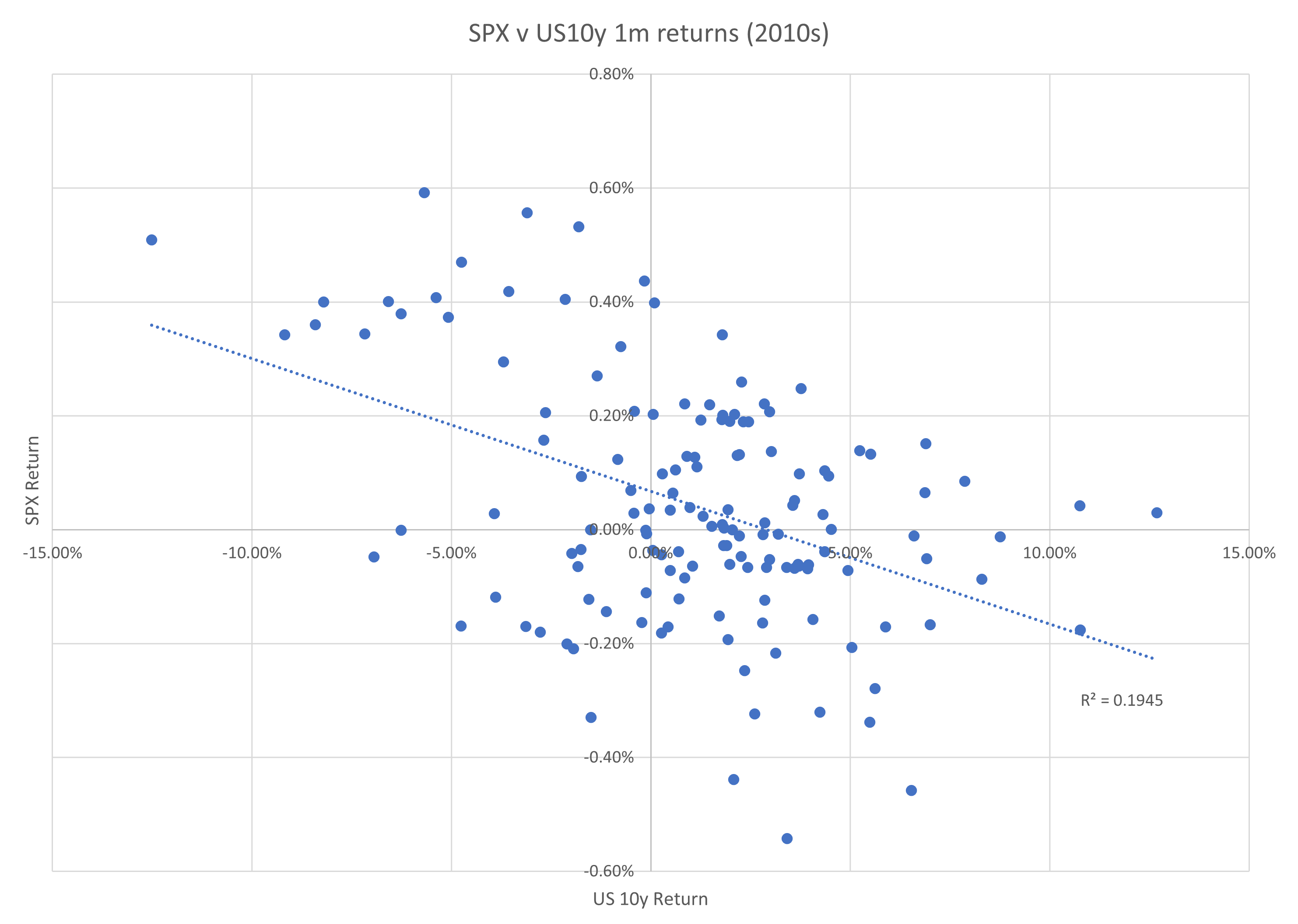
This analysis has shown that the correlation is most affected by the “extreme” cases of equity market moves, where equities move more than 5% in either direction in a month. Something had changed to make falling bond yields a “good” thing for risk, rather than a “bad” thing.
The most popular reason cited for this is inflation. However, this argument hits a snag when it is properly understood why the correlation changed when it did. Inflation in the 1990s and the 2000s wasn’t that different, yet this is exactly when the correlation between bonds and equity switched.
Central banking’s view of inflation is more important than inflation itself
Inflation in the US started the new millennium at the highest level since the late ‘80s. Inflation hit 3.7% three times in the year 2000, the highest level since 1991. Average inflation in the ‘90s was 2.9%, while the 2000s saw 2.65%, a figure close enough to be considered unchanged. The lowest rate of inflation in the 2000s was only 0.2% less than the lowest rate of the ‘90s.
This set of statistics invalidates the conclusion that inflation meaningfully changed from the ‘90s to the 2000s, causing an issue for the hypothesis that the equity-bond correlation changed because of inflation.
Over the long-term, bond yields will adjust to the economic reality of the environment which they are in. In the short to medium term, however, the primary driver of bond yields are central banks.
Their decision on short-term interest rates will be the most important factor in determining the level of long bond yields. How they interpret inflation is more consequential than the inflation level itself, therefore the reaction function of a central bank to inflation is all that matters for bond yields.
A central bank can decide that a 10% inflation rate is appropriate and can leave interest rates unchanged at a low level. Nominal bond yields will trade using this rate as an anchor, and real yields will have to be deeply negative to compensate. You can argue about whether doing something like this is a good idea or not, but there is no law that says that rates must go up with inflation.
This is what did change between the ‘90s and the 2000’s: The Fed’s communication and subsequent action when considering the same levels of inflation changed considerably.
In short, falling inflation went from being “good” to being “bad”.
Nothing demonstrates this change better than extracts of the Fed meeting minutes for across these time periods.
All these extracts are taken at times when the year-on-year inflation rate was at or around 2%, a level well below the average level before the GFC. The quotes below must be taken in this context.

The first extract is from the meeting minutes of September 23, 1986:
Slightly greater reserve restraint would, or slightly lesser reserve restraint might, be acceptable depending on the behaviour of the aggregates, taking into account the strength of the business expansion, developments in foreign exchange markets, progress against inflation, and conditions in domestic and international credit markets.
The next is from August 18, 1998:
At its meeting on August 18, 1998, the Committee adopted a directive that called for maintaining conditions in reserve markets that would be consistent with the federal funds rate continuing to average around 5-1/2 percent. However, in light of mounting financial strains abroad, their potential implications for the U.S. economy, and less accommodative conditions in domestic financial markets, the Committee concluded that the risks to the outlook were no longer tilted toward rising inflation but had become more balanced.
And the last from September 16, 2003:
At its meeting on September 16, 2003, the Federal Open Market Committee adopted a directive that called for maintaining conditions in reserve markets consistent with keeping the federal funds rate at around 1 percent. In reaching this decision, the Committee members generally perceived the upside and downside risks to the attainment of sustainable growth for the next few quarters to be roughly equal; however, they viewed the probability, though minor, of an unwelcome fall in inflation as exceeding that of a rise in inflation from its already low level. The Committee judged that, on balance, the risk of inflation becoming undesirably low would remain the predominant concern for the foreseeable future.
The change is obvious, and stark.
In 1986 the experience of low inflation was spoken about as “progress”, with the Board clearly pleased with the outcome. In this meeting it’s also important to note that the transcript is full of contributions from regional Governors whose primary concern was the growth in money and debt fuelling another inflation scare rather than any possible worry about low inflation. There is not one mention of concern about deflation or any dissatisfaction with low inflation, despite inflation recording a level around 1.5%.
1998 showed a strong shift in communication despite the inflation outcome being the same as it was in 1986. Risks were not considered to be tilted towards rising inflation, but the outlook had become more balanced. This marked the start of the ‘transition’ period in the equity-bond correlation.
Finally in 2003, low inflation triggered a more worried response. It was clear that the predominant concern about inflation was it becoming “undesirably low”. This view, as we know, stayed consistent until 2022.
It wasn’t inflation that changed. It was the attitude to inflation.
What changes the central banker’s reaction function?
I don’t know exactly why this shift in attitudes about inflation occurred. It could have been from a change in economic theory as academia progresses a lot in this area (see the move away from measuring money supply in the ‘80s to gauge an economy). It could also have been a cultural change in central banking. Central bankers meet and talk frequently, and because of this they all generally have the same attitudes when it comes to managing monetary policy.
The answer could lie in the shift away from the strong growth of the ‘80s and ‘90s. Once recession became more likely from slower GDP growth, excuses were made about lower inflation (as their mandate was inflation) that made it easier for central banks to justify easing purely to support growth.
The more likely explanation, in my view, is just the amount of time that passed since the memory of the ‘70s. The fear of returning to that period was strongest during the ‘80s and waned significantly by the turn of the century. Once that fear had passed, then perhaps the growth argument came into play more.
This is just speculation, however, and it would be interesting to explore this topic further.
Is the 60/40 portfolio dead?
2022 has seen the worst performance for the benchmark 60/40 portfolio. Positive correlation between equities and bonds during a large equity drawdown will do that.
It’s no surprise that this has happened because of the accelerated bout of inflation we are in right now. The reason is a little more nuanced than this though – it’s because central banks have shifted their opinion of where the tail-risk to inflation lies. For the last 20 years it’s been on the deflationary side. Now it’s about inflation.
Whether the 60/40 portfolio is resuscitated will depend on whether we see a permanent shift back to the dominant worry being high inflation rather than deflation. This will depend on several factors, with the length and severity of today’s inflation being the primary determinants.
If you believe that this bout of inflation is so brutal that it will change how central bankers think about risks to upside and downside on inflation for the next 5 to 10 years, then the 60/40 portfolio is dead.
Listening to how Jay Powell spoke at the House Financial Services Committee certainly could lead you to this conclusion:
The main thing is we can't fail on this. We really have to get inflation down to 2%," Powell told lawmakers. "We're going to want to see evidence that it really is coming down before we declare any kind of victory.
In this new world, central banks would be hesitant to cut too much in downturns, for fear of stoking inflation. This would limit gains on bonds, causing a re-emergence of positive correlation in these types of markets.
Just like there is no law that says bond yields must rise in inflationary periods, there is also no law that says that bond yields must fall in deflationary periods. Both situations only occur when there is a central bank willing to fight inflation or deflation through intervention.
How much they are willing to fight in each case is the ultimate determinant of the survival of the traditional balanced portfolio.