

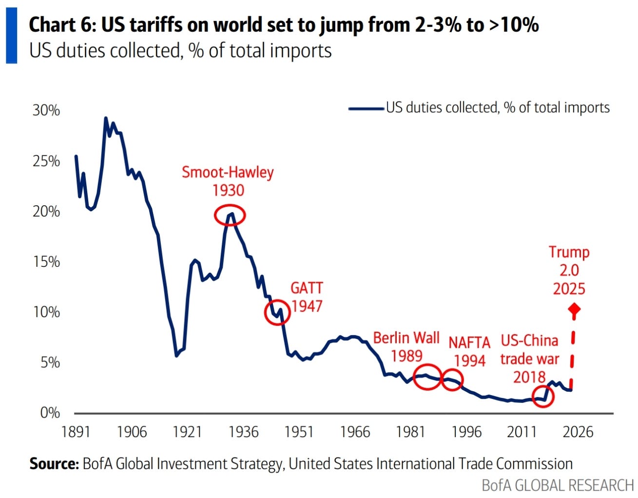
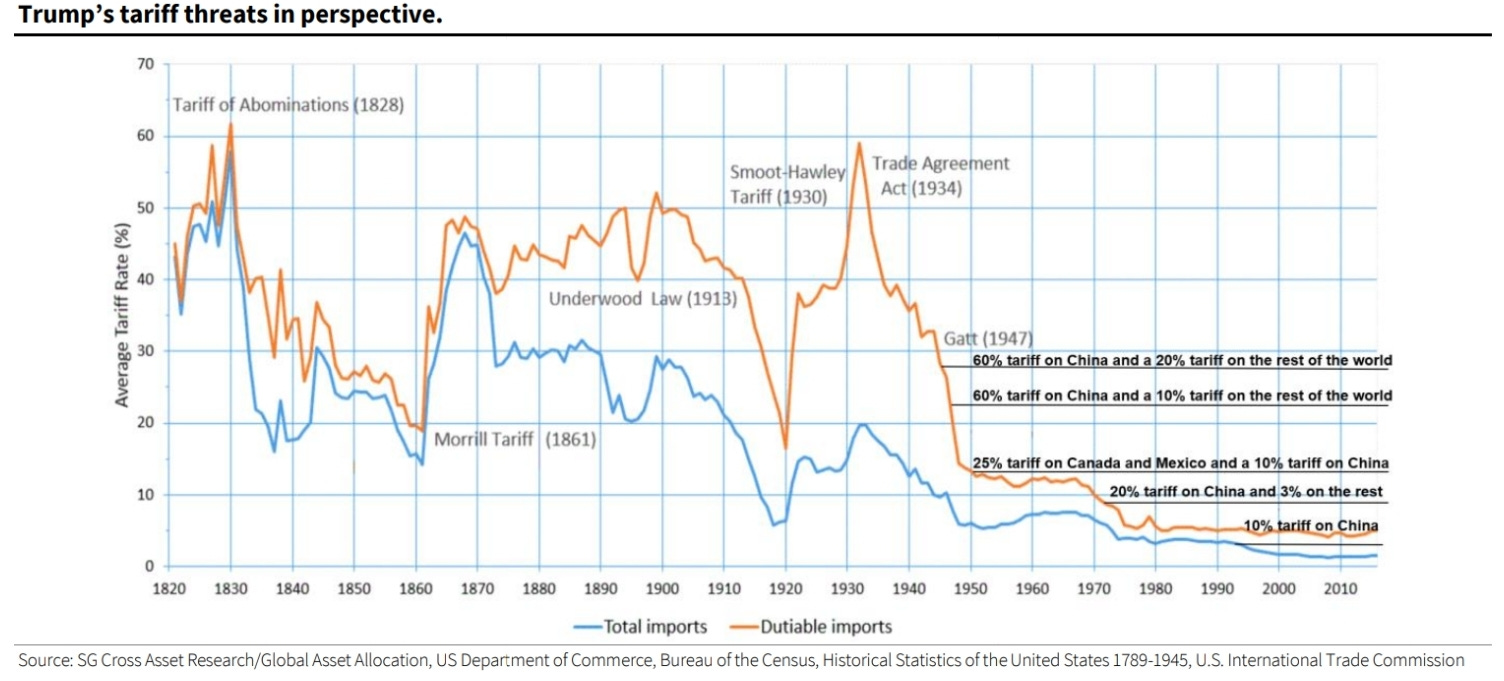
There will be no charts on or about tariffs, I promise.
Europe plans sharpen up
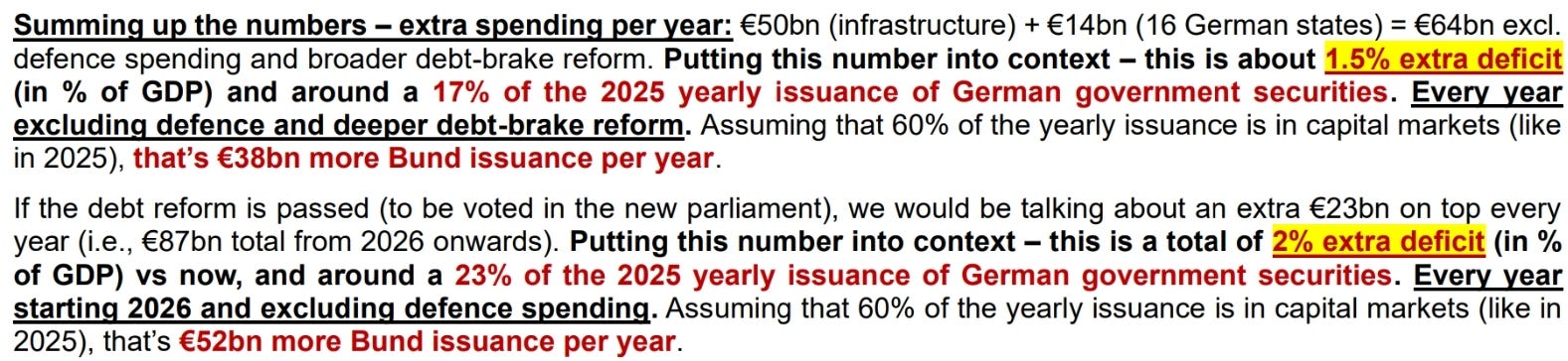
HSBC details the exact numbers that result from the passing of stimulus below.
A 2% deficit should drive real GDP away from being stuck at zero.
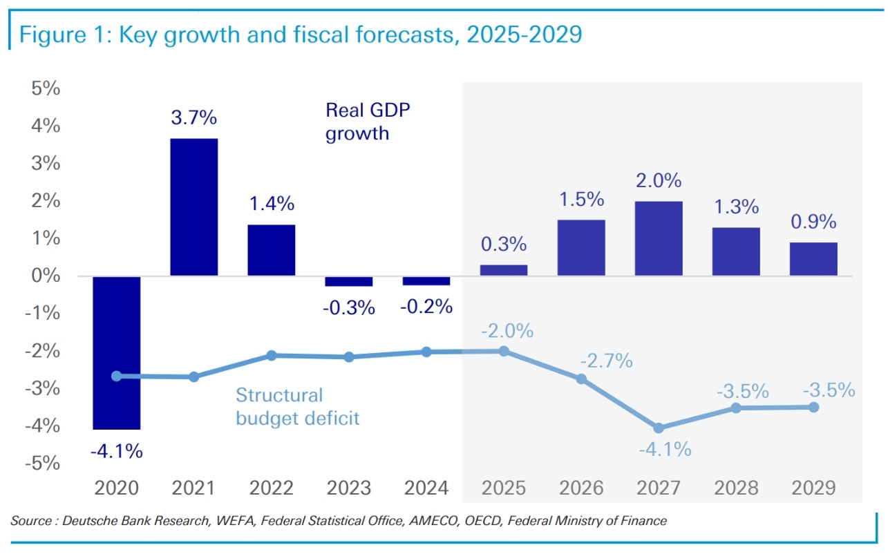
This increase in spending should drive the deficit to a healthy 4.1% of GDP, according to DB. It seems like they’ve applied a multiplier of 1.0 to the fiscal spending, something that isn’t unrealistic at all.
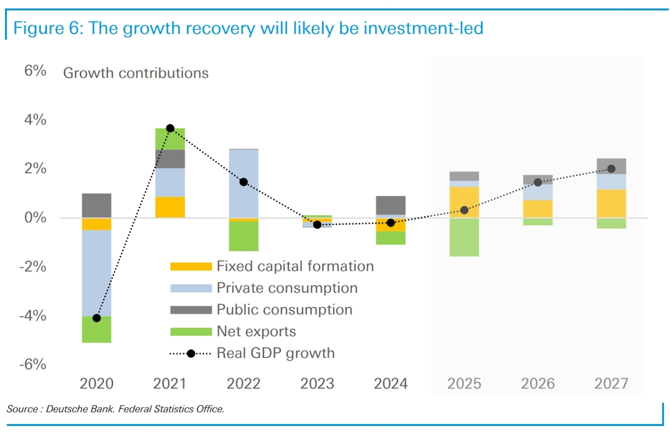
Unsurprisingly the composition of growth will be investment-led given the high infrastructure component.
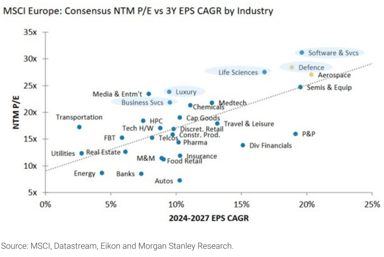
Defence has had a huge run and is now starting to look expensive versus upgraded earnings forecasts.
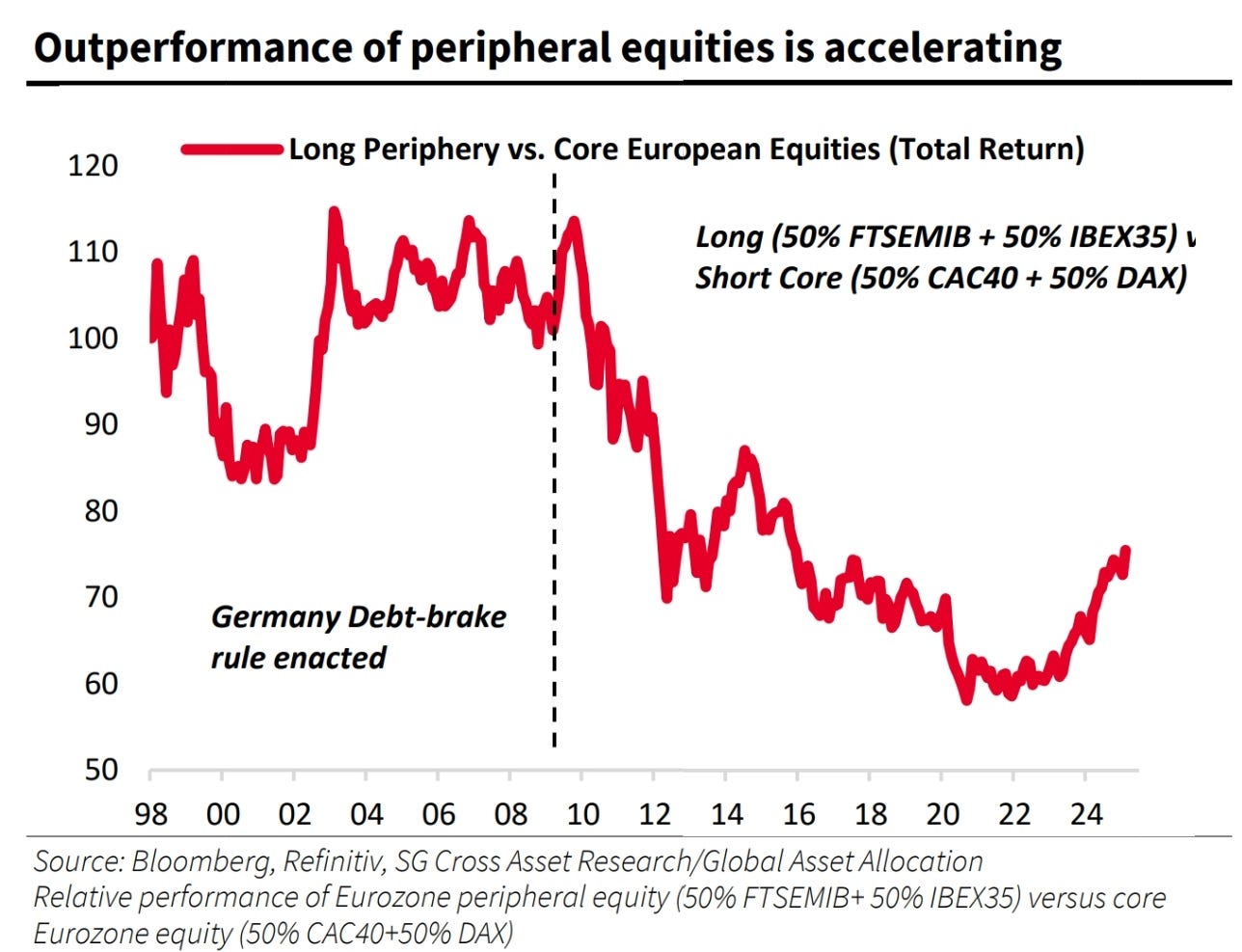
Interesting chart from SG. Peripheral stocks have been outperforming for a while now, representing poor relative German GDP growth and exposure to weakening exports over Italy and Spain. the outperformance has only got better recently as the Italian and Spanish stock indexes are less weighted towards global trade and more to European domestic growth.
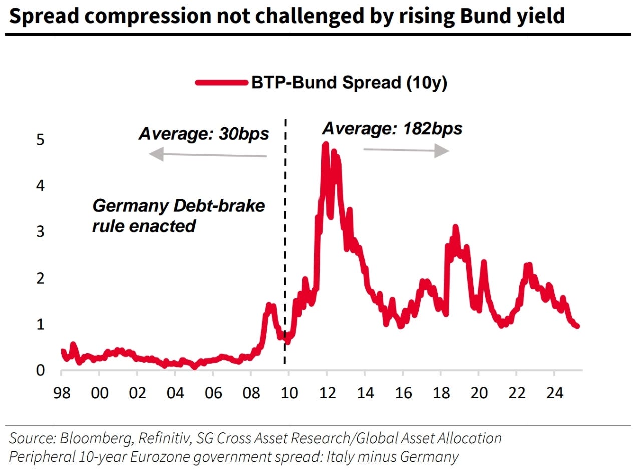
Peripheral spreads have done better than I thought they would. This might represent the smaller importance of defence against Russia to the far more remote Italian and Spanish populations. My thesis was based on the political convenience afforded by being able to spend without Father Germany looking over your shoulder. Maybe it’s too early for that one.
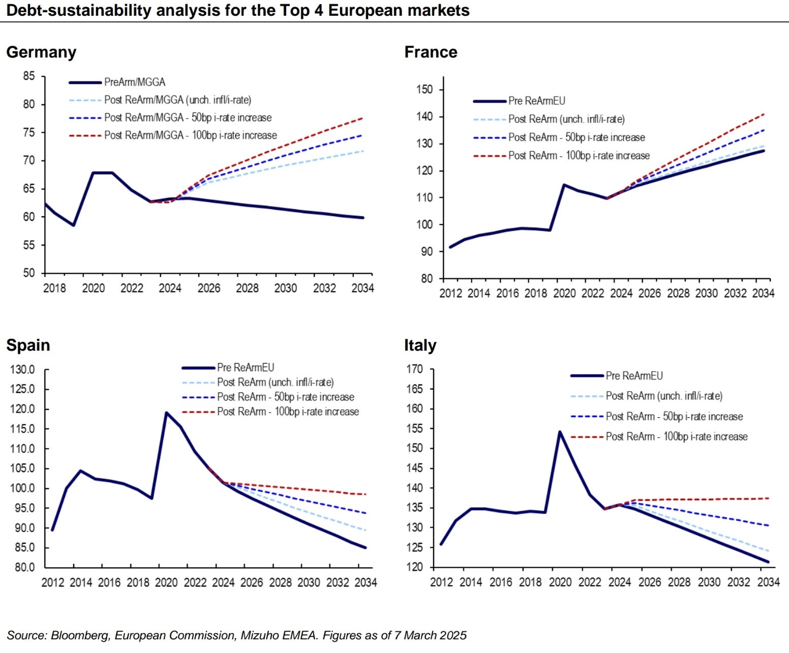
These trends are reflected in debt forecasts.
This hasn’t stopped the ECB thinking about asset purchases to fund the defence spending though.

Expectations have been forming for some sort of buying programme from the ECB outside of Holzmann’s comments. Just don’t call it QE.
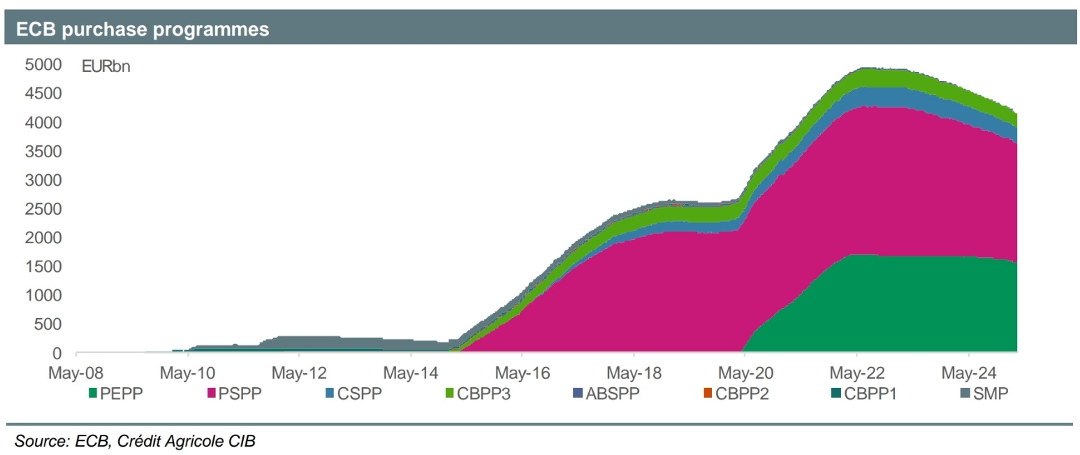
The ECB has been shrinking the balance sheet for a while now…
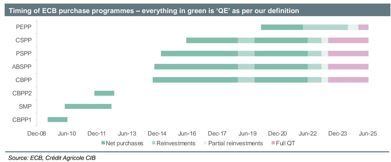
…so more conservative analysts tend to think that only a slowing of QT is possible. Credit Agricole had an interesting (and very definitive) note saying that QE would not come back in any form.
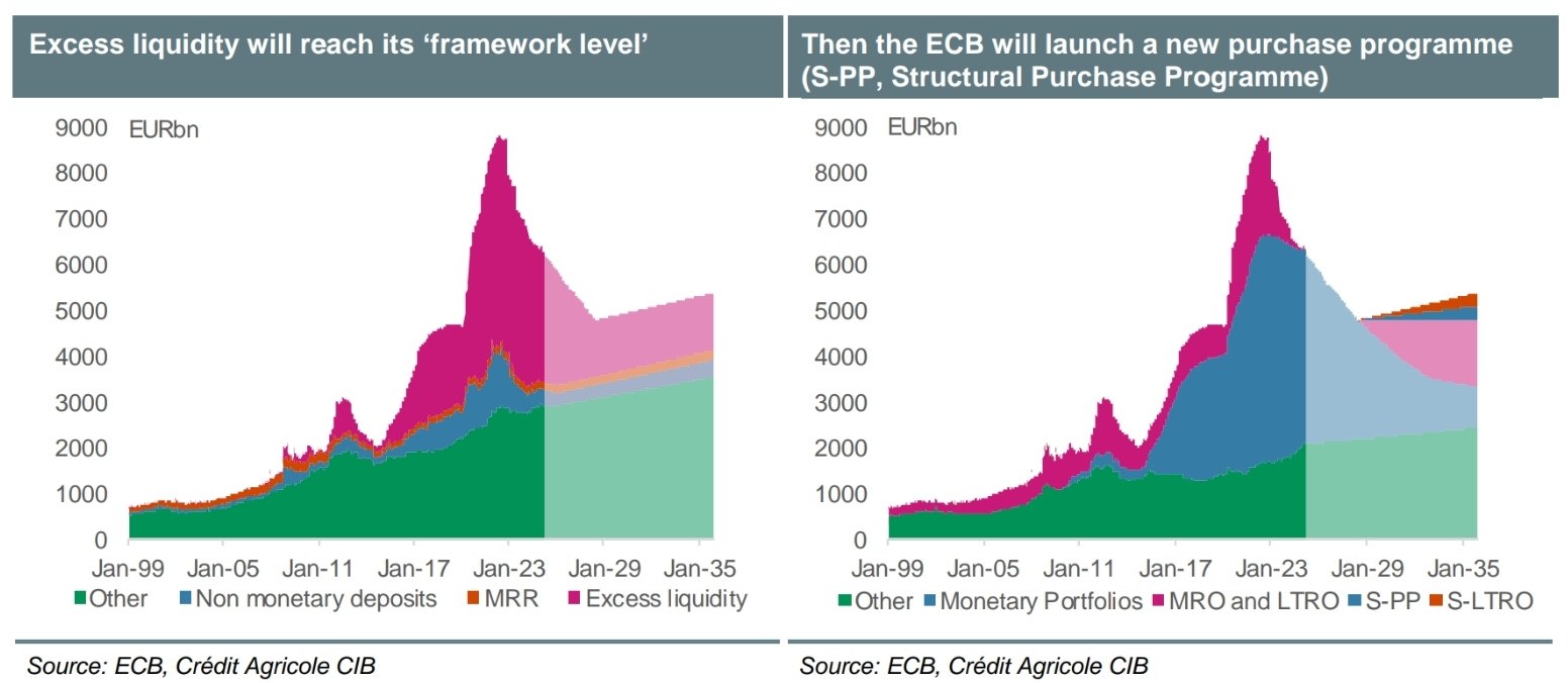
The primary reason was that liquidity in the banking system was still far too high and above where the ECB has stated it wants it to be. The only concession this analyst gave was purchases in the case of financial dislocation (uncontrolled BTP spreads, for example) would cause the resumption of buying under something like the TPI.
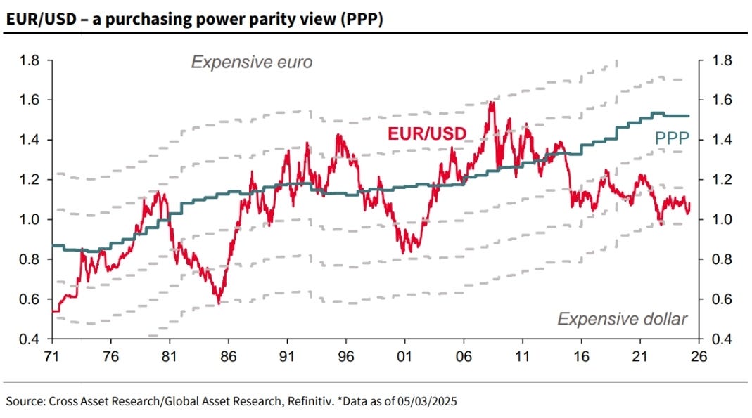
Great chart on the post-GFC weakening of the Euro. Will the narrative of the last 15 years change?
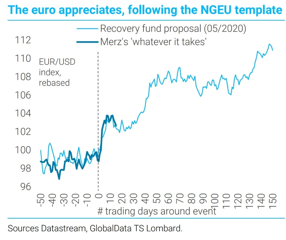
On a shorter-term basis the Euro is currently following the path set in 2020 in a clever chart from TSLombard.
US 👊 Europe: Round 3
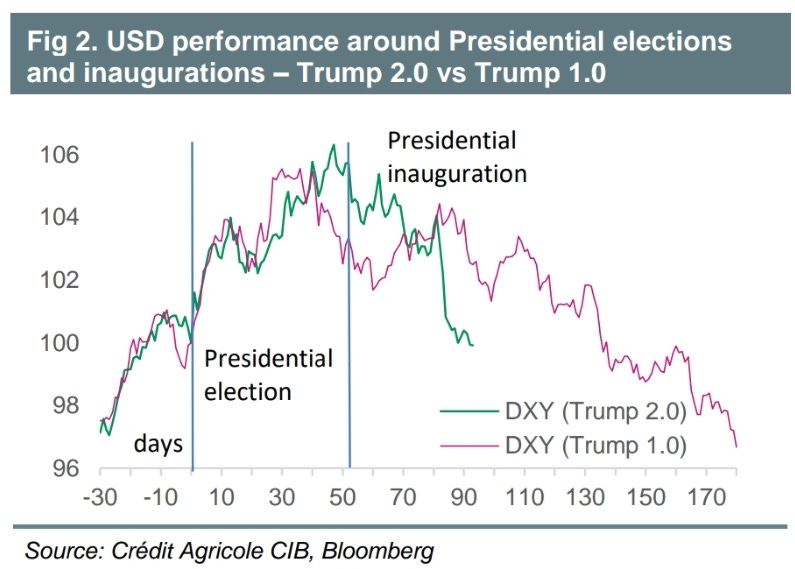
Swinging to the other side of that FX pair, the USD is also following the path traced by Trump’s first presidency.
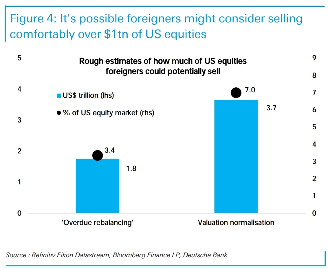
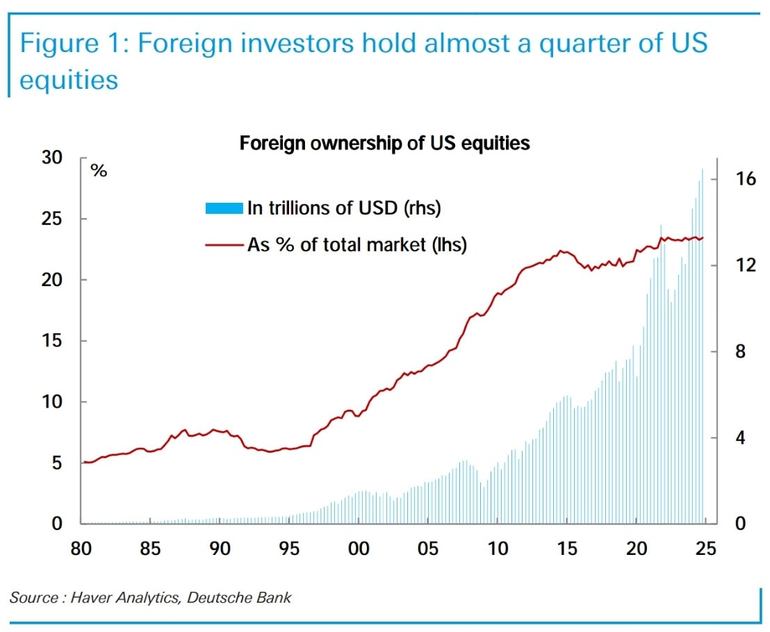
USD weakness has been blamed on the volume of foreign selling of US equities.
The numbers are big, no doubt. But they match other panic filled episodes.
Yeah, I think this chart falls into the “charts I hate” bucket.
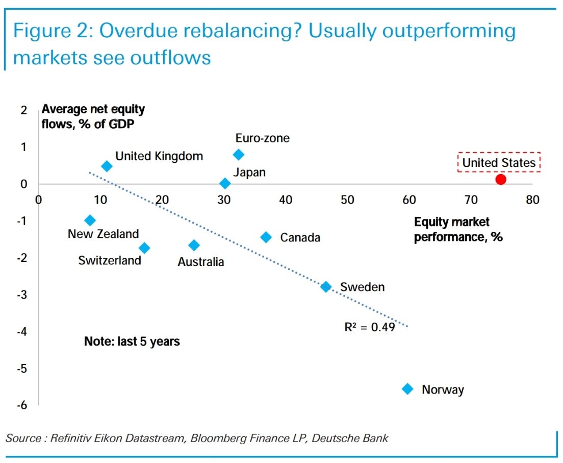
I can understand the rationale for this chart. If you outperform, then the market should rebalance against you.
The problem is that it ignores the very reason why foreign ownership is so high. The US’ current account deficit ensures that foreigners that net export to the US must hold USD. And that means holding USD assets. So, if you sell US equities, you must hold another type of USD security such as US Treasuries. You may be able to move your capital into European equities or Chinese tech stocks, but on a net basis the flow into USD assets must continue.
It is for this reason the valuation gap exists. They make less desirable USD assets than the flow inwards demands.
It’s just that those assets have become relatively slightly less desirable than they were previously…
…and it’s driven markets.
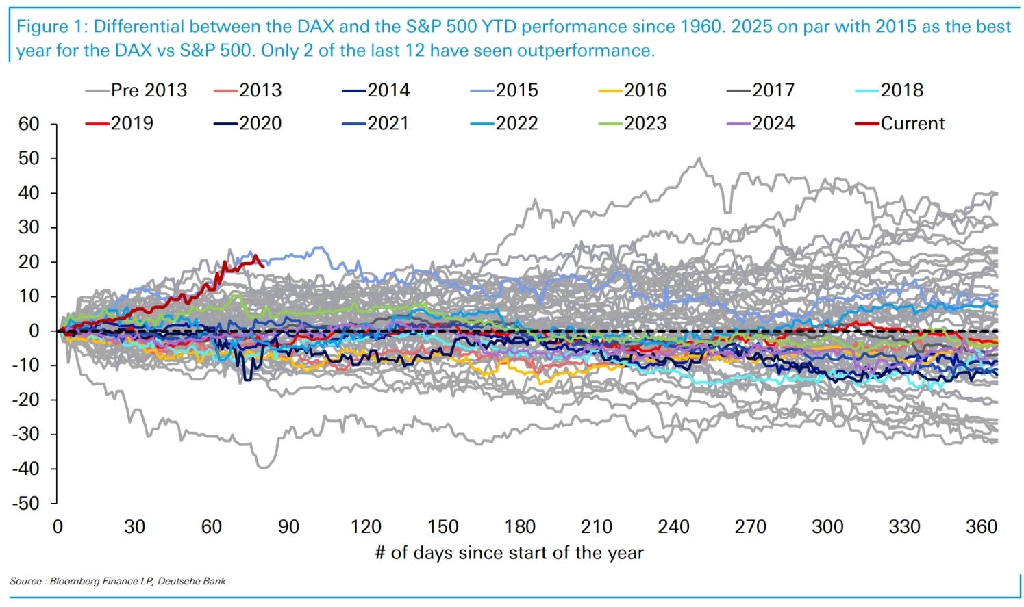
This has been vicious in some markets. DAX v SPX performance so far in 2025 matches the best ever (2015). As an aside there are a number of similarities with the current market and 2015.
Tariff charts
Damn it
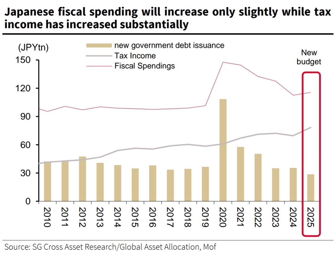
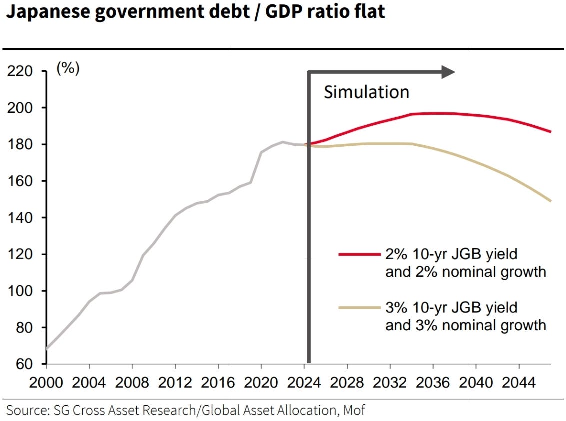
Surprise of the week - Japan’s surplus
In a brutal blow to the “issuance is all that matters to bond yields” crowd, Japan records a surplus while 10y and 30y yields trade at the highs.
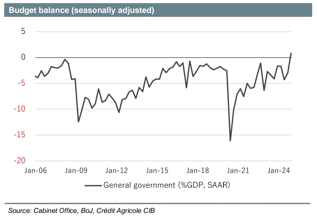
Out of all the developed world, Japan handled the pandemic the best by far. Avoiding big spending allowed it to piggyback off of the world’s demand to drive nominal growth up within Japan while avoiding the pitfalls. Tax receipts benefit from brisk nominal growth.
The chart below shows the how little the yield of JGBs matters when higher nominal growth is the driver of those yields (maybe Europe will learn a thing or 2).
I wrote a thread a while ago detailing how the Japanese had a superior response to the pandemic if you are interested.

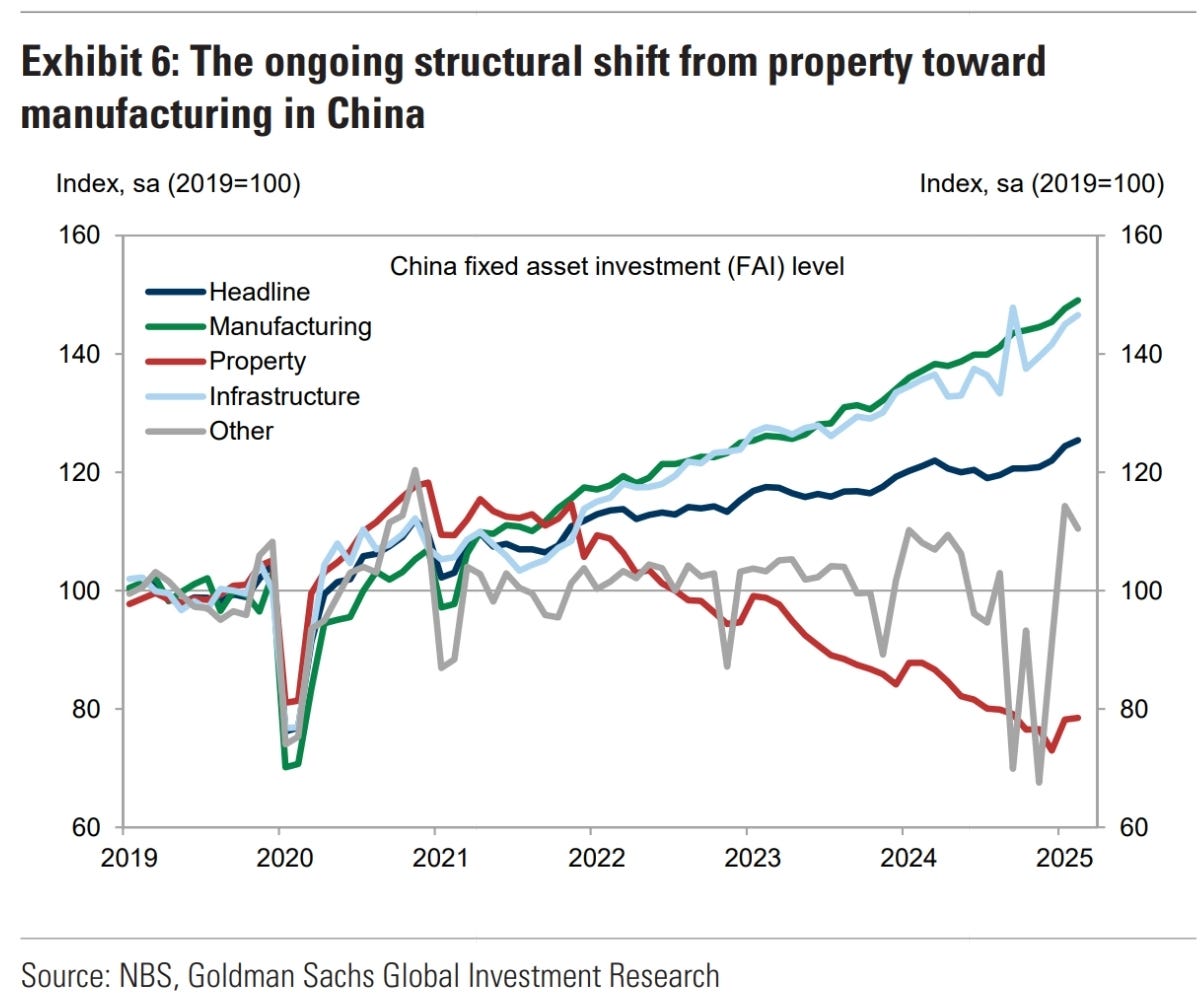
China strength?
Q4 was a very strong quarter for China. There is more data suggesting this will partially reverse in Q1.
Going all-in on manufacturing continues to work wonders against property weakness.
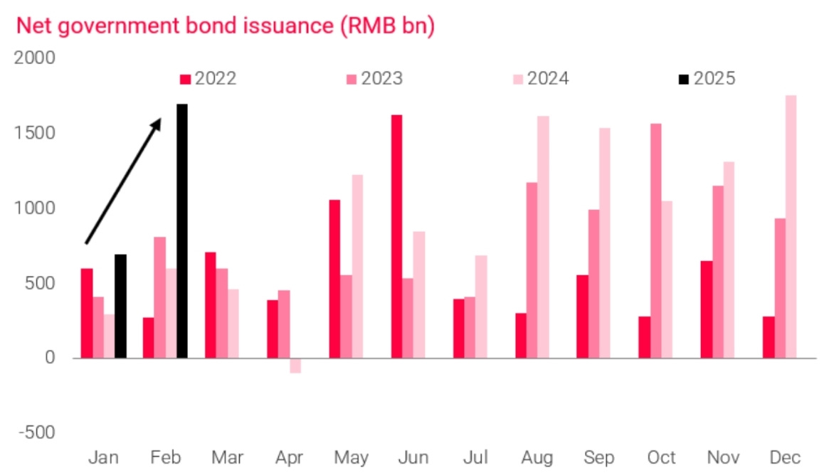
TSF turning up but it is entirely driven by government bond issuance.
90s fiscal consolidation
Great chart below on how the Clinton administration managed to achieve decent GDP growth while bringing the budget into balance.
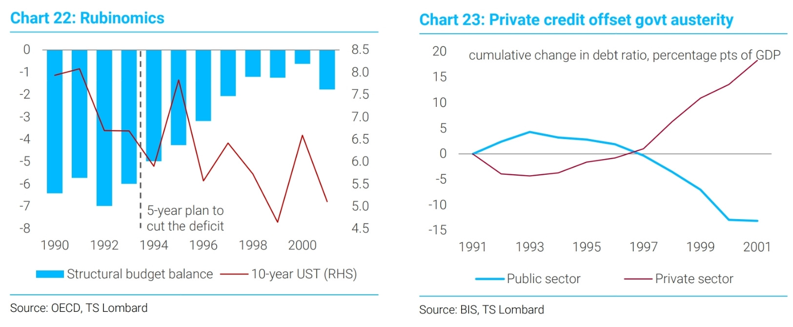
The acceleration in the private sector is the opposite of what we’ve seen recently where the government increased its borrowing at the detriment of the private sector (as a % of GDP).

Great roundup as ever Peter, thanks
Great set of slides Peter. Am sure you meant "clever chart FROM TS Lombard" rather than "clever chart FOR TS Lombard". I shall not tell Perkins!