
Charts & Notes: Tracking Tariff Effects #3
While tariffs were missing from the CPI, longer-term analysis is revealing

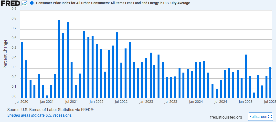
July’s US inflation print was the prompt for another issue of “Tracking Tariff Effects”, but ended up not being the source of new information.
While there was some evidence of acceleration in broad inflation for the first time this year, tariff related categories weren’t the culprit.

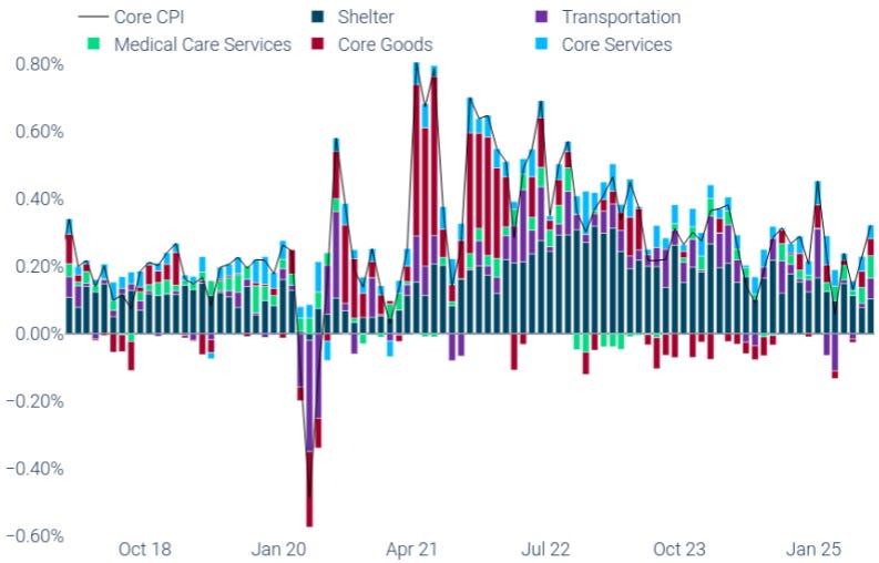
An updated version of Robin’s charts above show a general move of tariff sensitive categories with the seasonal average. Tariff effects skipped July.
The top left chart gives us an idea of how much higher core goods inflation than it possibly would’ve been otherwise. This is tracking about 0.6% above median, or about 0.15% to core CPI in total (so far).
Tariff tracking analysis
The “Tariff Tracker” from HBS Pricing Labs has set about to summarise how prices have changed across a broad range of baskets. It’s quite interesting.
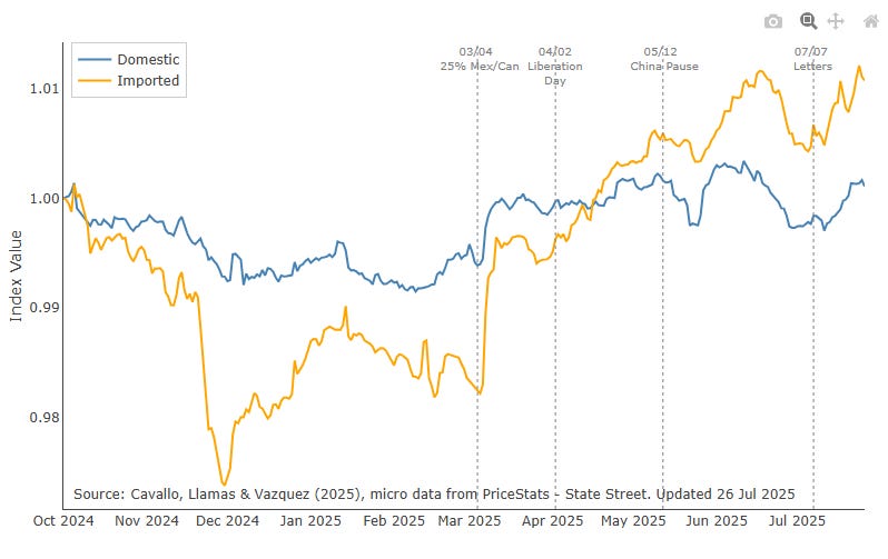
Above is imported versus domestic goods.
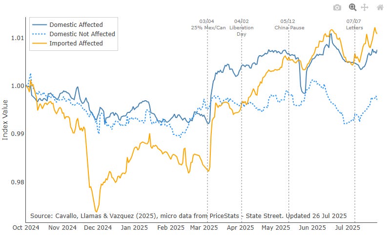
Here is a further breakdown of the domestic bucket into those affected and not affected by tariffs.
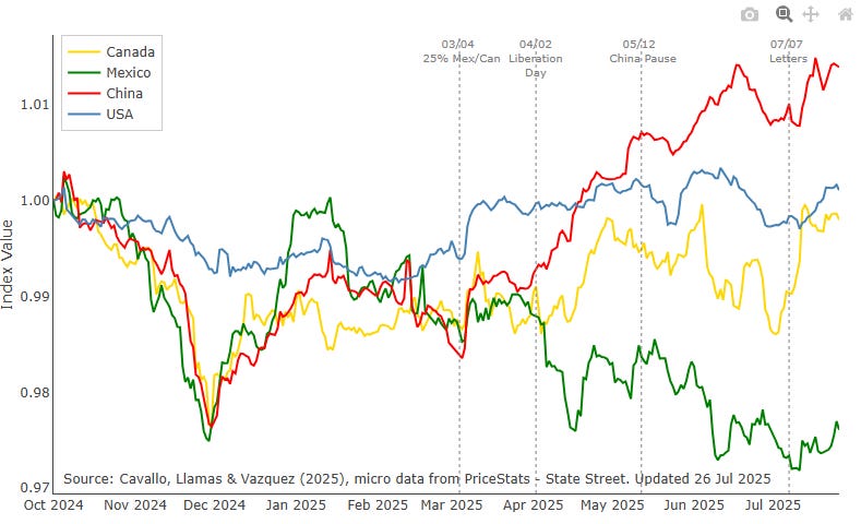
Above by source country. The Trump tariff plan has one clear target (China) and results so far indicate that Chinese goods have been the most affected.
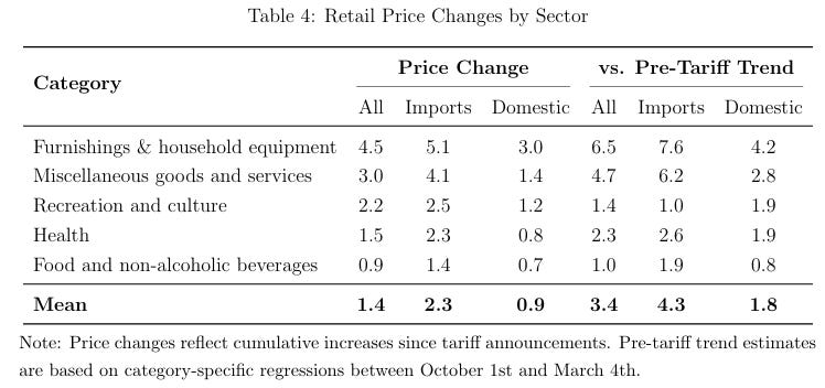
Here is a more formal presentation of the difference versus the pre-tariff trends in prices. Note that there was deflation in core goods over 2024 as some of the pandemic inflation was unwound, so there may be some overstating, but the mean outcome versus the pre-tariff trend has been an increase in prices of imports of 4.3%.

If you click through to the paper you can see the above summary of all goods and the median price rise over time.
Goldman Sachs also put out some research hoping to identify who was paying for tariffs.
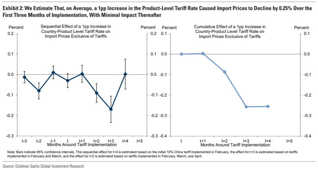
On average they found that import prices fell by about 25% of the tariff rate (the exporter is absorbing some of the price rise).
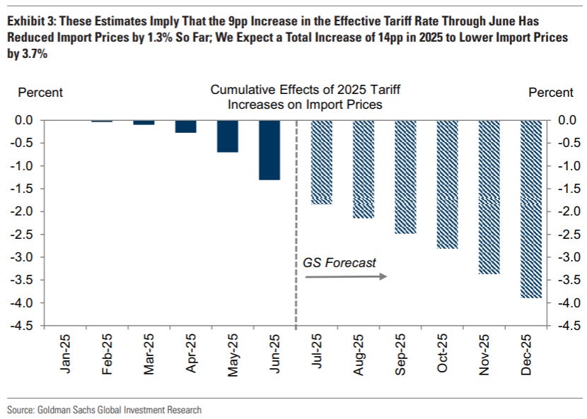
Expanded, this means that an increase of effective tariffs of 14% should deliver a total of 3.7% lower import prices, with only 1.3% being experienced so far.
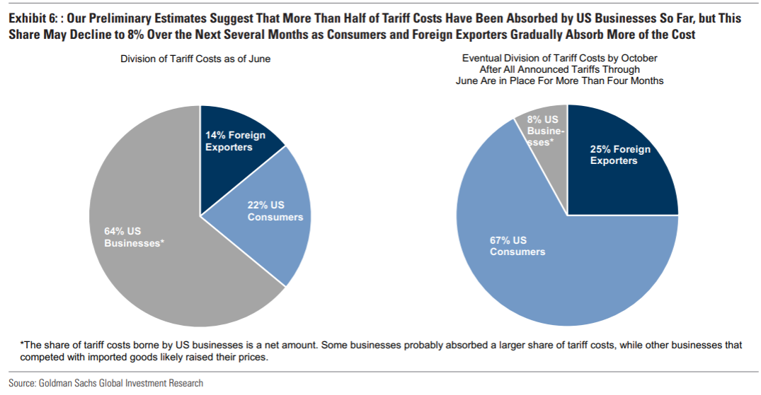
Finally, the key chart is the current and expected split of the tariff burden. While importers have absorbed most of it now, they expect this to be passed onto the consumer.
Eventually they expect the split to show 25% exporter, 8% importer and 67% consumer.
This implies we are only 1/3 of the way through the CPI effect, so the current 0.15% effect becomes 0.45% by the end of the year.
July CPI
Core CPI popped to 0.32% for the month, quite a bit higher than we’ve seen for a while. It was broadly in line with market.

The average economist has been over estimating core CPI for a while. This print ended that run. Inflation has been weak (driven by shelter), and it is to be seen whether anyone shifts their projections higher because of this print. Personally I don’t think there is a smoking gun to make a call either way.
Medical services (driven by a huge jump in dentistry prices) and volatile airfares accounted for some of the higher print. Nothing convincing there.

Supercore (core minus shelter) became trendy again after falling out of favour as the way to dice up an economic print to prove your narrative. It rose 0.48%.
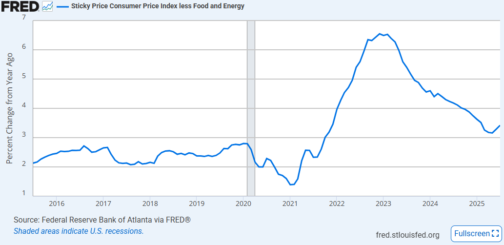
The other important point was that “sticky” inflation (by the Atlanta Fed’s definition) in year-on-year terms has turned higher decisively.
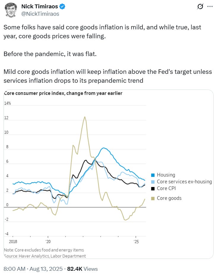
Nick says what many have been saying for a while.
It is highly unlikely that core inflation can get back to 2% without core goods deflation which we saw in the 2010s. It is becoming clear that the Fed is OK with core at 3%, and personally I don’t see why they shouldn’t be.

China’s manufacturing expansion should ensure lower export prices and core goods deflation, but the more prices fall, the more room there is for further tariffs!
Markets
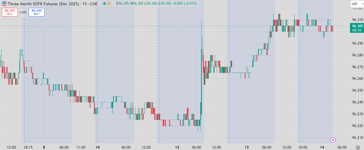
Front-end pricing perked up on the inflation print. While some were confused given the more concerning nature of this inflation report, the market thought it was contained enough to see the Fed move in September.
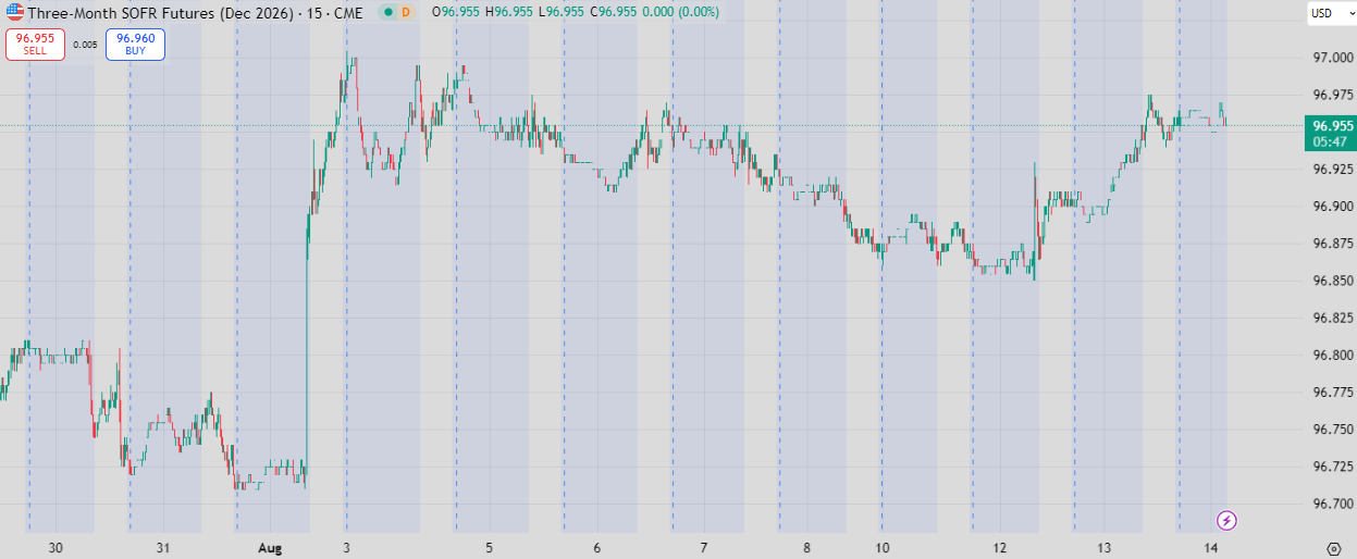
Further out the curve saw little action, with most of the move coming after that last payroll print (or should I say payroll revision).
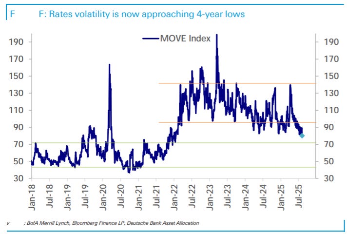
Rates vol continues to edge downwards. Slowly but surely the threat of any more rate hikes in this cycle are slowly going away, and lower vol shows more comfort with this (having said that I think the long-end may still be rich if we really are in a 3%+ inflation world).
Equities continue to do fairly well.
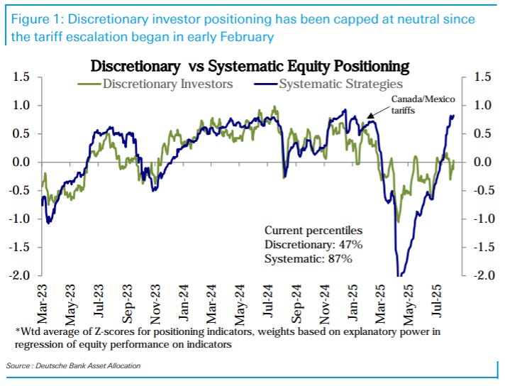
Systematic is all in now, with the April drawdown falling out of the lookback for most models.
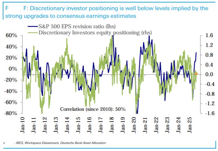
Discretionary remains on the sidelines, not keeping up with earnings revisions.
It’s been a mighty turn since bearish April.
US consumer
I spoke about slower 2025 consumption last week. BofA had some proprietary data which show a reacceleration.
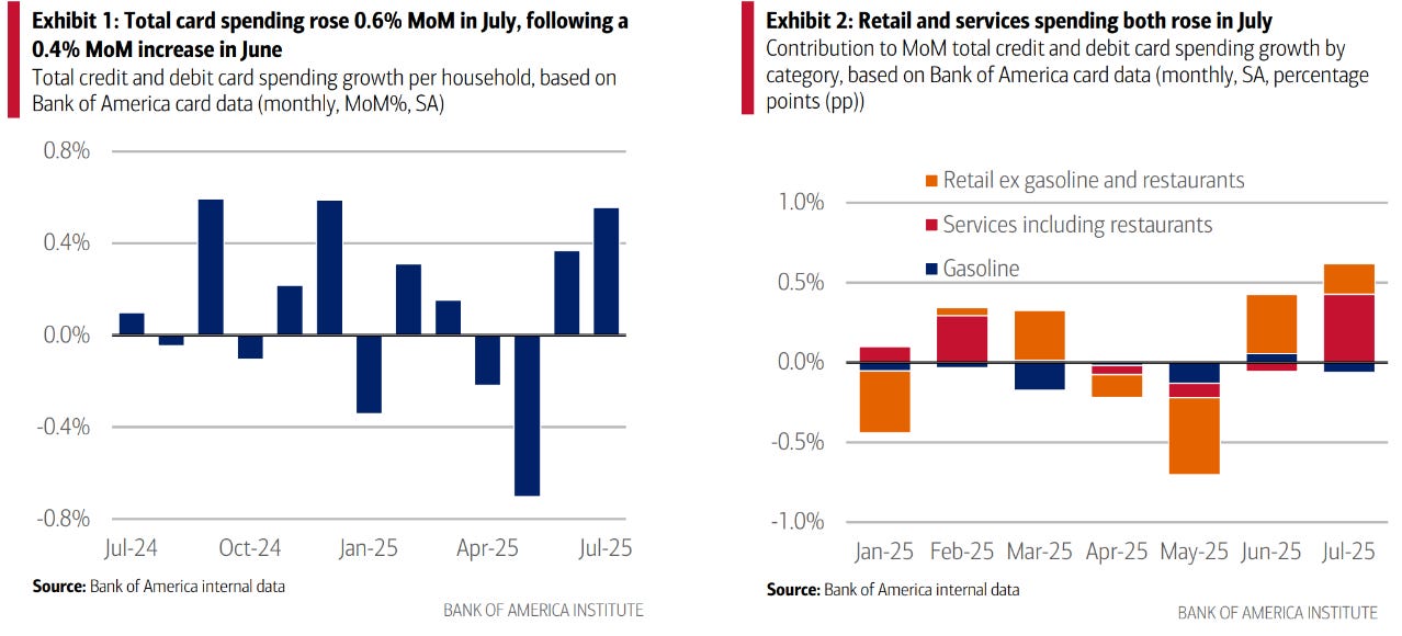
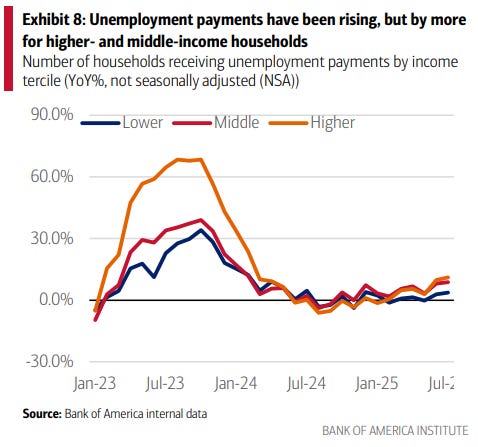
No signs of concern in employment.
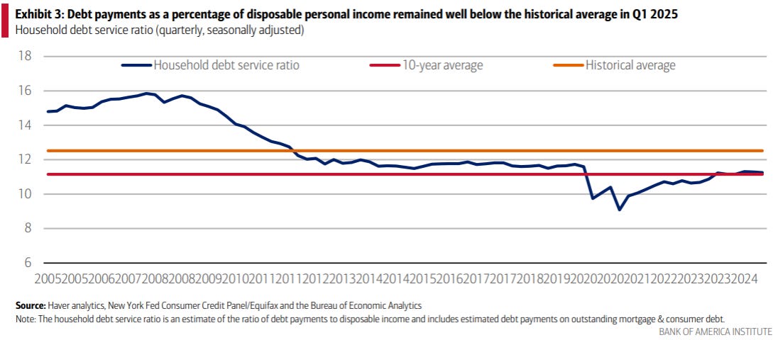
Leverage is low.
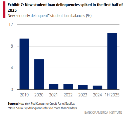
I feel like we’ve spoken about this risk for a while. Delinquencies on student loans have jumped.
JPM on healthcare
JPM did a review on healthcare that had some interesting charts.
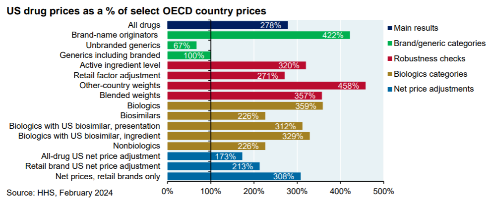
US drug prices vs RoW.
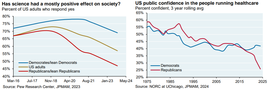

The section on vaccinations show a partisan divide, but the vaccination rate for measles (which needs a 95% vaccination rate for herd immunity) by state seems to be mixed by political affiliation.
Narrative award of the week

Fantastic chart.