
Charts & Notes: Sovereign debt stress analysis is back
Not seen since the European crisis of the 2010s

The next “Macro Is Dead” long-form piece will be out next week!
“Mutually Assured Economic Destruction”
We consider how China’s closed capital account has hacked America’s desire to optimise for consumption, and makes parallels to the Cold War, where the USSR was also effective at exploiting US economic and political systems - for a while.
The rise in long bond yields has brought back sovereign debt stress analysis. Have to admit, it’s been a while.
US 30-year bond & fiscal update
Long-end Treasuries have delivered a negative return over the last 10 years.

Since this is total return analysis, capital returns have been negative accounting for the coupon that has been earned on these bonds in the meantime.
Of course, the rolling 10y return will only look worse as we roll through the bottom in yields which occurred just after the pandemic.

Rising yields have brought back the “bond vigilante” and “term premium” memes, along with sovereign debt stress analysis.
Barclays provide the summary above across developed markets. The US isn’t alone in size of primary fiscal balances either - France isn’t far off.
The French political environment is still very unstable. Where volatility used to emerge only once every 5 years (the Presidential election cycle), it now arises every year during budget debates.

Greater trends in primary fiscal balances are considerably worse than during the post-GFC austerity periods.
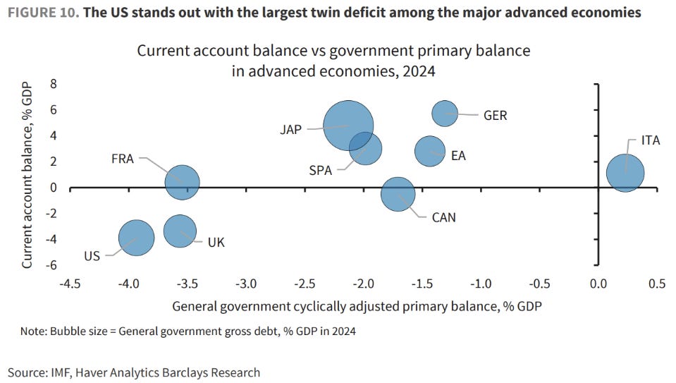
The US has a choice to run a twin deficit; it is not something forced upon them. Reduce the budget deficit and the trade deficit will follow.

S&P’s downgrade of the US issuing entity sees a huge effect on global availability of AAA assets, falling from 40% to only ~10%.

DB has an interesting r* model using bond/equity correlation to impute the neutral real rate.
Like most other estimates, they are rising. With inflation added to this (2.5%?), it supports a curve hovering around the 5% mark.
More on Treasury bond weakness
BNP had an interesting note this week about the change in the CTD (cheapest to deliver) bond affecting demand for the 30-year Treasury Bond future.

The table above highlights that as yields rise, the cheapest-to-deliver is forecast to become a longer maturity bond. Why does this effect demand for futures?
Since CME traded Treasury bond futures require physical delivery of the underlying asset, the asset that it will most likely be is important to how the future’s pricing behaves.
Physical delivery just means that if you have a long position in the future and you hold that future until the expiry, the trade is settled not by cash, but through actual delivery of a bond to you. The “cheapest-to-deliver” is just the bond that is the cheapest on repo.
If yields move a lot, then the CTD bond can change. In this case it might move from the 2041 bond to the 2045 bond. A bond that expires in 2045 has a longer duration than a 2041 bond, meaning that an investor would need to sell some futures to get back to the same target duration in their portfolio.
BNP notes that the same thing happened in late-2023, the last time we heard “bond vigilantes” being talked about.
You may have realised that the 30-year bond future doesn’t even represent a bond that matures in 30 years, with the 2041 maturing in only 16 years. Same goes for the 5 and 10-year futures as well. This is why the “ultra” futures exist which represent bonds that are closer to that point on the curve.
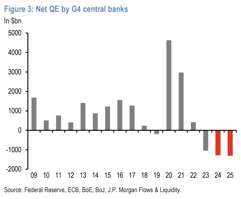
JPM produced this chart highlighting the flow of QT that has persisted for more than 2 years now. Note that yields aren’t meaningfully higher than when net flow went negative.
The only thing QE did was destroy trust in the Fed

There is little evidence that Quantitative Easing (QE) has the effect of lowering yields and flattening the yield curve. In fact, the evidence points to the opposite being true.
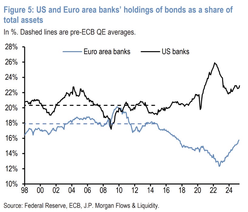
SLR reform should see US bank holdings of debt increase. Europe’s under investment here is likely due to ECB LTRO’s.
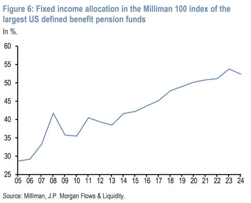
An aging population means this chart should be no surprise. What is interesting is that there hasn’t been a pick-up in allocation with long yields >3% higher than they were pre-pandemic.
Europe update
Euro rates have been a little boring recently, with quite a lot priced out in line with the fall in equity volatility.

Growth upgrades are starting to flow through now, with a number of banks calling for Germany to escape its growth stagnation of the last couple of years, with 2-year forward GDP growth expectations printing in the range of 0.4% to 1.4% growth…

…against 0% of the last few years.
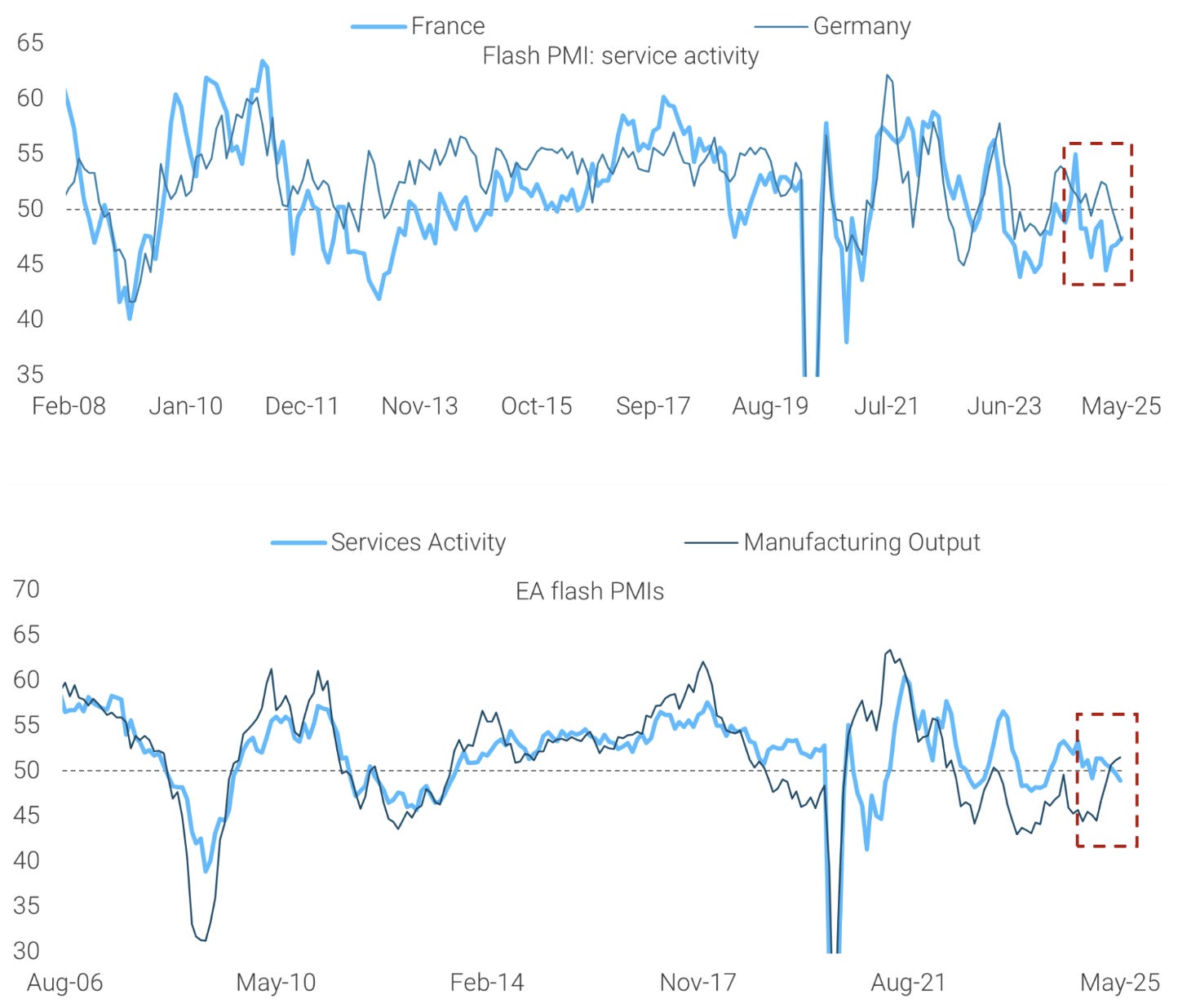
The latest set of flash PMIs aren’t as rosy on the services side of things though. Manufacturing looks quite good but could be affected by tariff front running.

This is supported by some very good German manufacturing numbers.

Most analysts have core disinflation on track in Europe. Headline will show more improvement than core, but both will move below 2% in time.

Two cuts are still priced into the ECB’s forward curve. Most expect a June cut, with the second (and final?) coming in September.
Bonus charts
Morgan Stanley put out a long analysis on single-stock drawdowns.
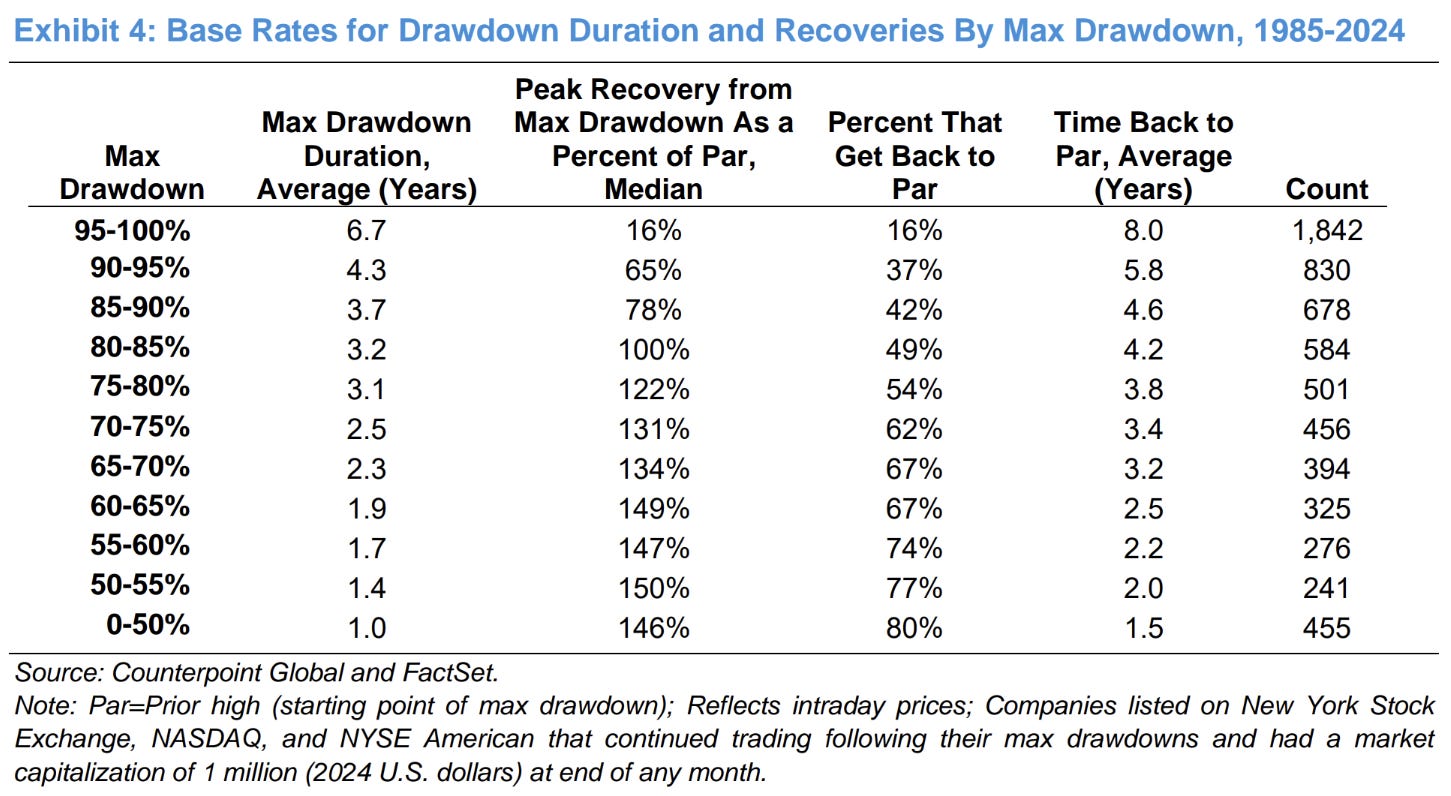
The results are what you would expect - those stocks with larger drawdowns are less likely to ever get back to their pre-drawdown level (only 16%). What is interesting in the count of shares in each max drawdown bucket. The bulk of stocks that are still trading today have max drawdowns of >80% over their lifetime.
A lot of the NASDAQ would’ve experienced this during the dot-com boom despite seeming invincible today.

NVIDIA long term revenue forecast versus the share price.

Ending on a bad note. Torsten Slok, ex-DB and now at Apollo, has always been known to put out a questionable chart. This might be one of his best. We live in a one factor world where the Fed directly determines employment, didn’t you know!
Since you started posting i learned more from you than 3 +1 years at university, thanks for what you do
This article does a great job connecting China’s closed capital account to broader US economic vulnerabilities, drawing insightful parallels to Cold War dynamics. The detailed analysis of rising long bond yields and sovereign debt stresses is timely, especially with the “bond vigilante” narrative making a comeback.