

I recorded a podcast with Aahan over at Prometheus Research which was just released below. We chatted about a whole bunch of stuff from long-term macro views to my thoughts on how you can build quantitative trading models while still respecting your fundamental view of economics and politics. Worth a listen if you’ve read a lot of my work on Macro Is Dead!

Also, my new long-form piece is out. If you haven’t read it check it out!

Summary here if the 4,000-word piece is too long. Click through for the X thread.

I hope to do a review of Section 899 impacts soon, but this week is about reviewing where rates are trading and where we are going.
The ECB meeting this week brought the end of rate cuts into focus for the ECB, while US rates played in the other direction with the selloff in long-end rates taking a breather.
Rates stocktake - US
US 30y rates failed to break their prior 2023 highs with yields dropping as equities have meandered a few % of their 2025 highs.
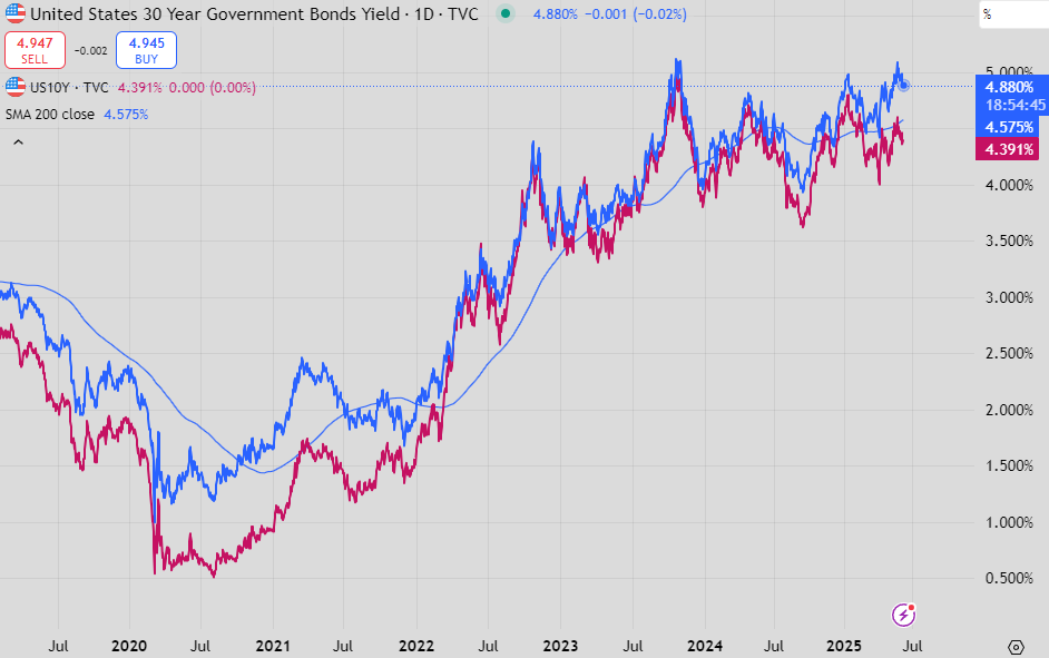
The charts are for higher yields, although you have to squint to see the very weak upward trend.

Options skew shows a market continuing to pay up for protection against higher 30y yields.
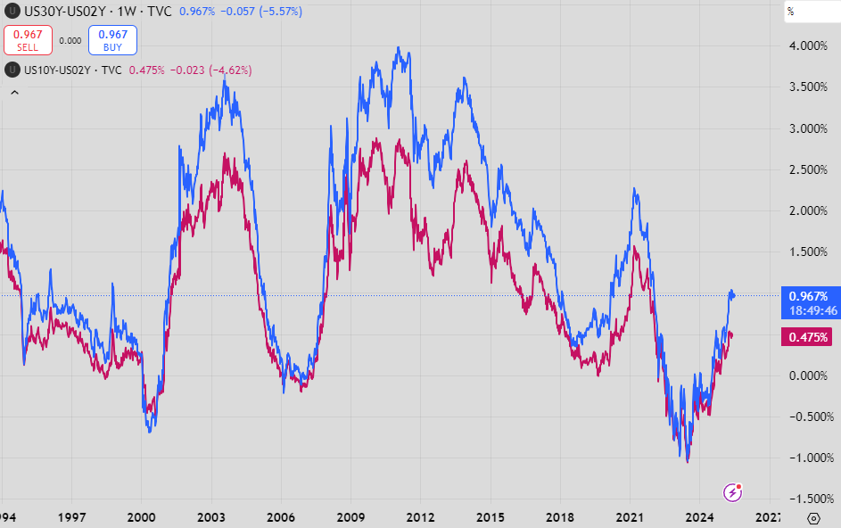
Against 2y rates, both the 10y and 30y levels are approaching what could be considered normal for any period outside strong pre-recession rate cutting. or the ZIRP era.
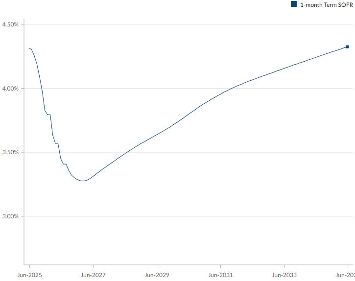
The nadir is rates priced by the market is currently ~3.3% roughly at the end of 2026, in 18 months’ time. It implies roughly 1% of cuts, at which point the curve pivots to allow for a positively sloped 2s10s.

The chart above highlights how the market has moved around this pivot point.
What’s noticeable is that the three curves above weren’t really affected all that much from the April volatility.
The blue line (the difference between Dec-2026 and Dec-2027 3m SOFR) jumped through April but has largely retraced this move, moving back to its upward trend of 2025, increasing its positive steepness and (taken literally) Fed hikes during 2027.
The pink line (the difference between Dec-2025 and Dec-2026 3m SOFR), has become more inverted, indicating more cuts between these 2 periods. Importantly, the trend has continued lower even after the recovery.
These new cuts in 2026 have been pushed out from 2025, as the May reversal of the purple line (the difference between June-2025 and Dec-2025 3m SOFR) indicates.

The sum total of this is that the forward curves’ pricing for the Fed really hasn’t changed all that much from the worst of April volatility, only retreating about a cut’s worth (although it was a lot worse intraday on the 7th).
Moving back to 10y and 30y rates.
I continue to beat the drum about the un-investible nature of US bonds for anything outside of short-term trading. While potential SLR reform could be a bullish development, there is little else to support outperformance.
While curves appear to be normalising, they are still too flat for the prospect of risk-off forcing markets to price deeper cuts for a lower terminal rate.

My favourite expression of the steepener above (10y - Dec-2026 SOFR) held onto April gains well.

Shorter versions (against Dec-25 above) have retraced but are still good trades for unexpected risk-off with little downside over a one month hold horizon.
The USD continues to trade weakly in the context of a higher terminal rate in the US.

Adding to EUR support is the view to the end of ECB cuts.
Rates stocktake - EU
While expected for a while, the June cut was bookended by Lagarde guiding to the end of cuts, with most banks moving their expectation of the last cut out to September…

…and the rate curve roughly expects the same.

Europe inflation has continued to moderate, with sub-2% core inflation in sight for 2026.

Post September a sum total of 2.25% of rate cuts has saved German 10y and 30y from looking like really nasty charts.

The German 30y - 2y curve is even more stunning than its equal in the US. To be anywhere near the level of steepness that persisted during the years of negative interest rates is astounding, but I don’t think the market is really pricing in the full implementation of proposed fiscal stimulus either.
The global steepener trade is far from over.
Bonus charts

More Slok slop here. Seen this chart around a lot and it means nothing on its own for any asset class. More money in money market funds is just a consequence of bumper deficits and good private credit growth.
One particular owner of a social media site had a lot to say this week about the BBB. Some charts on fiscal matters.
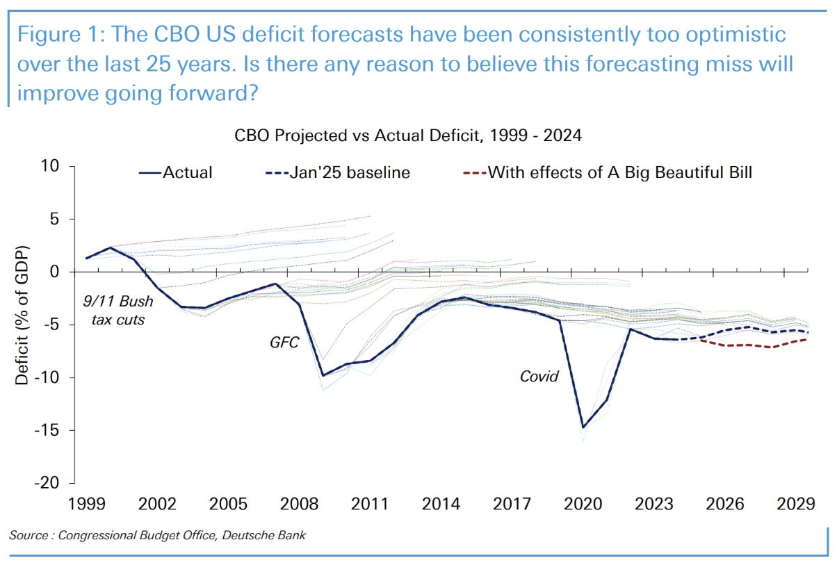
DB had a great chart on CBO projections versus outcomes for the deficit, presented in a similar way (called a hairy chart) to market forecasts for Fed Funds. Seems like they mostly get it wrong, which means it likely will be worse than we are expecting.

Another great chart (through Albert Edwards but from the Business Insider in 2013) showing how the late 90s surpluses actually came out versus initial CBO projections. The bulk (59%) over the next 10 years were from spending through new policies. The cumulative cost of Iraq and Afghanistan was $1.4trn over that time!

Finally, a breakdown of entitlement spending from 1980 to 2023. 1980 marked the last time the government had a serious deficit to fix. It is from the piece below by David Stockman.
The rise in total transfer payment recipients from 32% to 50% of the population makes spending cuts almost impossible.