

The way markets are trading, both in an outright and cross-market sense, continue to worry me.
This is separate to the tail that markets should be pricing in for the chance that tariffs meaningfully affect the global economy. This is the first credible source of a recession since the pandemic, and it is surprising that we ended April without equities pricing much of that probability in.
What does concern me is the relationships that have existed in the past, most notably equities-rates, equities-vol and implied-realised vol, just don’t seem be right and are setting off alarm bells for me. This week I’ll attempt to quantify those feelings.
Equities
The S&P500 ended just shy of posting a positive return for April, with 9 green candles in a row on S&P500 futures (ES) carrying through the result. I acknowledge the up move in equities as being a genuine response to the mechanical flow pressures that exist primarily from the firehose that is passive buying but includes a lot of other effects that has changed the realised vol to implied vol to spot level relationships that have existed in the past.
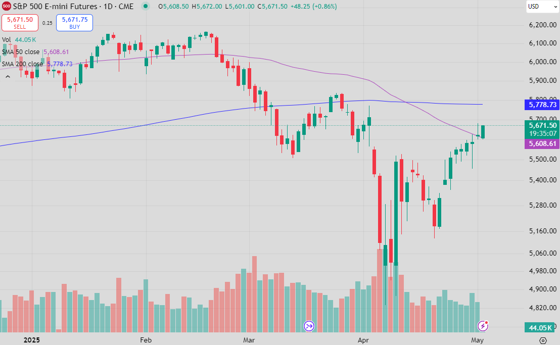
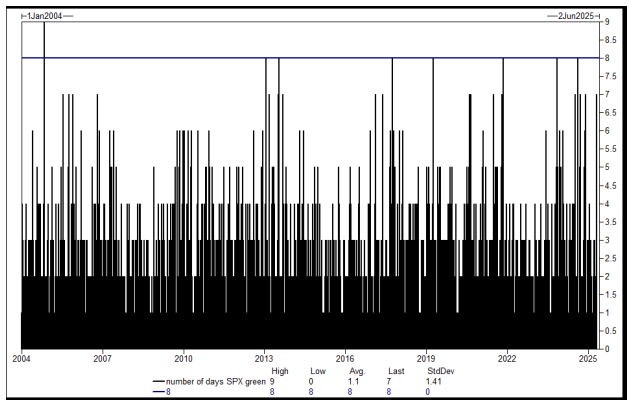
GS says that an 8 candle up move has only happened 4 times since 2004, with 9 happening only once!
I posed the question on X a little while ago about what leveraged players would do if the S&P was moving towards unchanged after a horror month. The answer is that they have to buy back in, increasing leverage as realised vol falls.
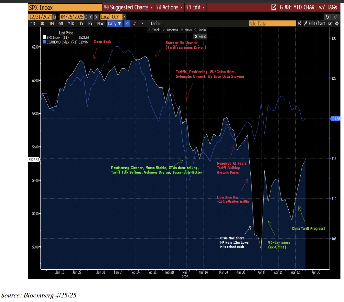
Citibank sales & trading has produced this chart highlighting the pivot points in equities over the last few months.
The news flow was clearly the catalyst, but I think there is much more in how the market moved that gives us clues to where pressure resides and what realised vol is going to look like in the future.
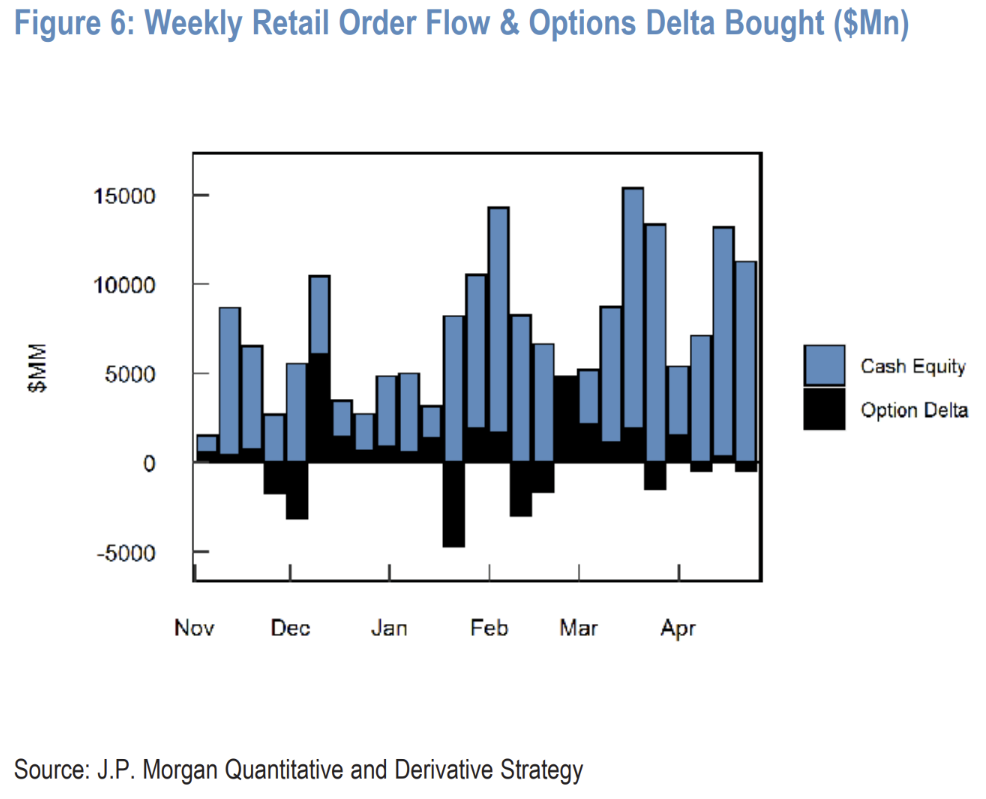
First up - retail only ever bought through the entire drawdown. This won’t stop until people lose their jobs, and the flow of savings turns back the other direction.
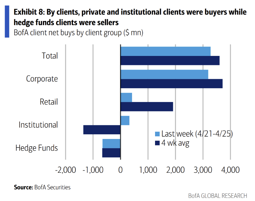
Along with corporate (through continued strong buybacks, a core driver of equities for a long time now), retail has bought while “fast money” and institutional flows sold.
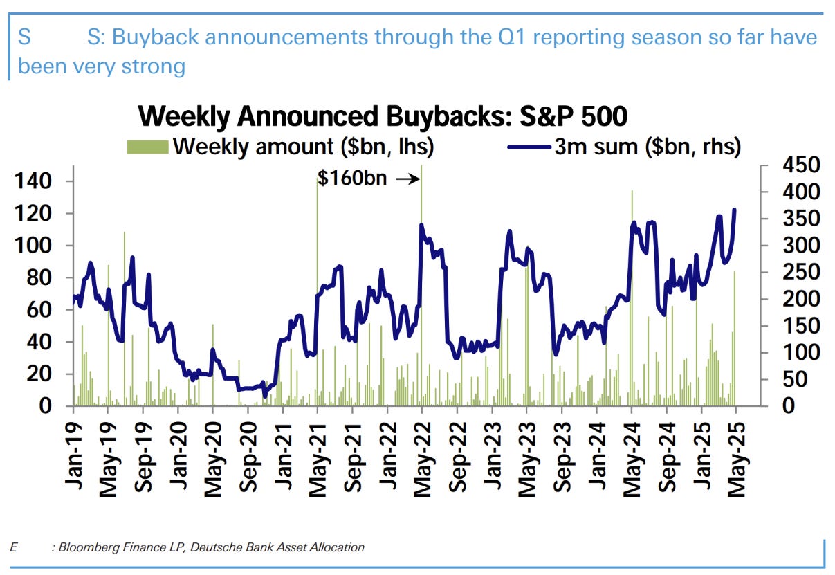
Buyback flow is illustrated above.
This chart highlights that private clients (presumably high net worth) who bought at an extreme as large a magnitude as hedge funds sold theirs.
For institutional investors these sales are understandable as their job is to manage risk, and risk increased substantially in a month with multiple trading days involving moves of 5% or more.
For leveraged accounts (hedge funds and the like), reducing gross exposure is a mechanical effect of using risk measures that are derived using volatility measures from those very markets.
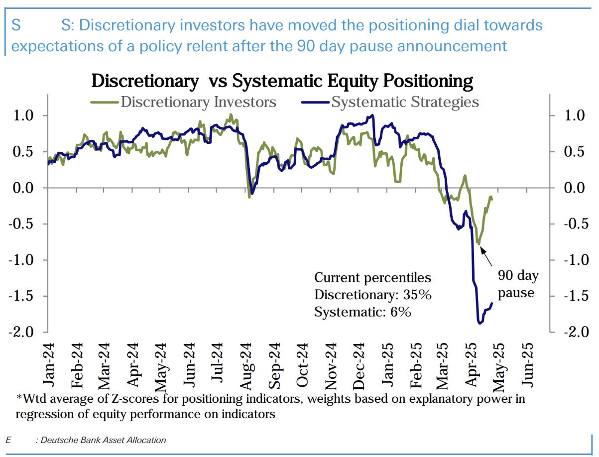
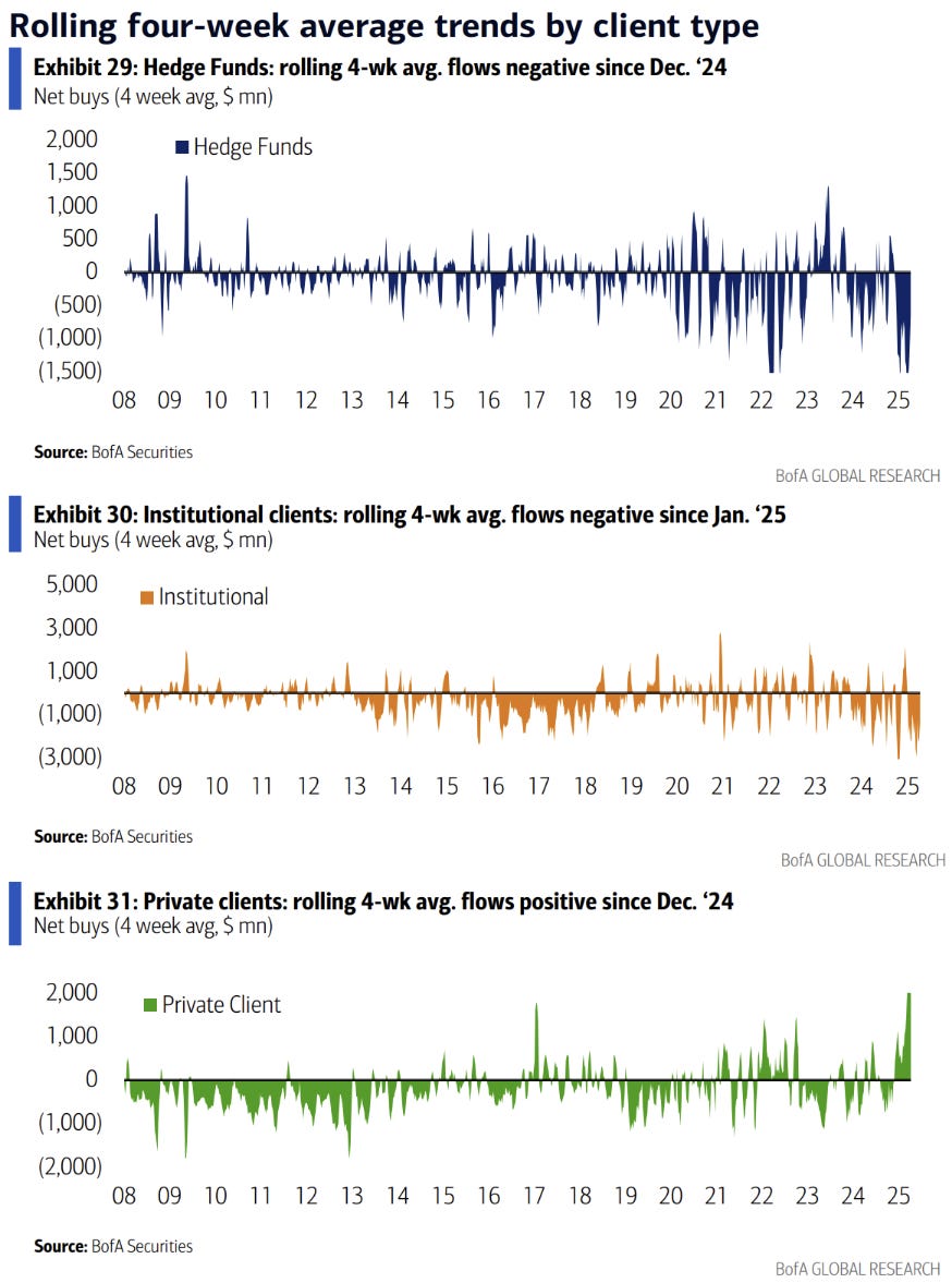
Within leveraged it was discretionary investors which managed to avoid selling in response to the drawdown in the first half of the month.
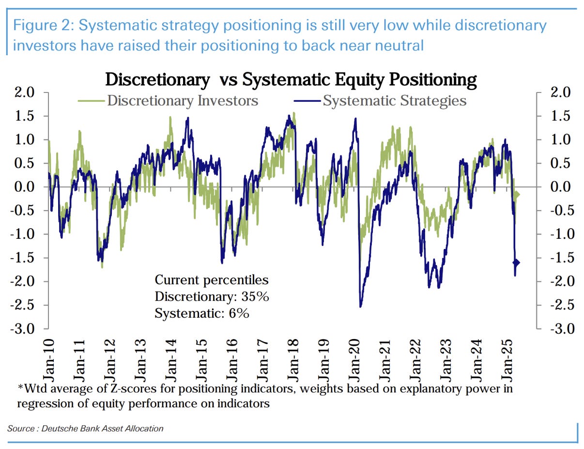
Here is the same chart on a longer time scale. Systematic would’ve had a very bad April.
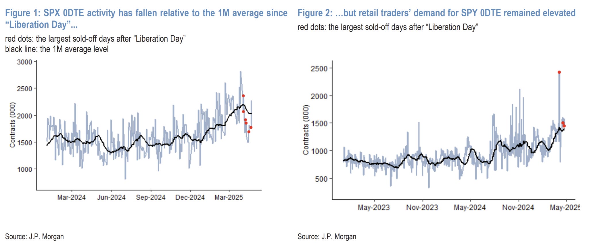
Retail demand for 0DTE keeps tracking higher, despite overall activity being down (linked to the de-grossing of hedge fund exposure, no doubt).
If I was to guess before the fact the increased cost of 0DTE would be the driver of lower volumes for retail. Turns out that isn’t the case and the higher premiums on offer was enough to drive higher volumes!
Solid results for GOOG, MSFT and META helped to simultaneously alleviate the “tech earnings downgrade” and “the loss of US exceptionalism” narratives in one fell swoop. Positioning still remains underweight, however. Plenty of catalyst remains to see markets extend gains, especially if there is good news.
Rates
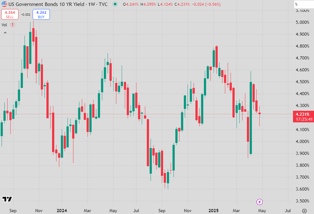
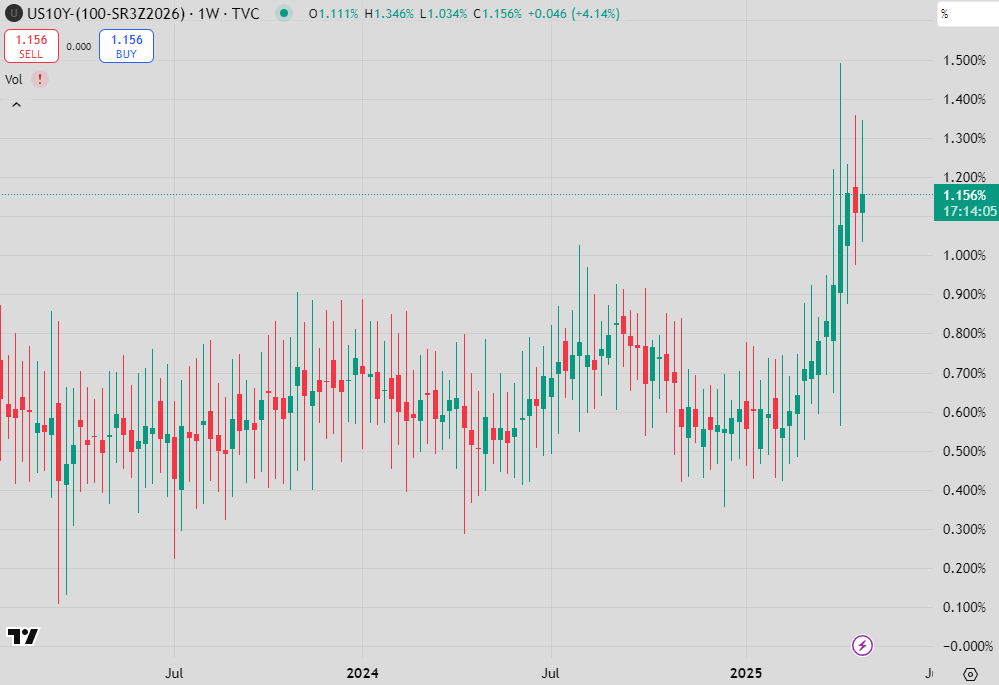
The daily US 10y chart shows little reflection of the wholesale change in the way global trade works we are apparently going through.
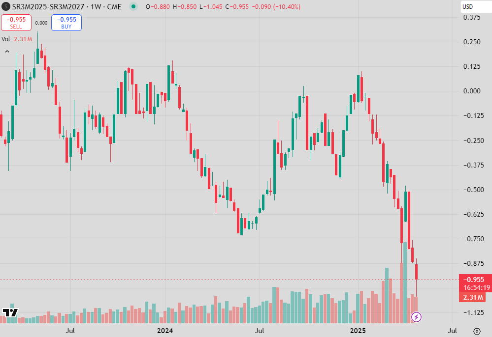
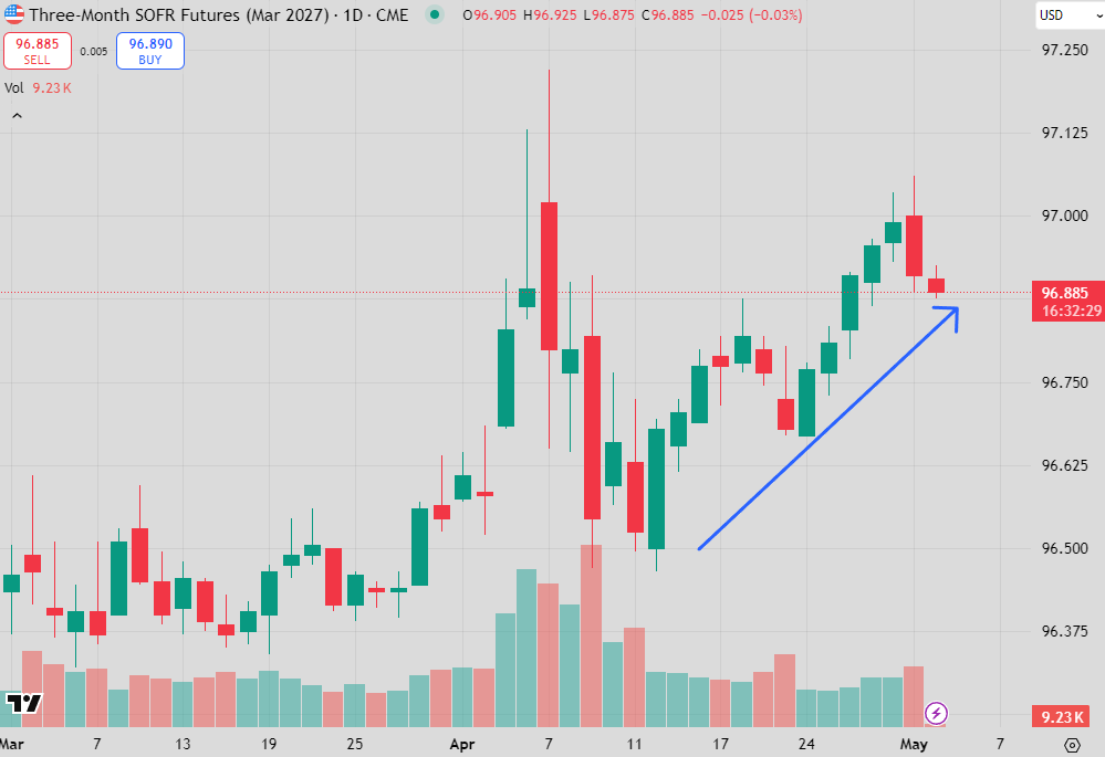
Moving to the shorter end of the yield curve shows a little more of what you would expect. Here is the June 2025 versus June 2027 SOFR futures. The market has priced zero cuts over the 2 years to 100bp of cuts.
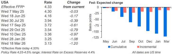
The loading of cuts to the 3rd quarter represents the view that the Fed is in no rush to cut rates, possibly as a response to Trump’s comments about Powell, or that the Fed is concerned about short-term inflation coming from tariffs.
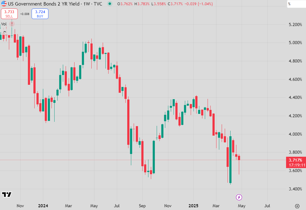
When zooming out to the outright yield level of front-end securities you don’t get the same break of 2024 yield lows. Again, this is very odd during such a risk-off period.
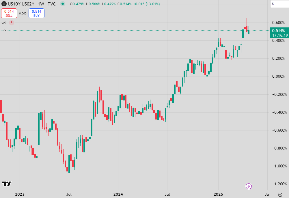
This has led the steepener to continued to perform across both 2s10s…
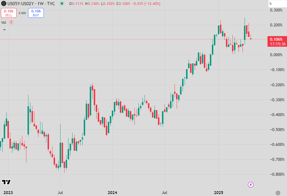
…but has slowed in 2s5s highlighting that the 5-year point of the curve has become a bit rich.
The big winner in the steepening trend has been the 10-year versus 1 to 2 year SOFR futures (above is the curve using Dec-2026 SOFR).
This is a trade I have been strong on, arguing that it would perform no matter the environment.

I went through the reason for bond weakness in a “Charts & Notes” 2 weeks ago, explaining the basis trade and why it drove long-end Treasuries higher in yield.
Given the market disruption that occurred due to this forced unwinding it perhaps shouldn’t be concerning that bonds have decided to rally as risk recovered and equity markets calmed down, but it leaves me feeling uneasy.
The reason is that bonds have rallied but curves have hardly flattened at all. This has meant the rally has actually come in the form the expectation of more cuts from the Fed, something that will become less likely as markets correct.
This leaves the rally in 10s and 30s looking very vulnerable and this is where the unease arises from. If the Fed gives the signal that there aren’t cuts coming anytime soon, the curve will steepen again and 10s will lead the charge higher in yield.
Taking a cut or 2 out of expectations over next year could easily see the 10-year above 4.75%, heading to 5% again. Keep steepeners and be wary of outright bond positioning.
Cross-Market
Rates have had an odd correlation with equities, as had the US Dollar.
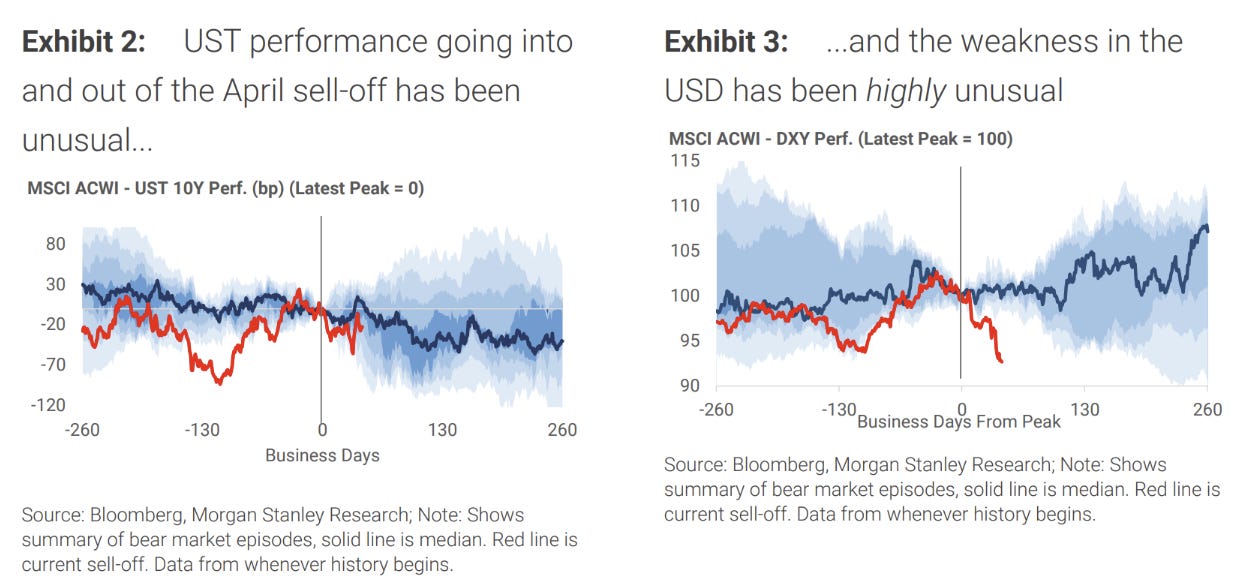
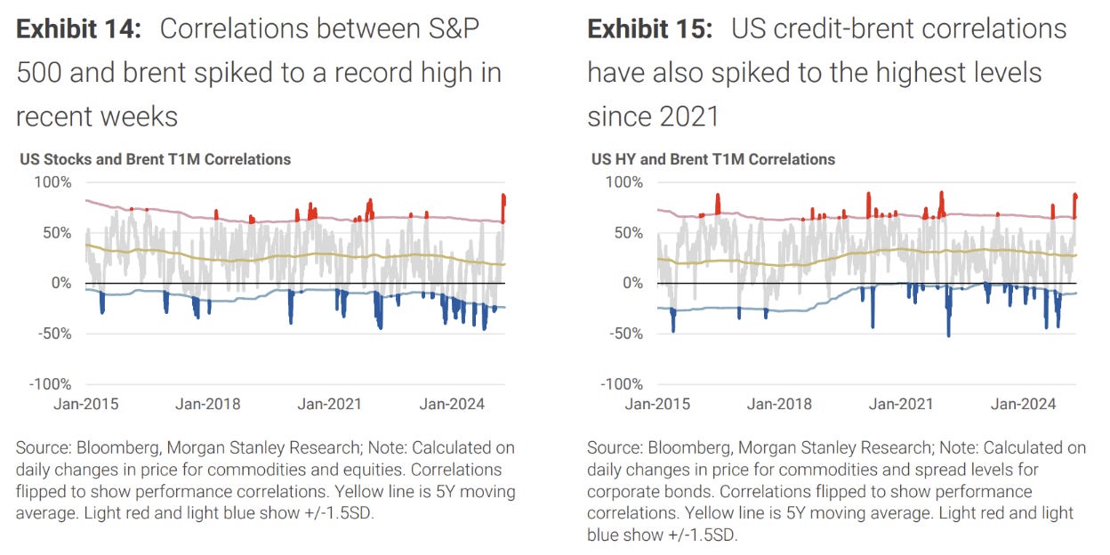
We’ve been through both of these effects over the last few weeks. This oddness extends to other asset classes as well, such as oil where the correlation has rarely been this high.
The intention by the Saudis this week to extend the oil price war and accept lower prices brutalised crude pricing once again. The Saudis say that their budget can cope with much lower prices for an extended period (reality: they can’t). Breakeven oil pricing is above $80 a barrel now for Saudi Arabia. The breakeven point is where their current account balances.
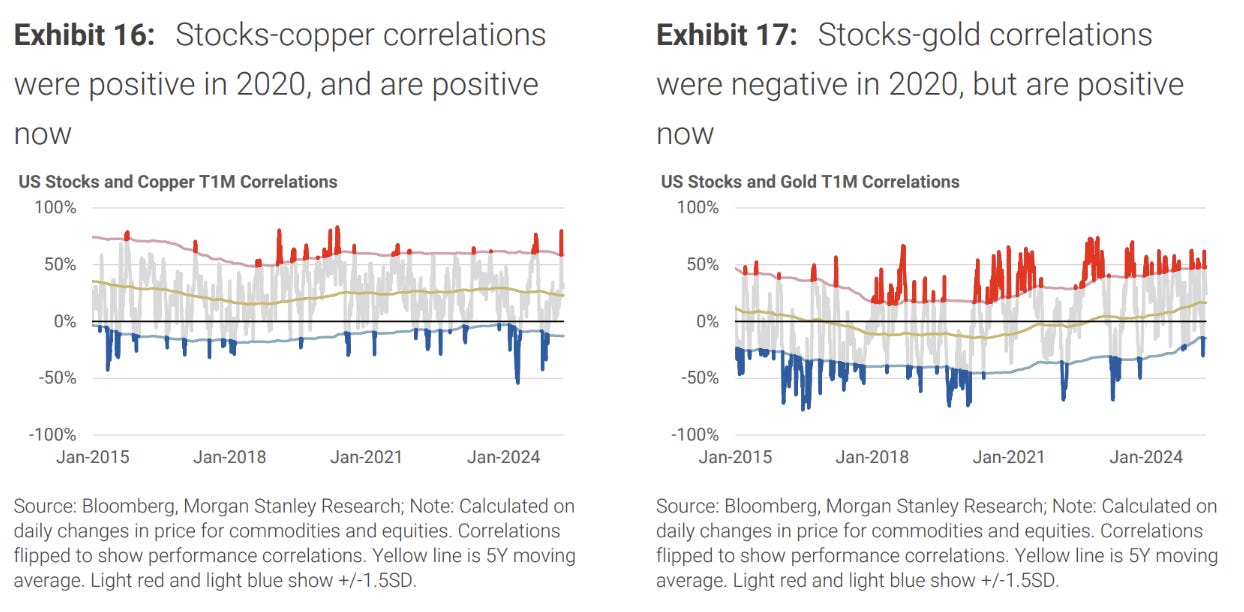
Gold has taken a breather in the last week with reports of Chinese liquidation. MS notes that stocks and gold were negative in 2020, but positive in this risk-off episode.
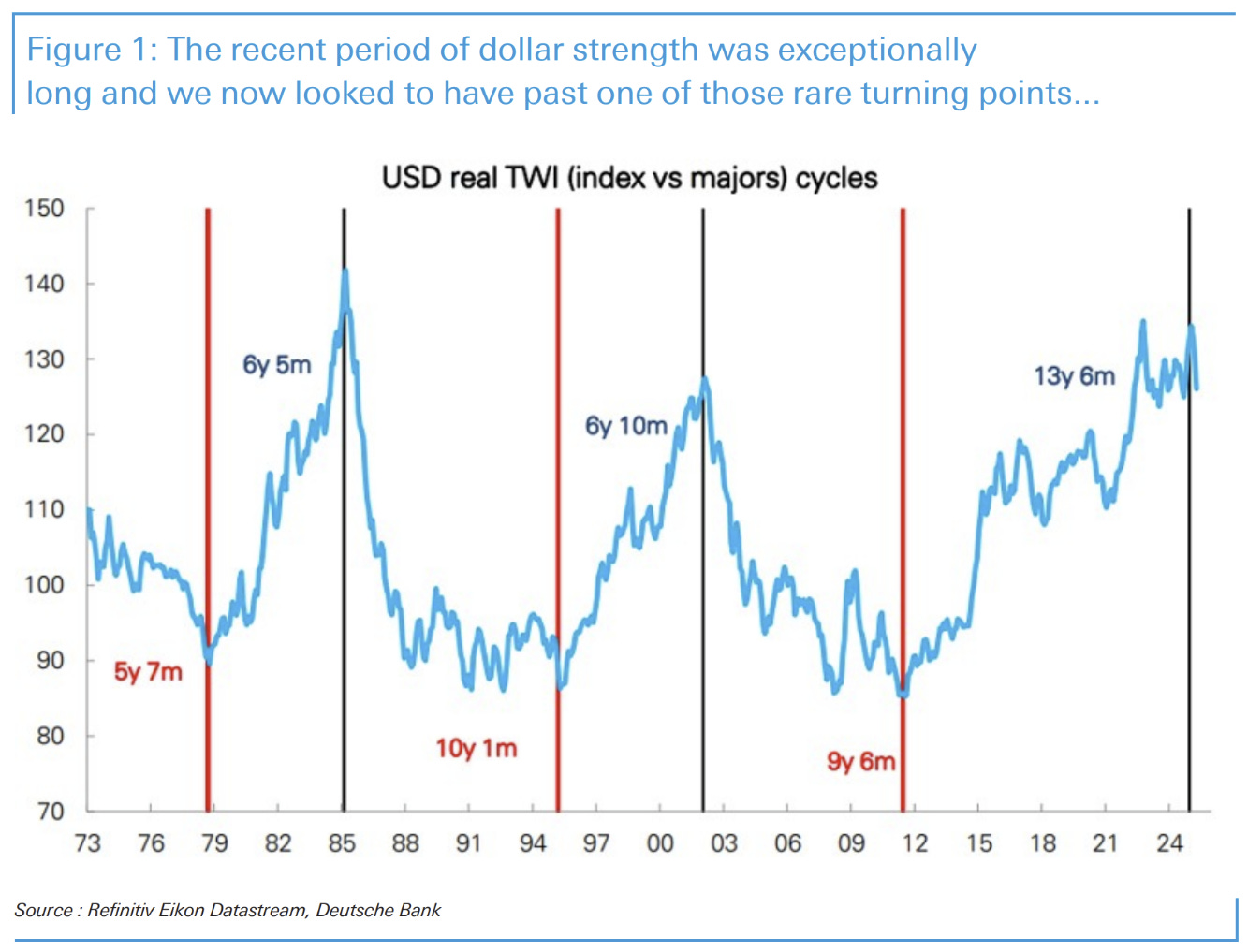
A longer-term view of the US Dollar trade weighted index (TWI) reveals the long-term cycles that sometimes last a decade or more. If this is truly a turning point, then there is plenty of reason to think that the oddness that persists cross-market is here to stay.
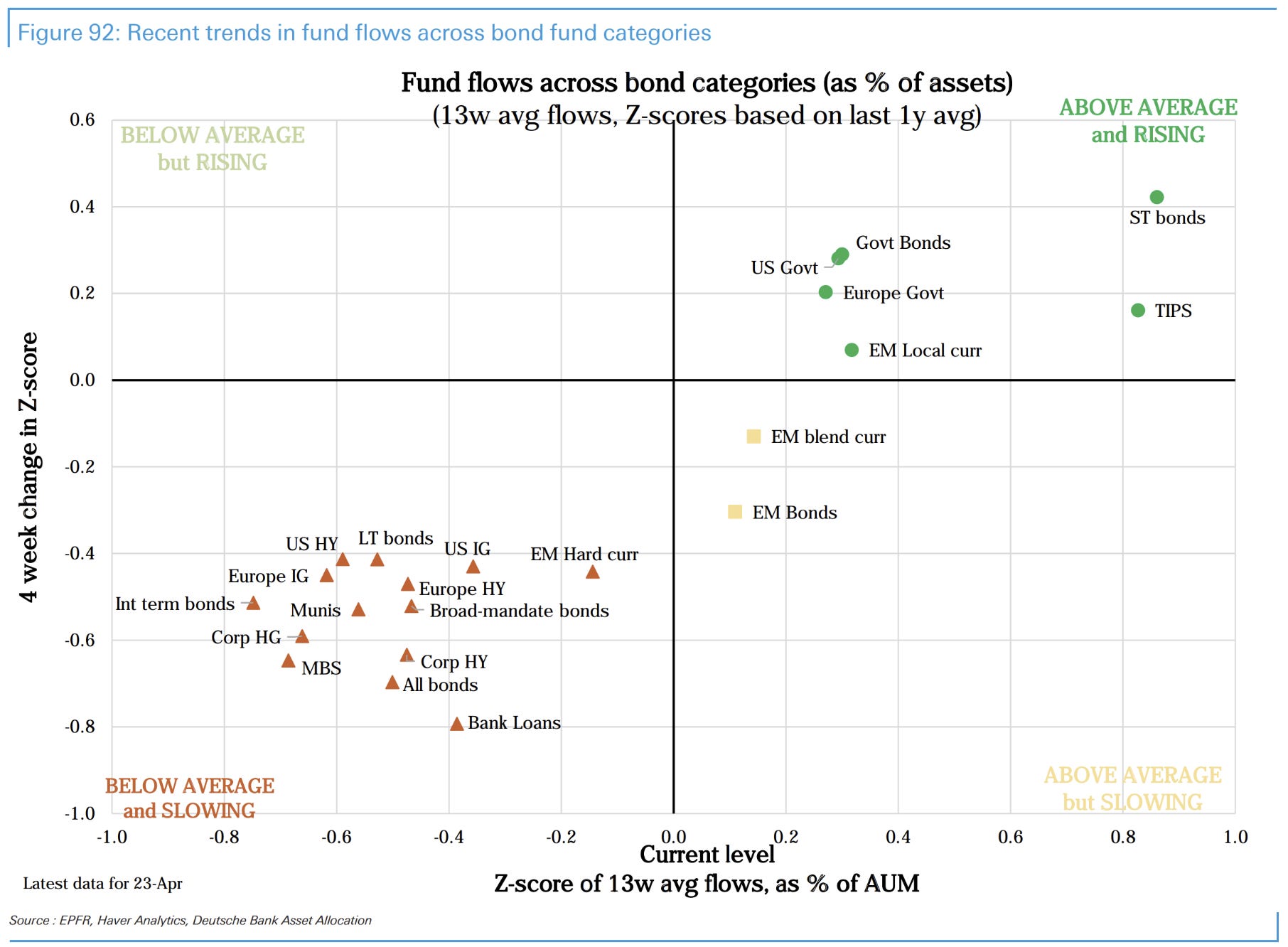
Fund flows show some surprises. Firstly, that US government bond funds are taking flow better than over the last year, challenging the narrative that there are mass sellers. European equities are also still a standout.
Volatility
Vol markets are the most puzzling. Usually after a severe disruption there is an extended period of elevated VRP (volatility risk premium) where the shadow of the crisis manifests itself in higher expected returns from taking short-vol exposures.
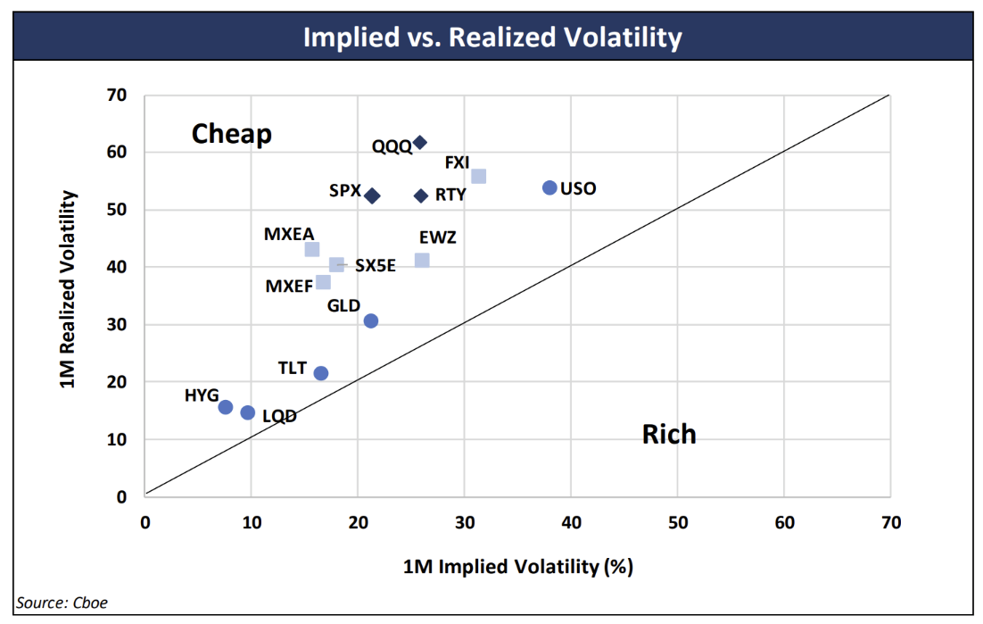
While the measure of realised volatility here is a lagged and flawed estimation, the point still stands that nothing screens as being “cheap” at all.
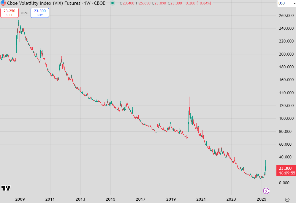
I’m not so concerned about the inaccuracy of that estimation because of how implied have acted. It’s clear to me that the spike in realised vol has been as bad as the pandemic or the GFC (the turnaround in the S&P this month was only beaten by March 2009 in the last 20 years), the spike in implied vol can hardly be seen on the cumulative chart of the first VIX future, above.

The other oddity is that the VIX curve hasn’t corrected itself despite bullish equity markets. This should correct to upward sloping for 2 reasons:
Short-vol should be rewarded for taking risk after a period of volatility
Upward sloping curves are a sign that everything is back to “normal”
Since we’re still inverted, vol markets are signalling that there is still vol to come, and it is more likely sooner than later.
Despite this, equities continue to climb the wall of worry. The flow of money encourages the disconnect, with realised vol more likely than not to continue to outpace implieds. It is a precarious position.
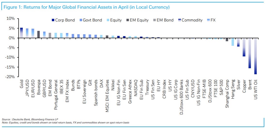
Finishing up, here is the final scorecard for April…
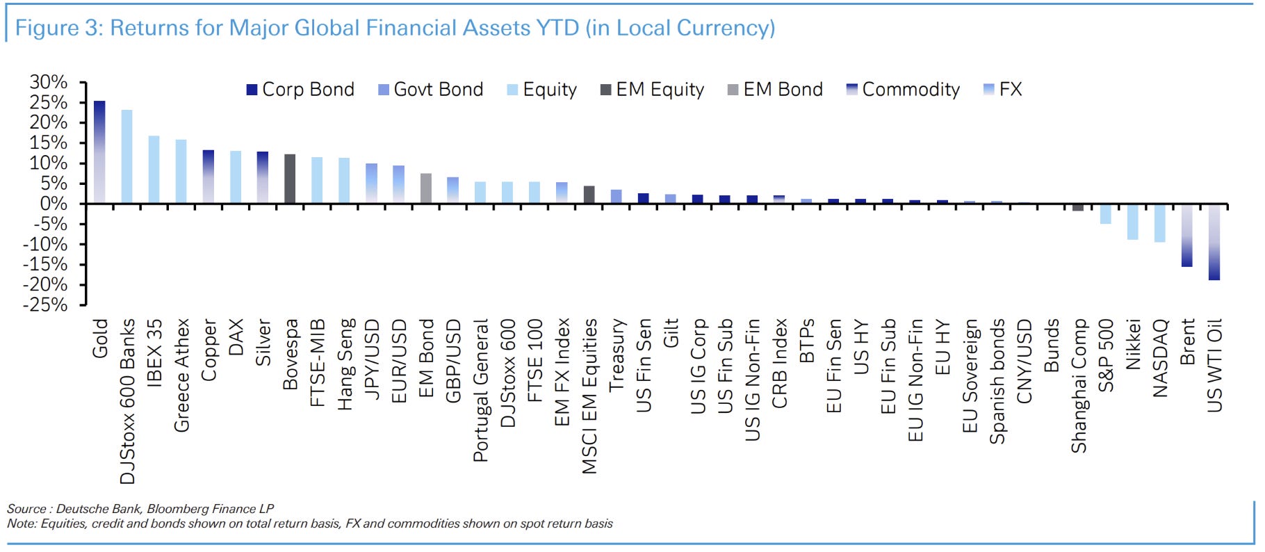
…and for the year-to-date.
Some terrific charts in here. Thanks Peter
Hope for the Second Coming of Steepening Bear to set the world aright :)