
The market is giving up on the idea of stubborn US inflation
Charts & Notes: Week 8, 2026

This week was a big one for rates traders, with stories of frustration from hedge fund land on the effect last Friday’s inflation data had on the shape of the short-term path of rates. Positioning was crowded in short-term steepeners, and the very benign inflation data caused some decent flushing out of positions.
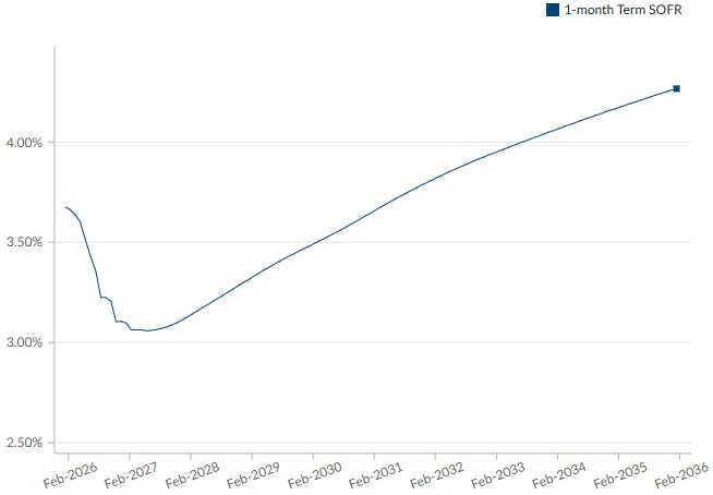
At the moment, the terminal rate implied by 1-month SOFR futures sits at just over 3% somewhere in the middle of 2027 but pay attention to the shape of this curve.
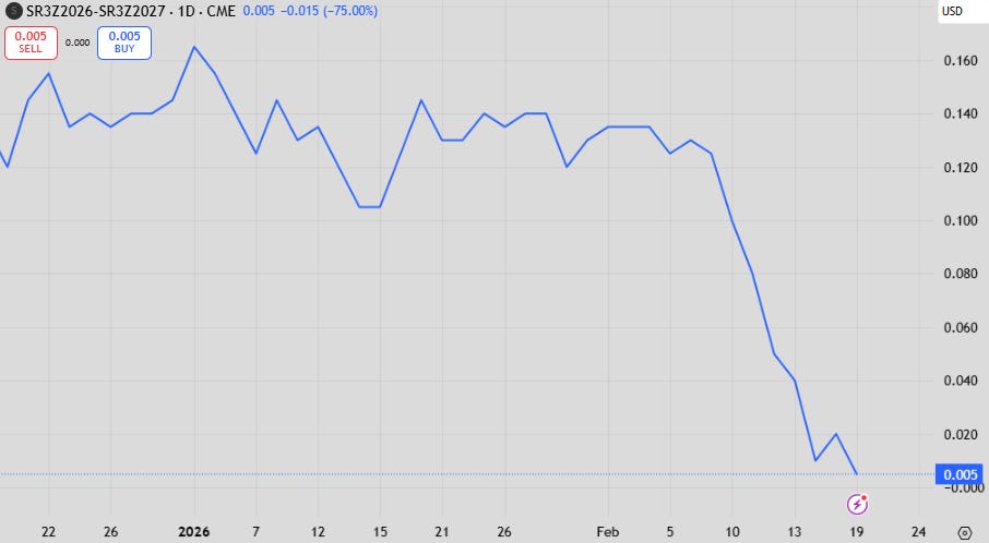
Employment data mid-week saw big headline payrolls growth which, rightly so, is a number that is being dismissed as being too unreliable at this point. It was the solid unemployment rate that emboldened positioning in SOFR futures that ultimately were expressing an inflation and employment picture that would see a Fed that would be forced to hike out of any politically encouraged cutting that would be priced in with the new Fed chair in charge.
The forward curve instead paid more attention to the weakness in equities, and then the inflation print put the nail in the coffin.
While the move itself wasn’t huge (12bp or about half a hike over 2027), it represents an important shift in how the market is now looking at forward inflation risks alongside an economy that is still rapidly growing in real terms and past the effect that tariffs were theorised to have on employment.
The argument that tariffs were going to have a persistent and large effect on inflation was never credible, and even the data from the first 6 months after they were applied said the same.
There was an argument that a US economy that was running hot could cause inflation to remain elevated into the future, and that argument is far from settled at this point in time. My own view is that a level of about 2.7% for core inflation that persists into the future was used in my recent piece on bond haircuts.
Stop asking "when?". The US has already defaulted!

The dominance of fiscal over monetary policy has finally become mainstream.
Core inflation printed at 2.5% YoY which wasn’t that far below expectation. Where the change in narrative came from was that this number was only held up due to volatile components such as airfares, while everything else was on the weaker side.
This now tops a run of weaker services inflation prints that brings the consensus view of inflation into real question.
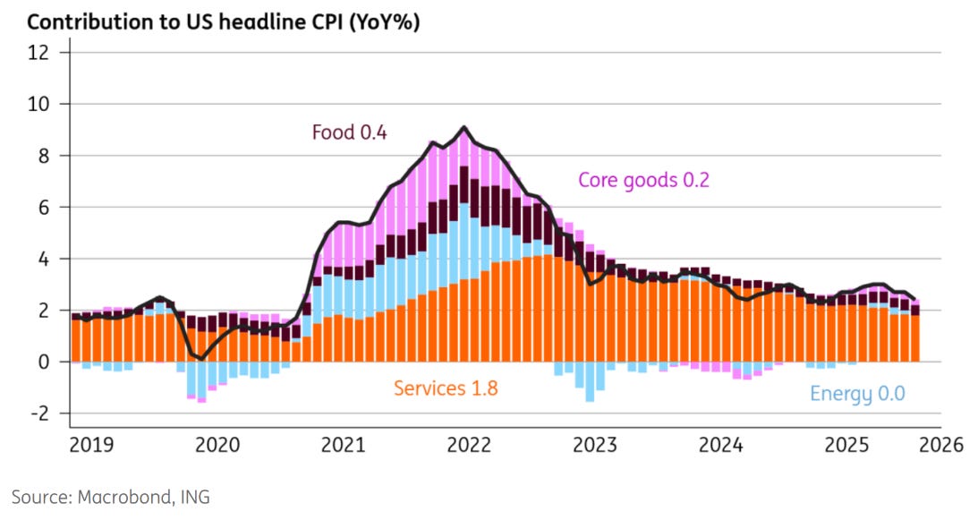
The chart above from ING illustrates this quite well. I’ve been bearish on core goods inflation which also caught many by surprise (most had strong numbers in their forecasts for January CPI because of strong retail price tracking), but it really is the moderation in services inflation that is changing the markets (and my) view here.
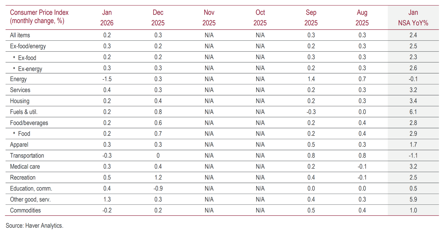
Services and housing inflation is still running at >3% on a component basis so it won’t convince everyone (including the hawks on the Fed board) that cuts are needed yet, and the Fed minutes released this week support that.
The market, however, sees it from the point-of-view that is relative to other economic strength.
If a 4.3% unemployment rate and nominal GDP growth still punching well above 5%, then what chance does inflation ever have of surprising stubbornly to the upside?

Net outward migration could be having a significant effect on these components of CPI as well, with particular focus on housing. If that’s the case, maybe everyone is off on their forecasts.
I am currently ignoring the argument that productivity growth is so strong that US GDP growth can be as hot as it without being inflationary. Fed chair appointee Kevin Warsh has himself put this forward as a reason for why rates can be lower than where they are. With AI capturing so much of people’s thought processes these days it’s also very appealing from a narrative perspective.
While some economists will argue with you until they are blue in the face that productivity calculations are robust, it still remains that it is simply an “error” term after growth is attributed to capital and labour. If something else is driving growth (like, let’s say, record government expenditure coupled with an enormous trade deficit), then it will partially appear as productivity gains.
Zooming out on rates
With this shift on how the market is seeing the forward path for rates in the US you would be forgiven for thinking that we were on some breakout path for bonds that would put an end to the bear market that started in 2022.
Nothing could be further from the truth.
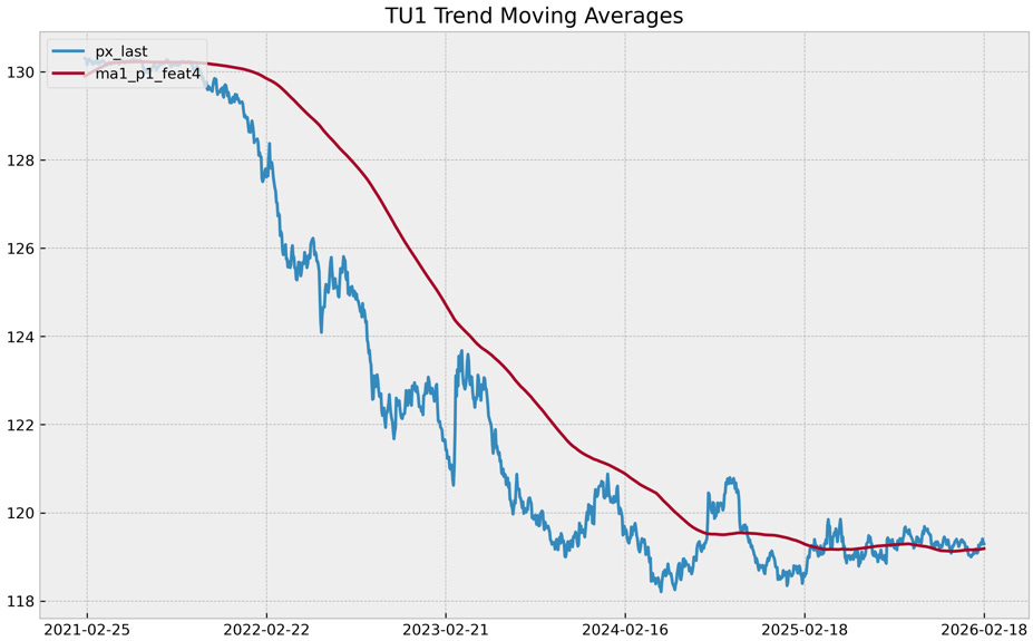
The chart above tracks the price of a cumulative US 2-year future that takes out the misleading effect of the curve shape when looking at a yield chart. This shows you that absolutely nothing has changed recently or even since the Fed started cutting rates. It is still ranging and offers very little reason to think a breakout is coming.
European markets outside of the Bund are the only markets which have continued to show strength. Even French OATs have a chart that show some evidence of breakout. This is resulting in tighter spreads to Germany, a theme which has continued off the back of Spanish economic outperformance, and the ongoing plan for Germany to increase fiscal spending dramatically.
The US isn’t the only region that is benefitting from a growth upswing either, making bond strength look a little more suspect.
While I was never a fan of steepeners in the short-end purely because of the number of competing drivers, I still like them longer out the curve with my preferred expression not much changed over the week and also still ranging.
The delta in inflation expectations falling will be felt in the short-end over the long-end in my opinion, so this trade still offers a better expression in either outcome.
4% in 10-year Treasuries is well supported for now, and outside of inflation expectations isn’t as desired as the short-end for portfolio purposes.
US equities
A final comment on US equities. We are approaching the fourth month of sideways trading, and many have covered the disaster in software (which has mostly been offset by gains in semis) which have put the brakes on further appreciation.

The US has broadly underperformed nearly everyone else at the index level this year, especially EM and the UK (also EM).

However, removing the effect of megacap tech changes the picture of relative performance considerably!
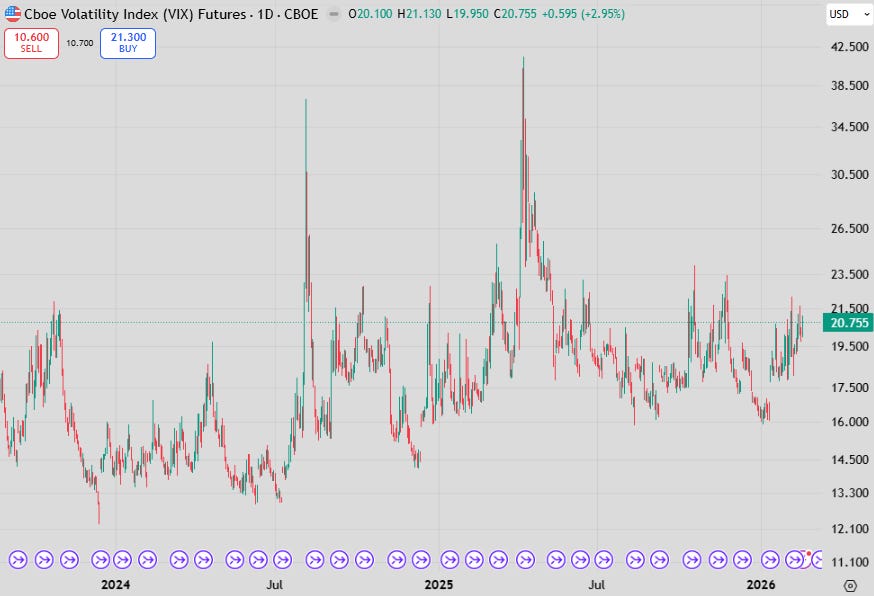
Vol remains elevated and probably will until the SCOTUS decision on tariffs comes through. It is meant to be soon but is unlikely to come out until after the State of the Union address next week to avoid giving Trump the stage to comment on it.
Current trading in the VIX (elevated level without a significant drawdown) bares most similarity to the end of 2014 and into 2015, where the S&P500 traded sideways for the entire year until a China FX devaluation induced drawdown in August of that year.
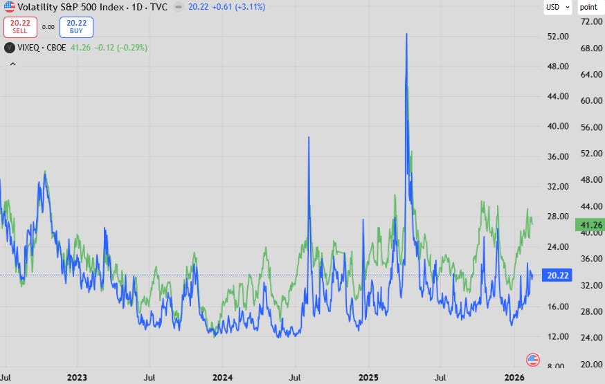
The difference between the VIX and the VIX for the underlying constituents continues to print with an extremely large spread. This spread has been climbing over the last few years as long/short equity strategies have grown in gross exposure.
Indeed, these notes are of HUGE value! One technical question: what are you using for TU1? The Bloomberg one shows a current price of ~104, which is clearly not what appears in your chart. Thanks!
Superb note Peter