

Last weeks’ charts & notes was entitled “growth is turning up”. Markets ran with this theme this week, with even US equities catching a bid after a few uncharacteristic months in a tight-ranged limbo. all the action has been outside the US (feels like the first time in a long time).
Markets
BofA points out the YTD performance of ex-US equities in USD terms. While the USD has in general stopped rallying for now, returns in local currency for the below indexes are stronger.
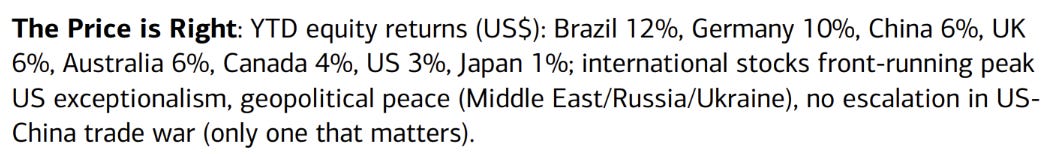
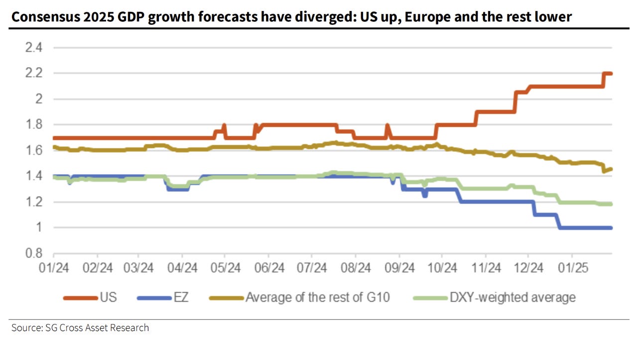
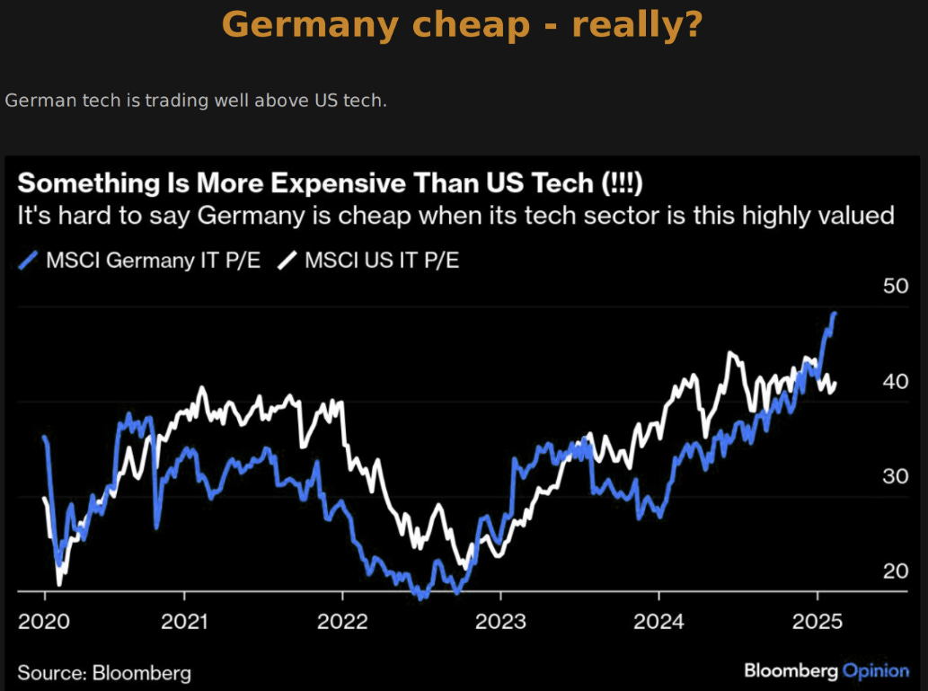
Of course, most of these indexes trade at a P/E discount to the US, and some by a considerable margin. The DAX (yes I’ll be banging on about it again today because of its meme coin like exponential performance) trades at a multiple of 16 versus the US at 22, this being the result of growth trends highlighted in the chart below.
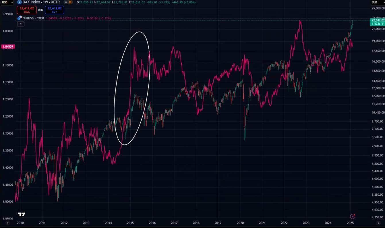
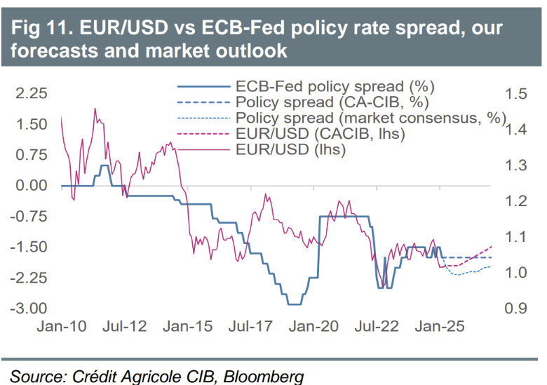
DAX performance has been driven by a fall in the Euro, in a move reminiscent of 1st quarter 2015 where it rallied >30% after an epic fall in EURUSD from 1.37 to 1.06. I remember this time well, FX rarely sees these types of moves.
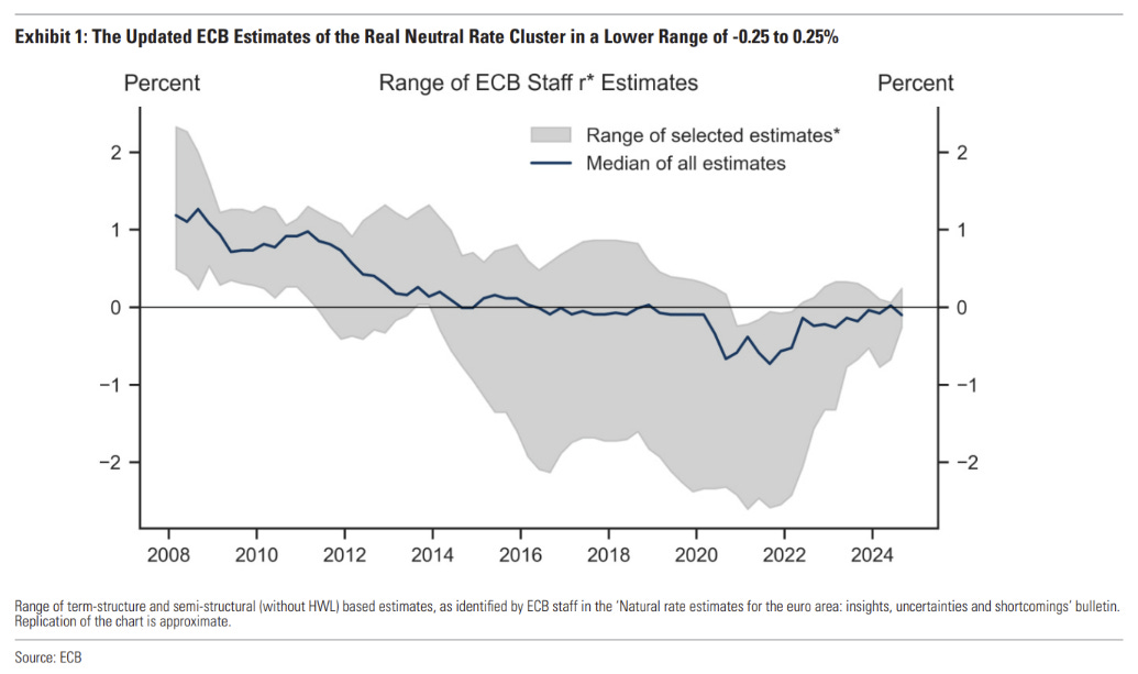
the ECB hasn’t been as helpful for the EUR now as it was back then. The slight downgrade in the ECBs “real neutral rate” (I do not endorse trying to estimate such measures, btw) was only slightly eased after the comments at the ECB press conference.
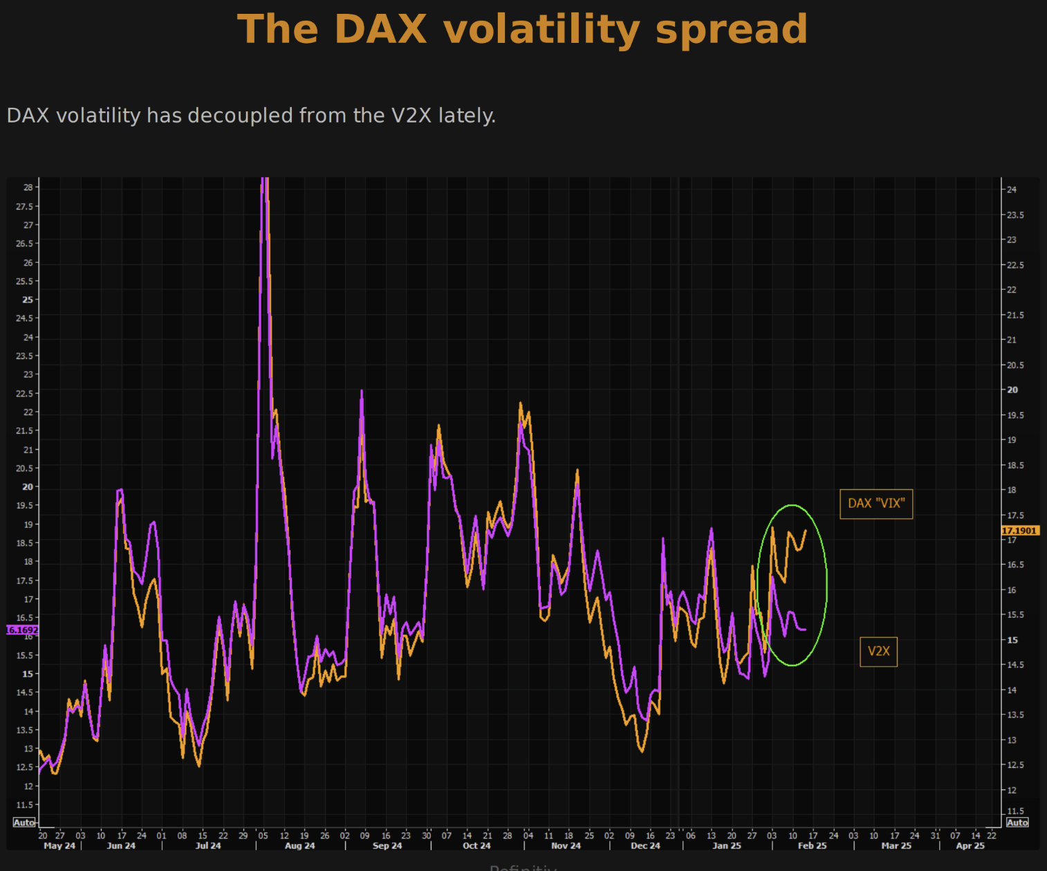
Very few are looking for further falls in the EUR, making the current move higher in the DAX seem a lot like momentum chasing.
Stocks up/vol up is a marker of this behaviour as topside is bought through long calls driving vol higher.
the drive higher in SAP has explained a lot of the run higher, itself being somewhat of an AI play. Interesting to see that German IT is now more expensive than American!
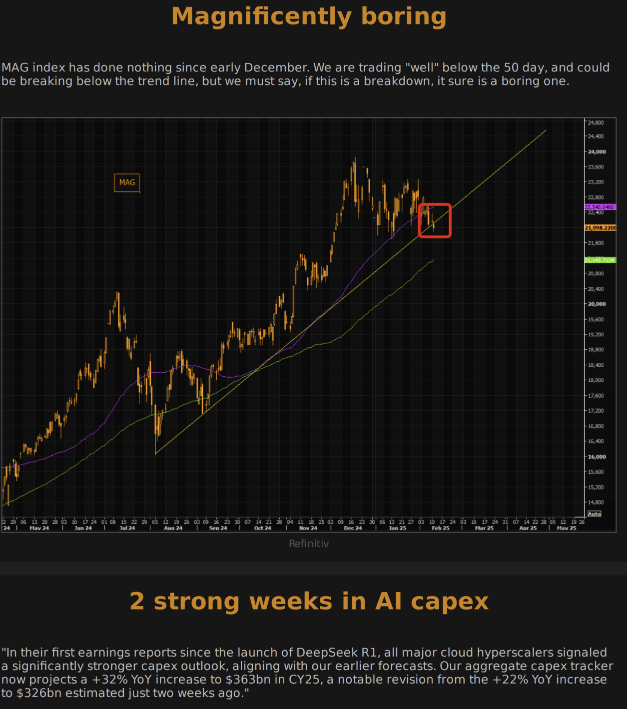
The US’ rangebound trading is due to MAG has been off the boil recently, exhibiting uncharacteristic weakness.
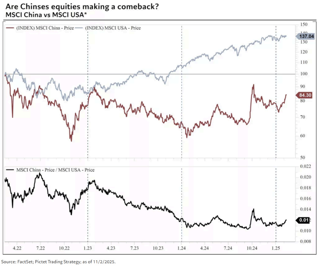
A newly invigorated Chinese tech sector (post-Deepseek and confirmation Tepper didn’t dump his bags on you) has turned China into an outperformer as well.
US Employment
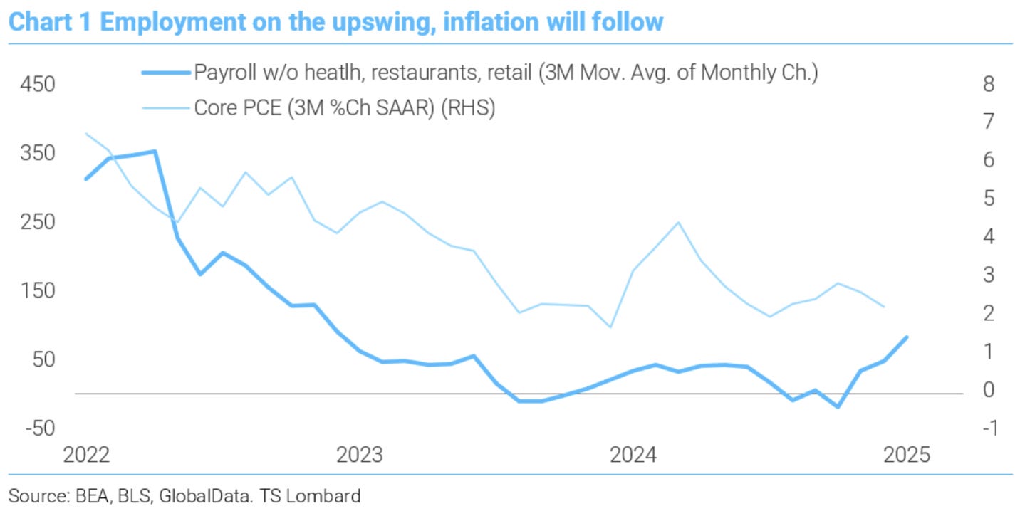
Soft January employment was offset by upward prior revisions to confirm the growth narrative and cause US rates to sell-off. Interesting analysis in the chart below by TSLombard that shows a better trend in employment than many aggregate measures see.
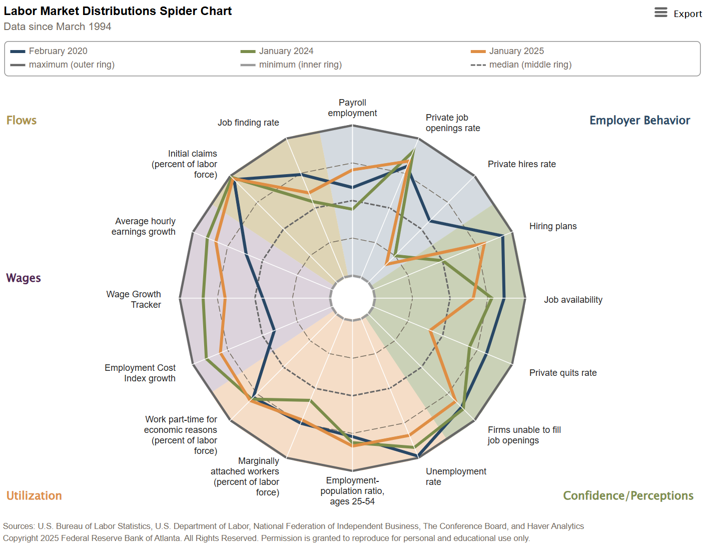
The Atlanta Fed also does a great summary chart that I had forgotten about. It summarises employment indicators by type and compares each month to the long-term average. Short story is that employment is strong (especially wage growth) with only new hires disappointing.
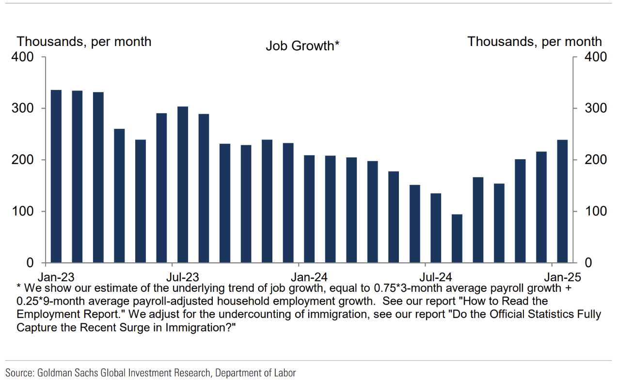
Here is another alternate way to see payroll growth by Goldmans. Again, it paints a very positive picture.
Outside of this week’s inflation print, the picture is already one that makes it hard for the Fed to cut rates.
US CPI
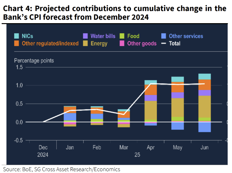
Another concerning start to the year. The same happened last year, with the first quarter ending up not being a indication of 2024 inflation. Aren’t these figures meant to be seasonally adjusted??? 😣
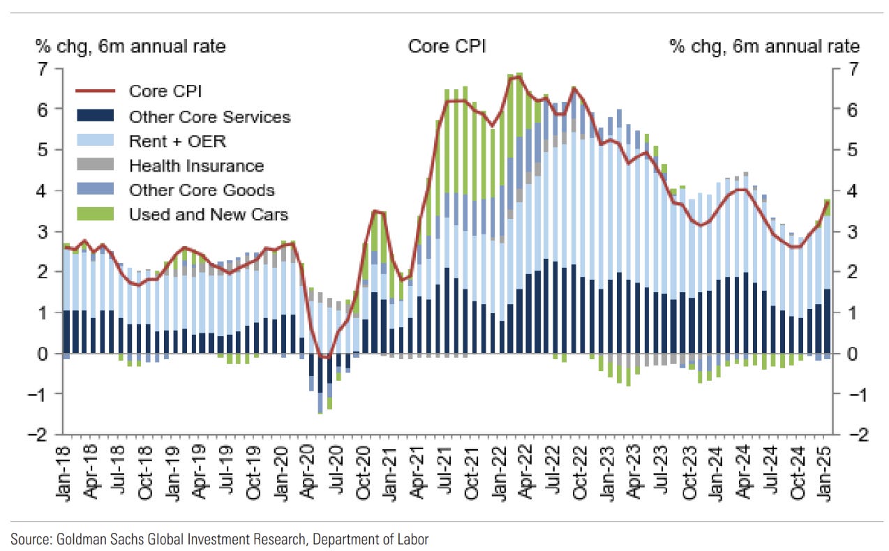
“Supercore” inflation came out at an amazing 0.757% on the month (>9% annualised). The usual first quarter inflation surprise, or more in store?

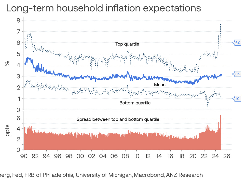
ANZ produced this chart before the inflation print. Not a good chart.
Everyone saw the incredible partisan bias to the short-term Michigan inflation expectations survey this week, essentially rendering that survey useless. I think the longer-term survey still has validity however, and the slow march upwards ultimately a sign of solid growth. Whether this can continue without all the debt is another story.
Central banks - UK and Australia
Bank of England cut a mixed story. A vote for a 50bp cut was offset by inflation forecast uplifts.
These inflation uplifts were decent and sent a message that forward decisions aren’t so easy. The curve has roughly another 3 cuts priced in.
In Australia the RBA is expected (with 93% probability) to cut next week. This is met with some scepticism, including myself. The inflation story isn’t that different from the UK, but growth is better and has shown signs of improvement recently. If a cut is delivered, it will be match with careful language, imo.
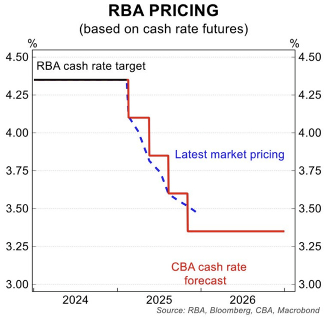
Main argument will be for a removal of restriction, rather than easing.
According to Goldmans, 88.1% of central banks are cutting rates (weighted by GDP).
Tariffs
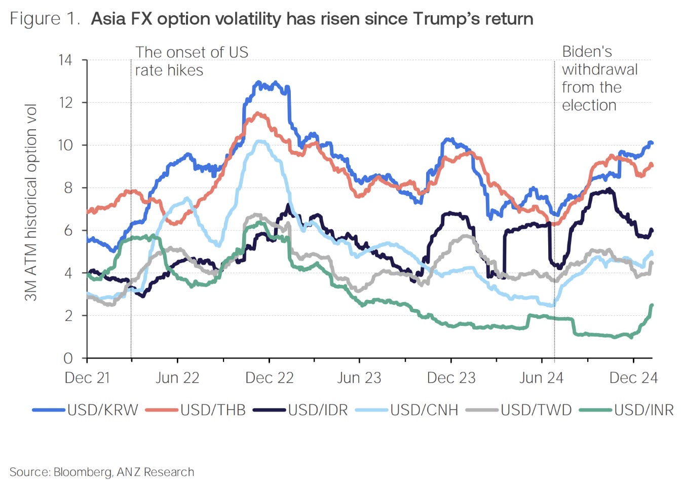
We are still talking tariffs! Markets continue to show some reaction to them, with Asian FX volatility up.
Taiwanese tariffs threats were a surprise a few weeks ago. I came across the following comment from a few years ago by the former CEO of TSMC:
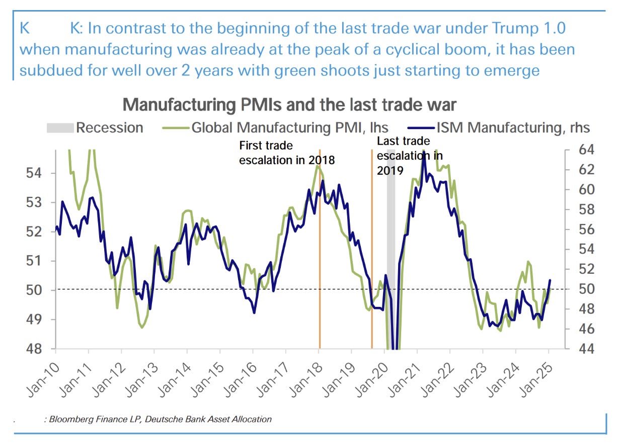
The last trade war was started at a peak of global manufacturing boom, this time is very different (some will read this chart as the trade war starting the cyclical downturn).
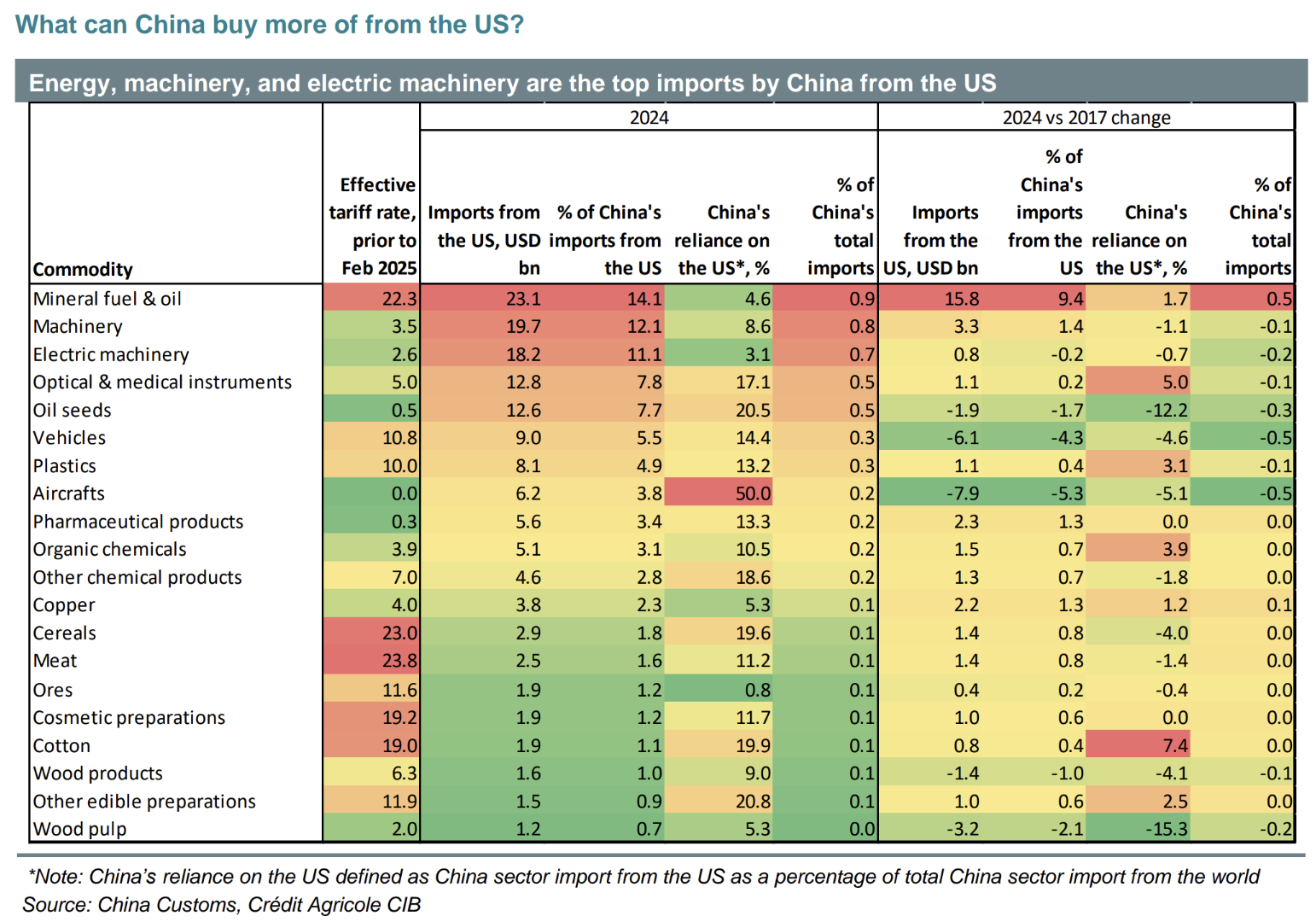
I found this table interesting. China purchased more of everything from the US since before 2018, and purchased far less of the things you would expect (autos and aircraft).
Fiscal
My next main-line newsletter will be an update of where the US lies fiscally and what it means for growth.
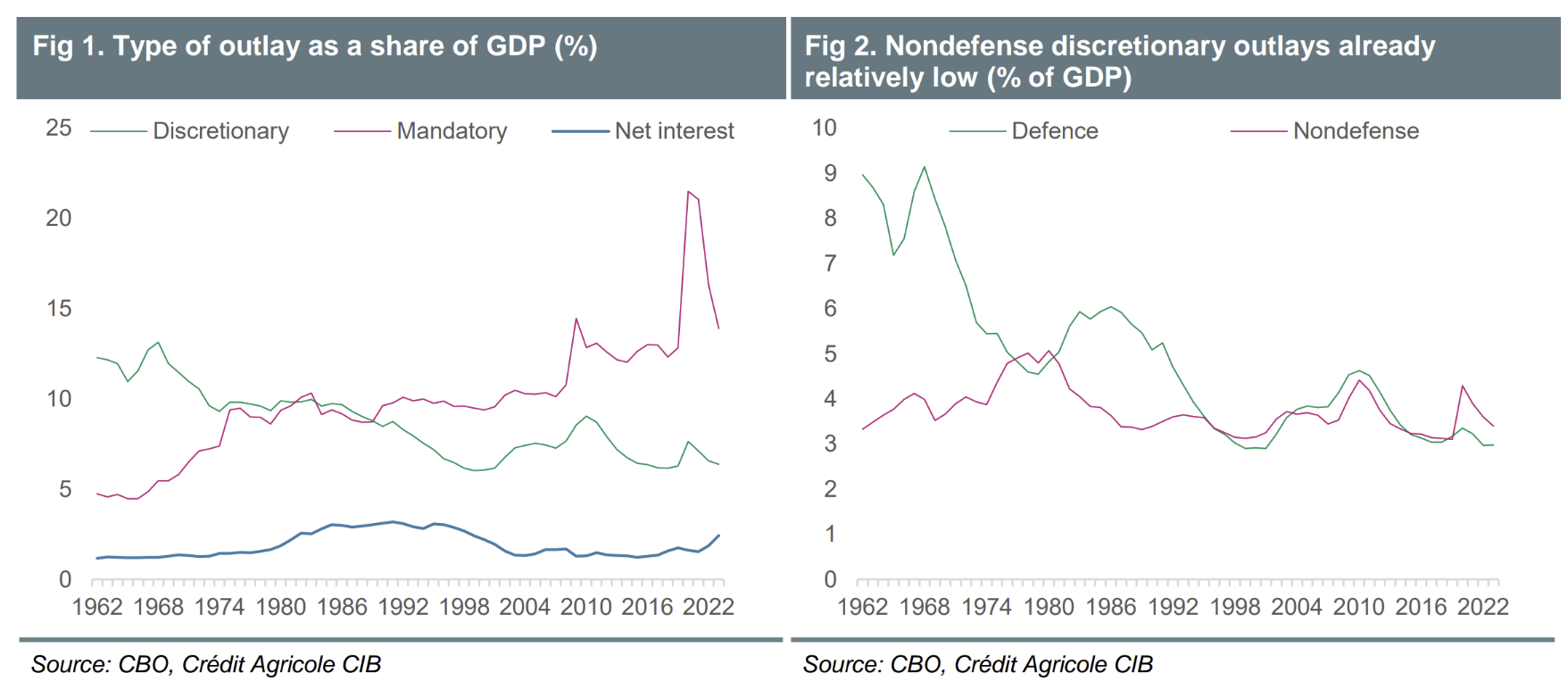
DOGE continues to be viewed with scepticism by the market, with the charts below a constant feature. I really do think they miss the point a little - excess spending can clearly operate within “mandatory” payments as well as discretionary.
The right answer is nobody really knows the scale of savings that are possible within either category.
By the same reasoning, the true measure of DOGE success isn’t how much it can cut spending - anyone can do that - it’s the step higher in productivity that comes from identifying and eliminating wasteful spending.