
Charts & Notes: Market volatility confusion
Is it the data desert, or is just nothing really changing?

Credit spreads have widened, and more recently equity volatility has picked up from super-depressed lows.
I’ve seen people talking about bond volatility as well. Most have pointed out the move higher in the MOVE index, an index of swaption volatility produced in the old days by Merril Lynch (the “M” in MOVE), which is now Bank of America.
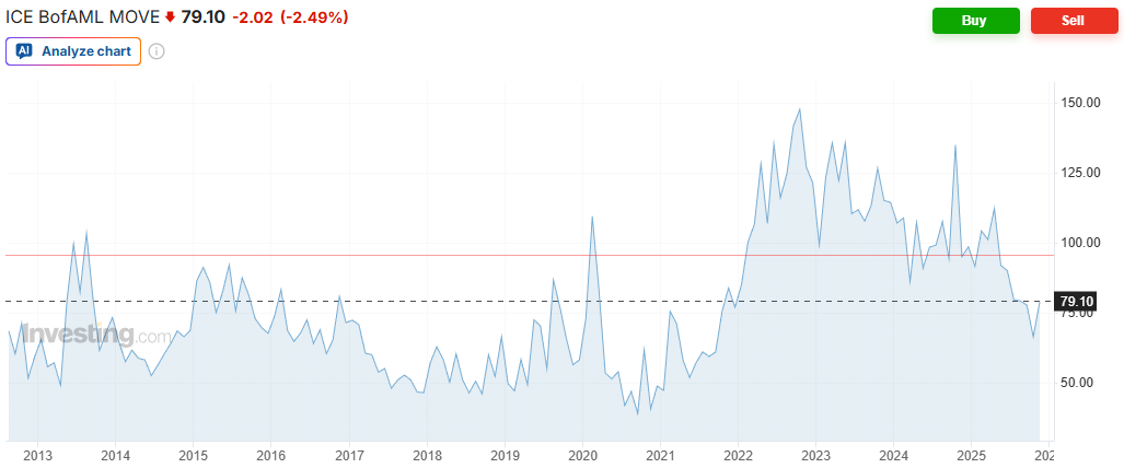
It has picked up, but clearly from cycle lows. Swaption vol is forward looking and represents market participant’s forward view on volatility derived from the pricing of these instruments.
Backward looking realised volatility tells a different story.
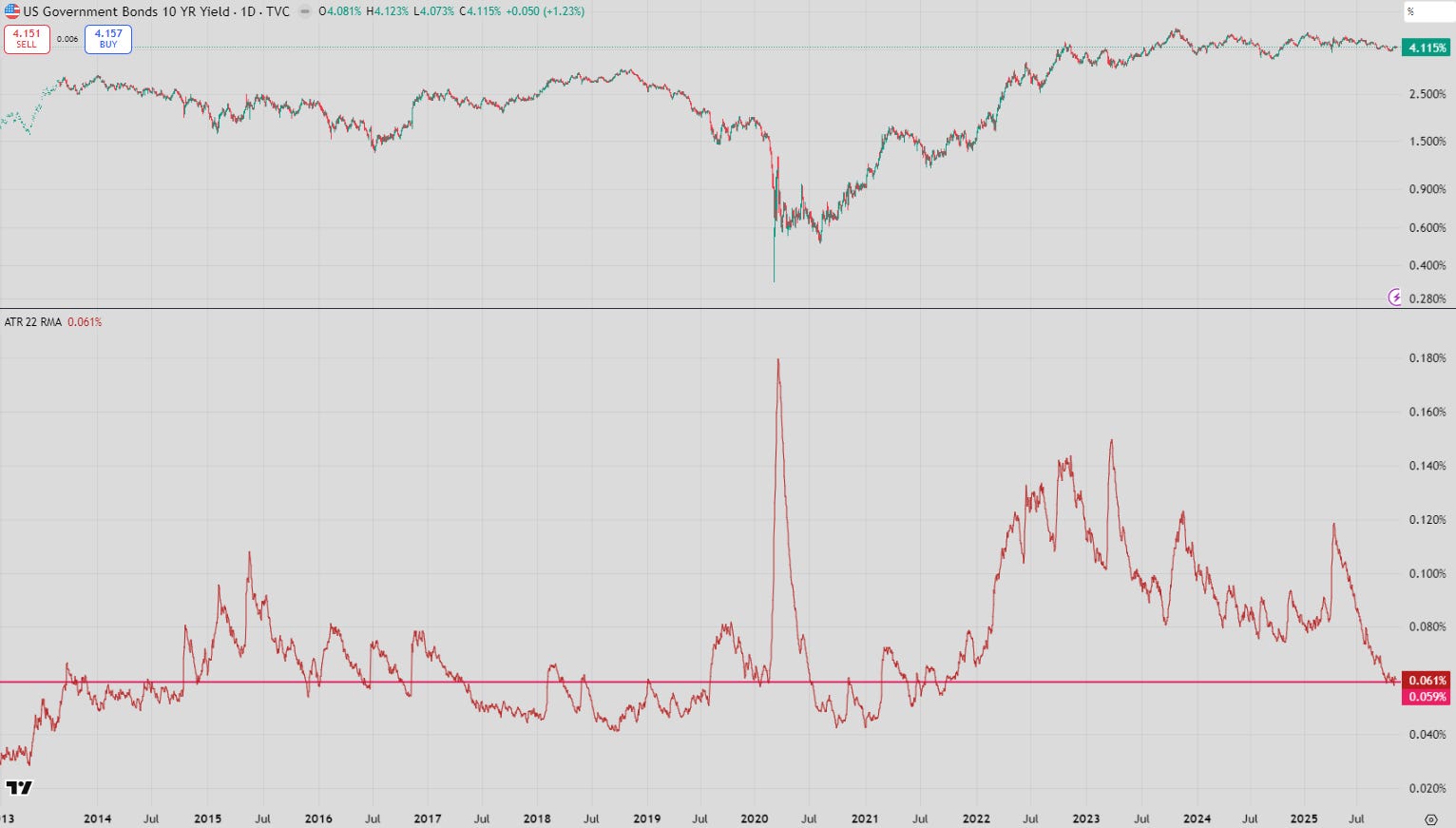
US 10-year note volatility (estimated by the Average True Range above), is it cycle lows, and is now in-line with most of the 2010s when ZIRP was in full force.
If I adjusted this by yield level it would look even lower (which is more correct as daily trading ranges should be higher when yields are higher, all else equal).
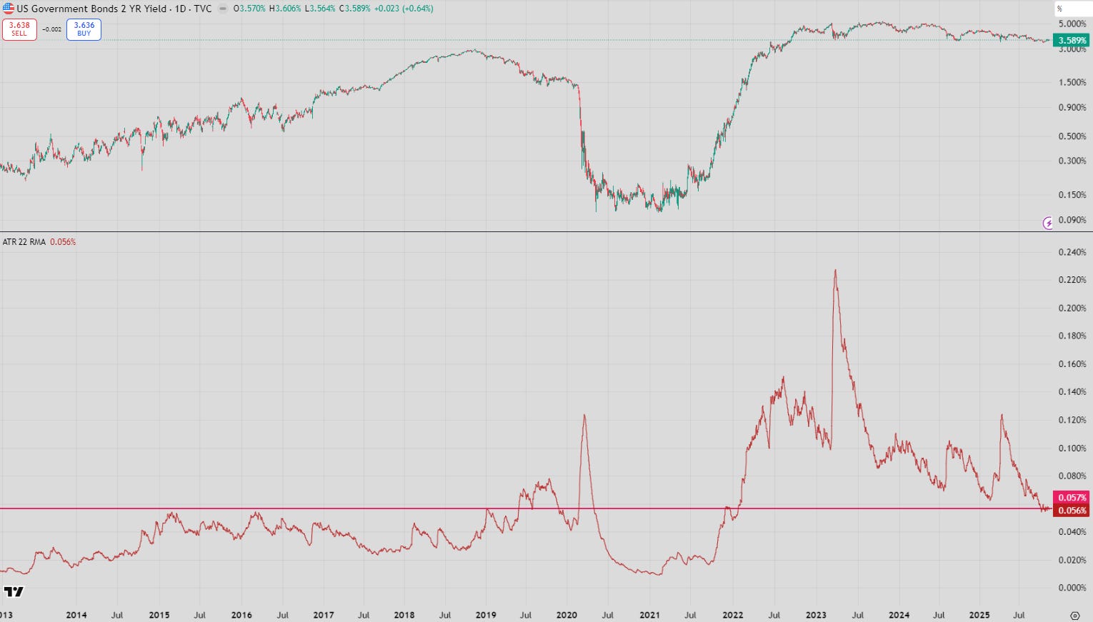
A similar calculation on the 2-year confirms cycle lows, but it is still a little higher than during ZIRP.
You can see something similar when you look at the front-end of US rates curve. The Dec-2026 SOFR trading range has collapsed to about 30bp. This is partially because Dec-2026 is getting closer, but I would attribute it to fast decreasing uncertainty about the journey towards the end of the cutting cycle.
So why did forward looking volatility pick up? My guess would be that it fell too far as a result of the removal of possible volatility events as a result of the US government shutdown.
Since the shutdown is now over, traders can start to price in events once again which should make buying vol more expensive.
But would it have made a difference anyway?
The ghost economic data points
It is highly likely that the missing data points (which are unlikely to be recreated, according to White House messaging) would have only introduced volatility through mismeasurement rather than actually revealing any change in the underlying trend.
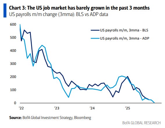
Alternative data reveals that nothing has changed in the broad employment picture. The US continues its slide towards zero employment growth as the current administration reports net negative migration.
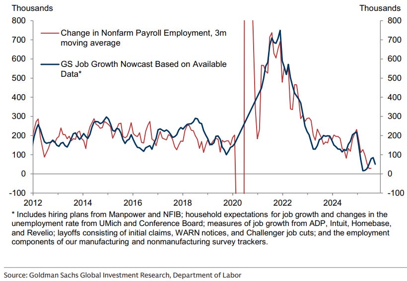
Goldmans confirms a similar outcome.
If the data was released and showed these trends, I don’t think realised vol would’ve been any different. You can’t price out a chance that the BLS delivered a +200k or -100k at one of those prints though!
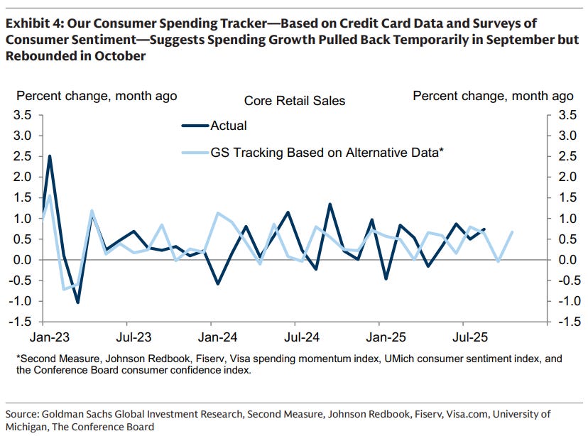
Other measures are less convincing, but don’t really show a change in trend.
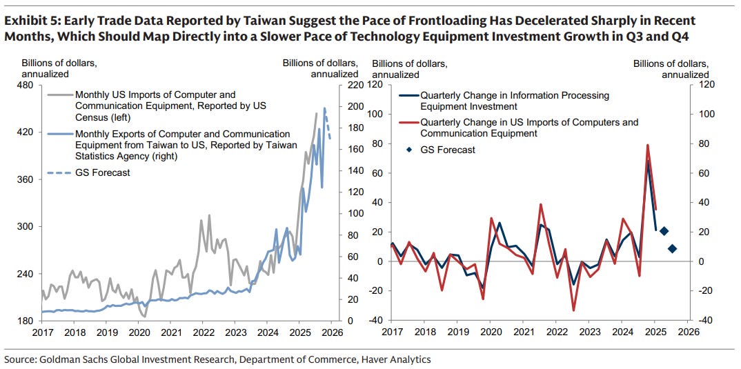
We may or may not see a cooling in investment led by data centre rollout.
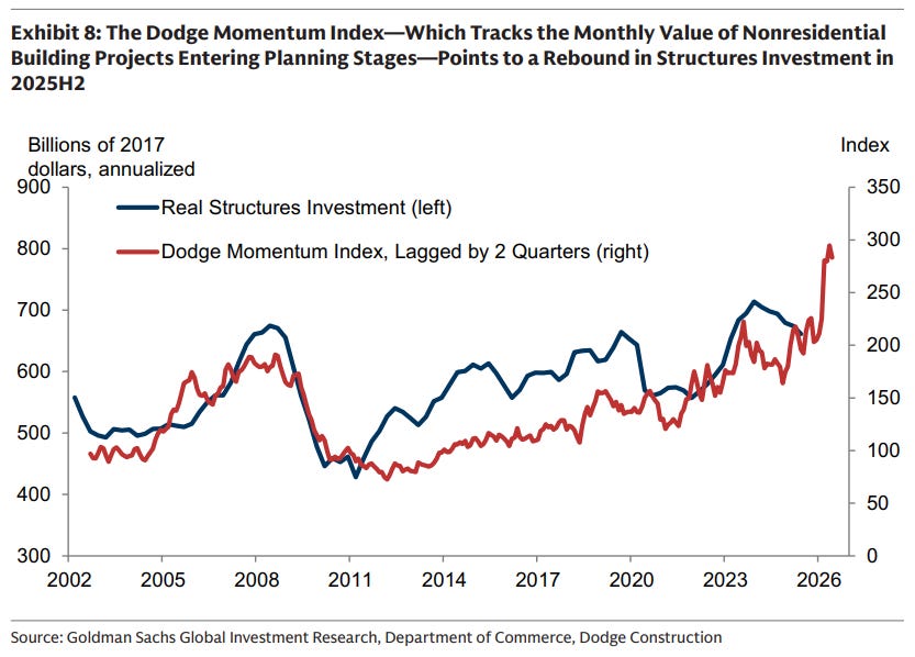
I’ve never heard of the Dodge Momentum index, so take the above with a grain of salt but investment elsewhere looks higher as well. Good for GDP.
Equity and credit are a different story
Average True Range in equities is rising.
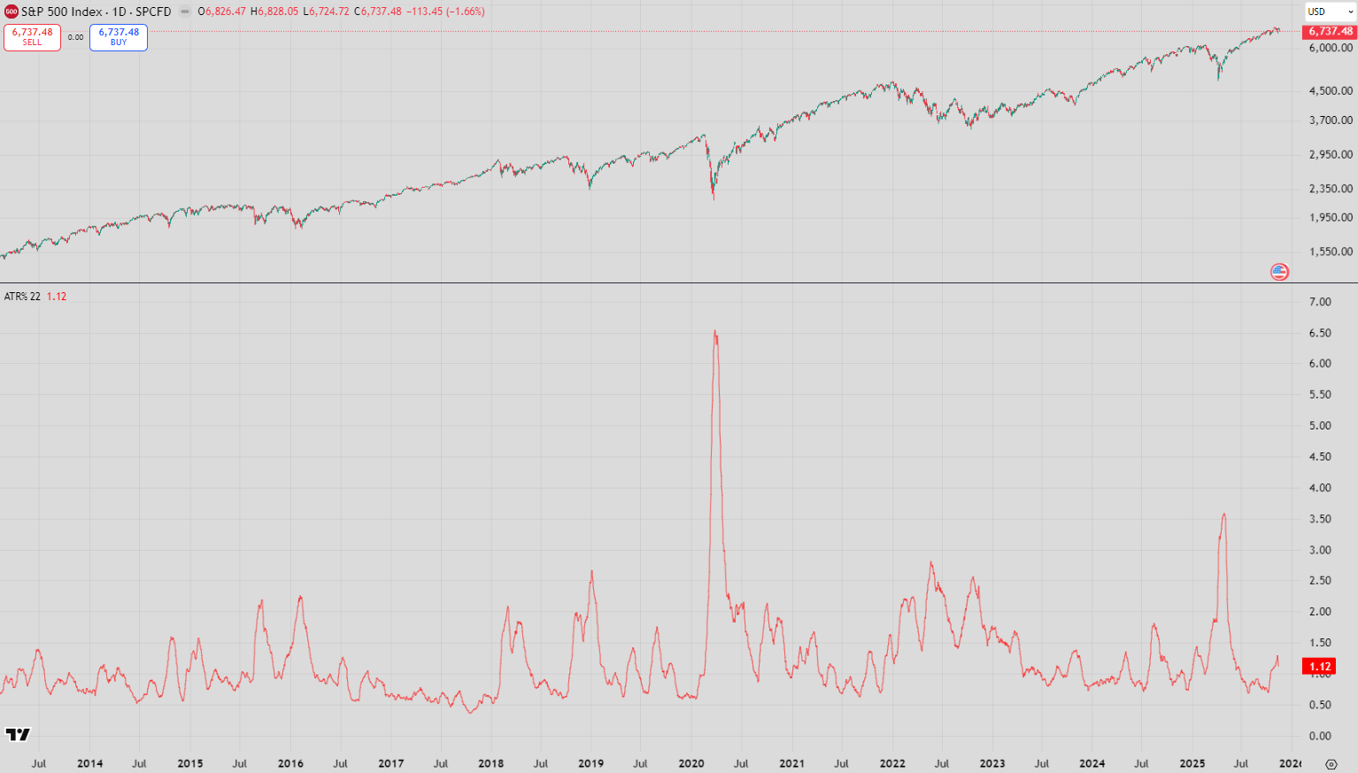
The Average True Range above is represented in % moves to account for the higher index value.
Those with some more experience are watching credit at the moment, with most indexes drifting wider. I’m not sure this is a concern.
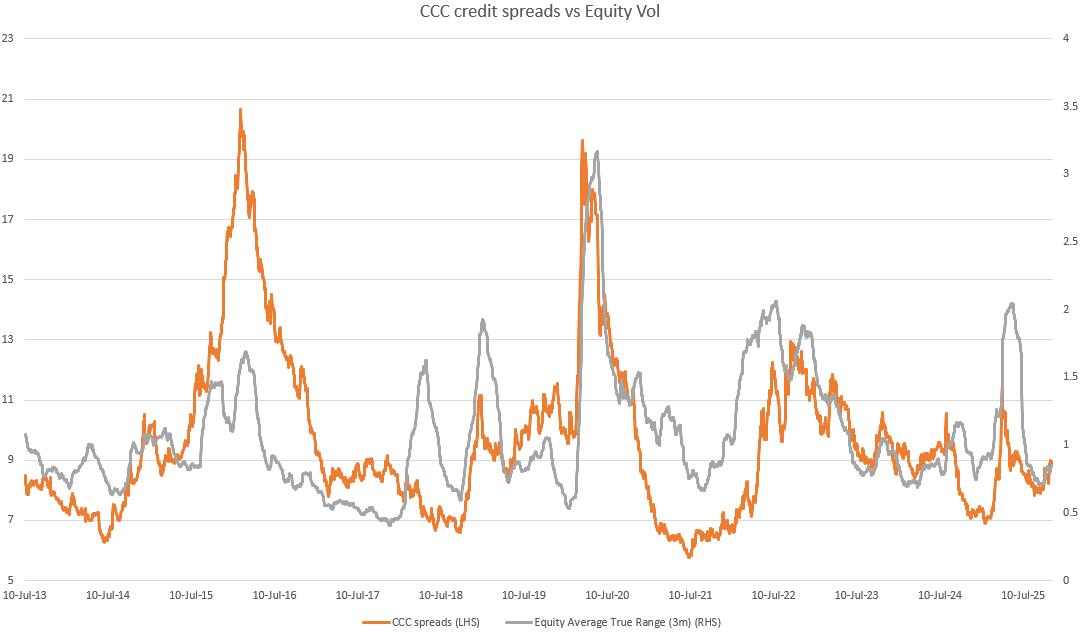
Using CCC spreads as a proxy, this market is just trading wider with a pickup in equity volatility in an almost 1-for-1 fashion.
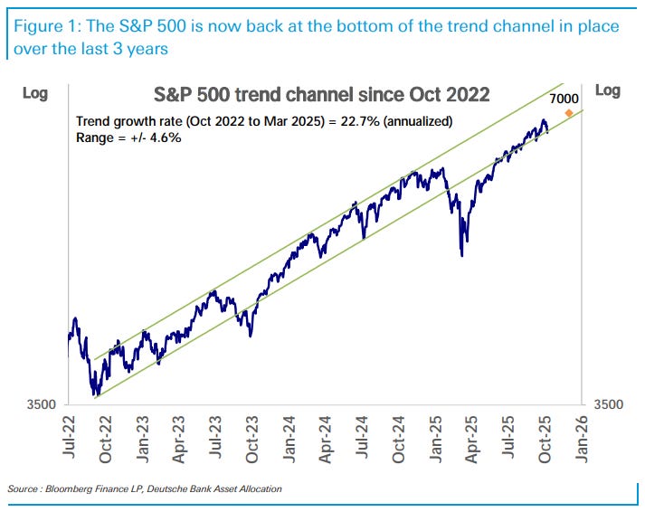
Everyone draws different resistance-support lines, but on DB’s measure above we are at the support line, despite the apparent intensity of the post-April rebound.
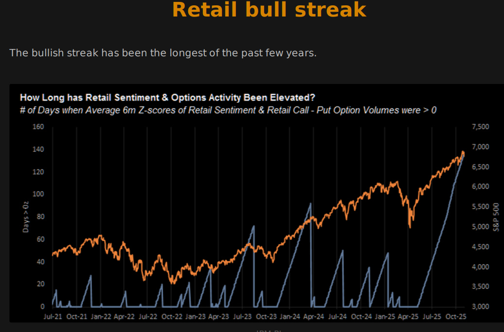
Passive (led by retail) hasn’t been missing. While the construction of the above measure might be a little suspect, it is still interesting to digest.
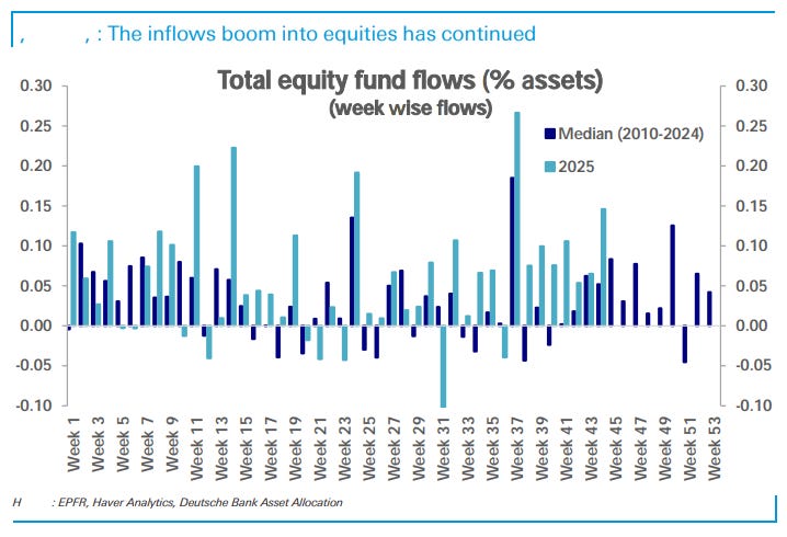
The inflows are just insane relative to history. The above chart is adjusted for the bigger nominal size of the market, and even then, the buying is record breaking.
In my mental model, slowing employment growth should act as a brake on this. However, still large fiscal and current account deficits are undeniable tailwinds for inflows.
Youth unemployment
One of the saddest aspects of the Euro crisis in the early 2010’s was the alarming rise in youth unemployment.
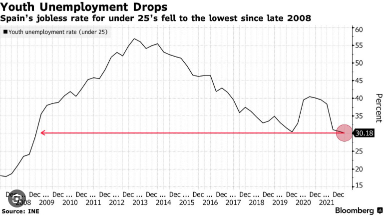
The numbers in Spain and Greece were astonishing. Thankfully this improved as Spain rebalanced, and it sits at about 25% today.
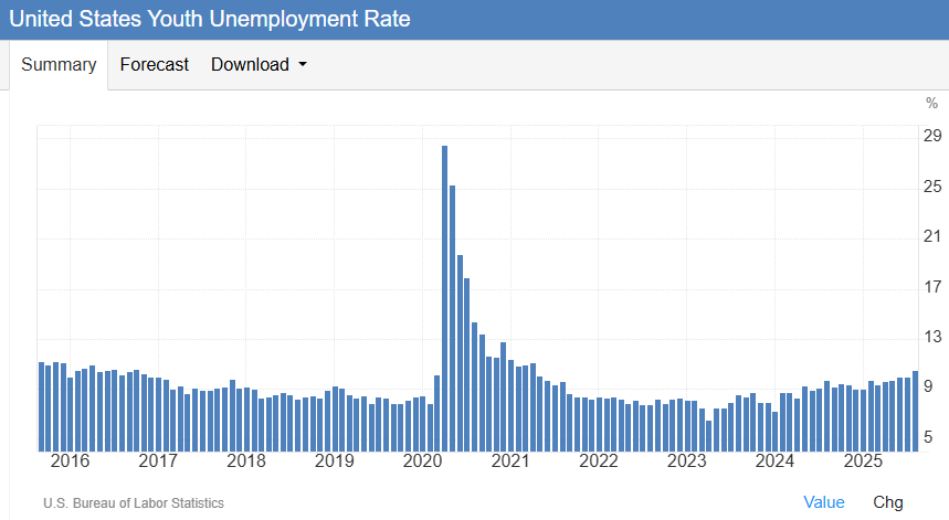
Developed markets trended in the other direction over that time. But that has now changed, and it is developed markets that are experiencing rising youth unemployment.
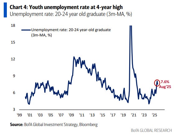
The US (above) has had broad youth unemployment rising for a while now, with graduate unemployment rising the fastest. While not at a dangerous level, it however is occurring outside of an economic slowdown.
No surprises what is driving the online youth political discourse.
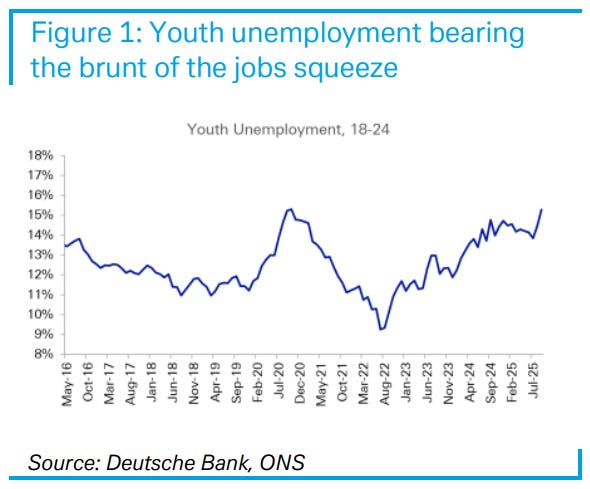
In the UK, the youth unemployment rate is a little more concerning. This is something both the left and the right have issue with, despite assigning blame in different ways.
